
Client
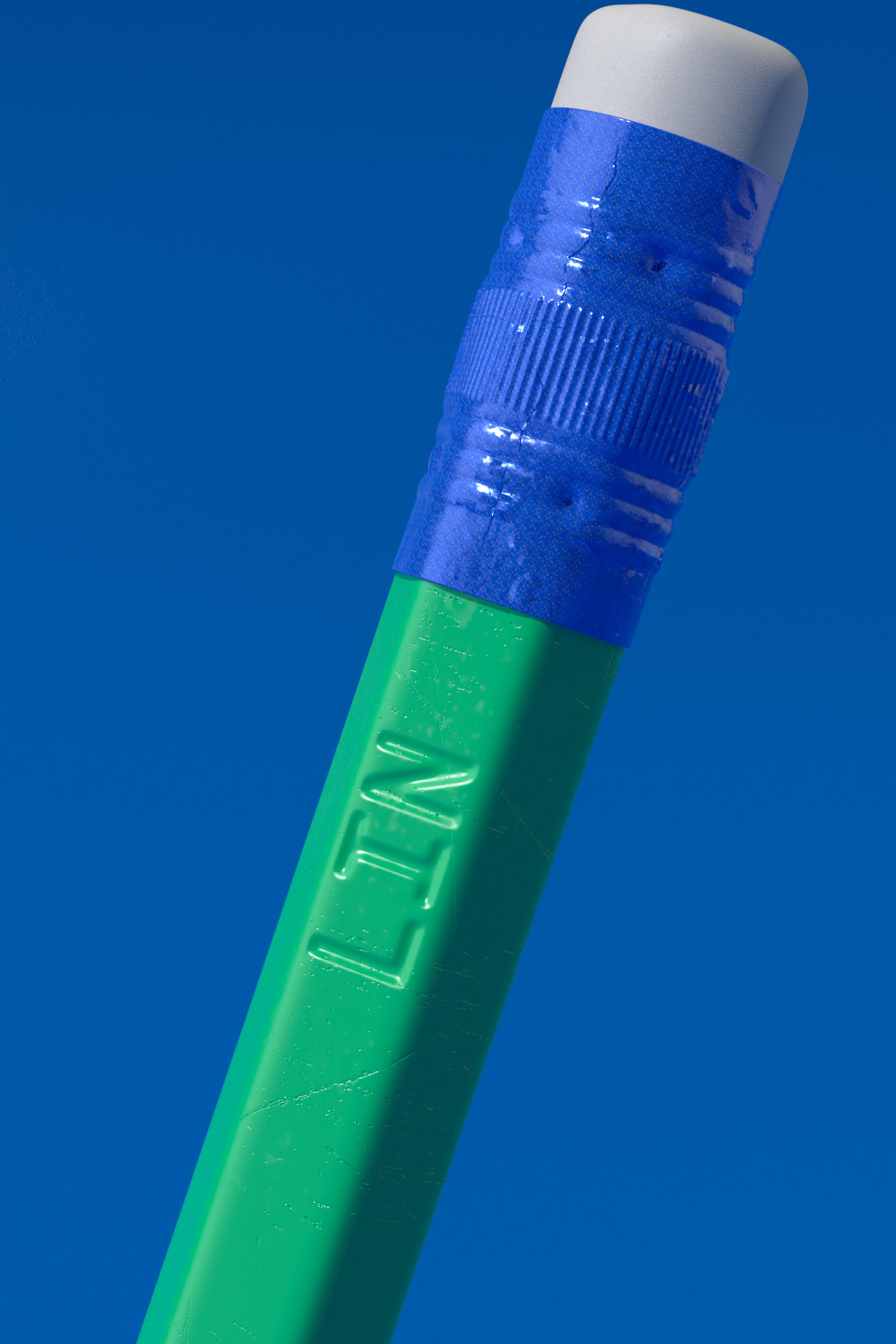
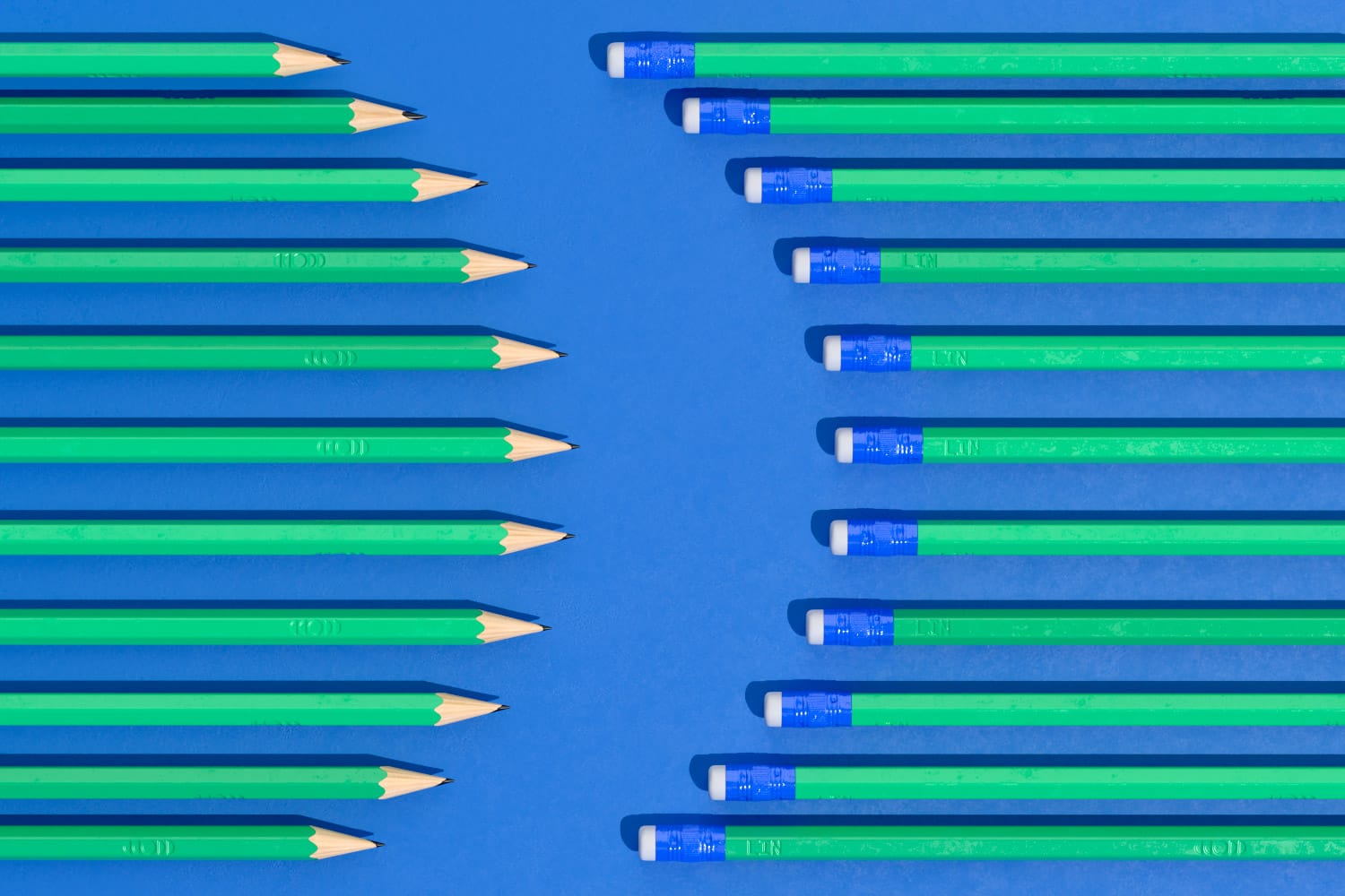
LIN
Sector
Non-profit
Discipline
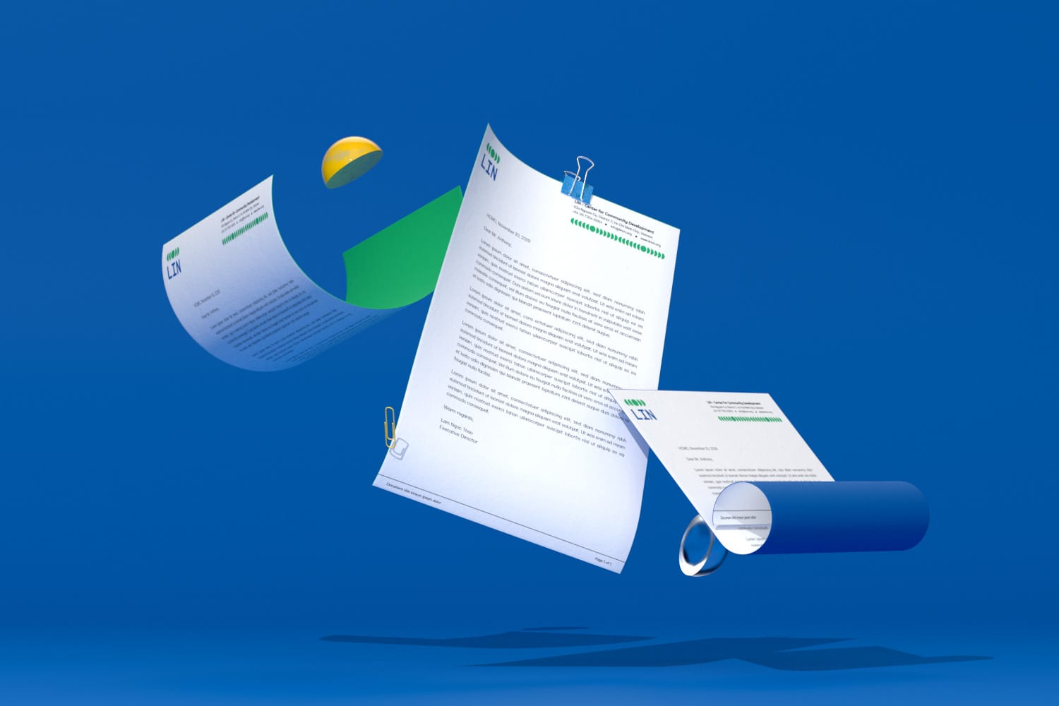
Brand identity
Website development
Project team
Lam Na Ny
Khoa Huynh
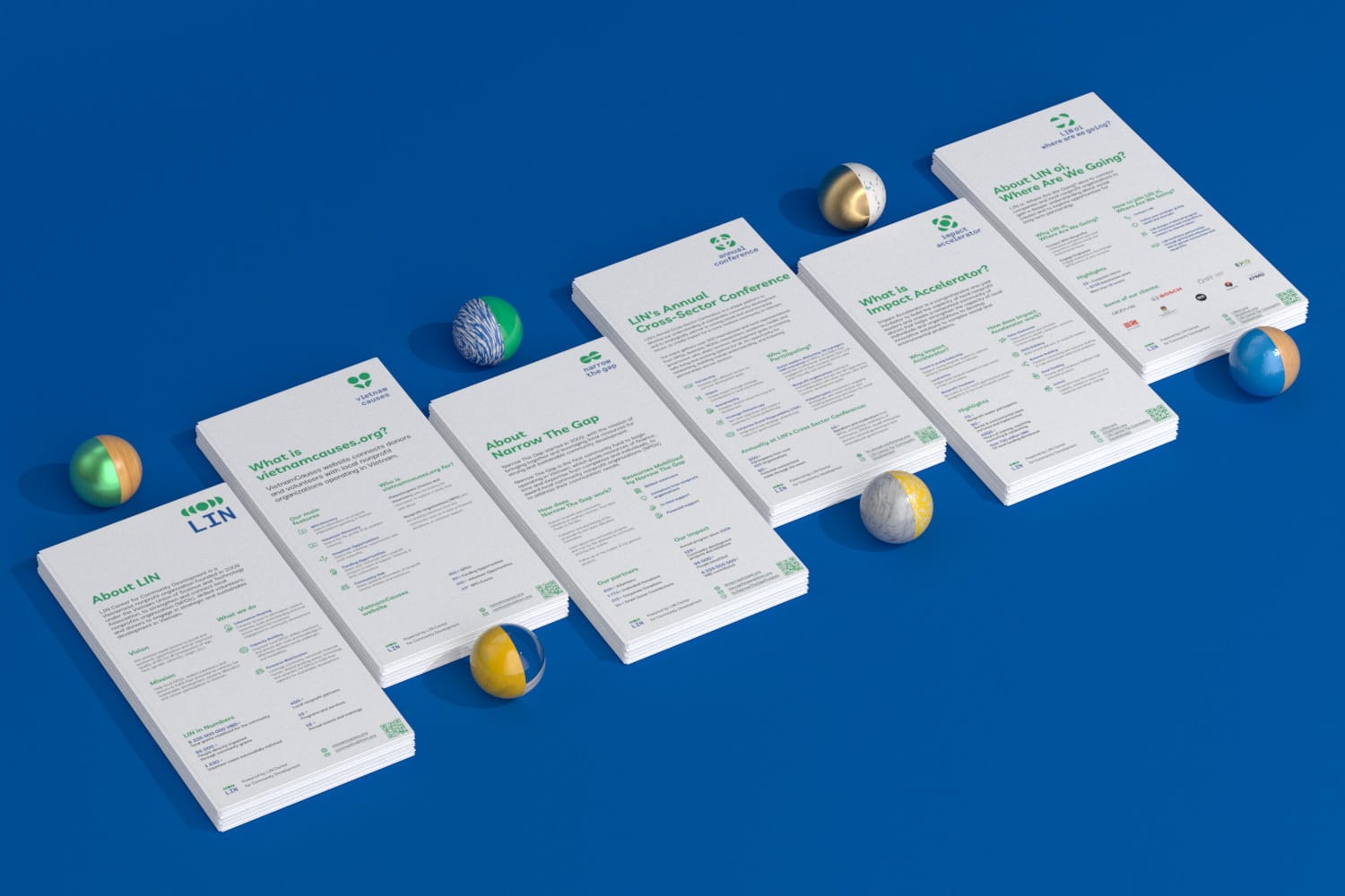
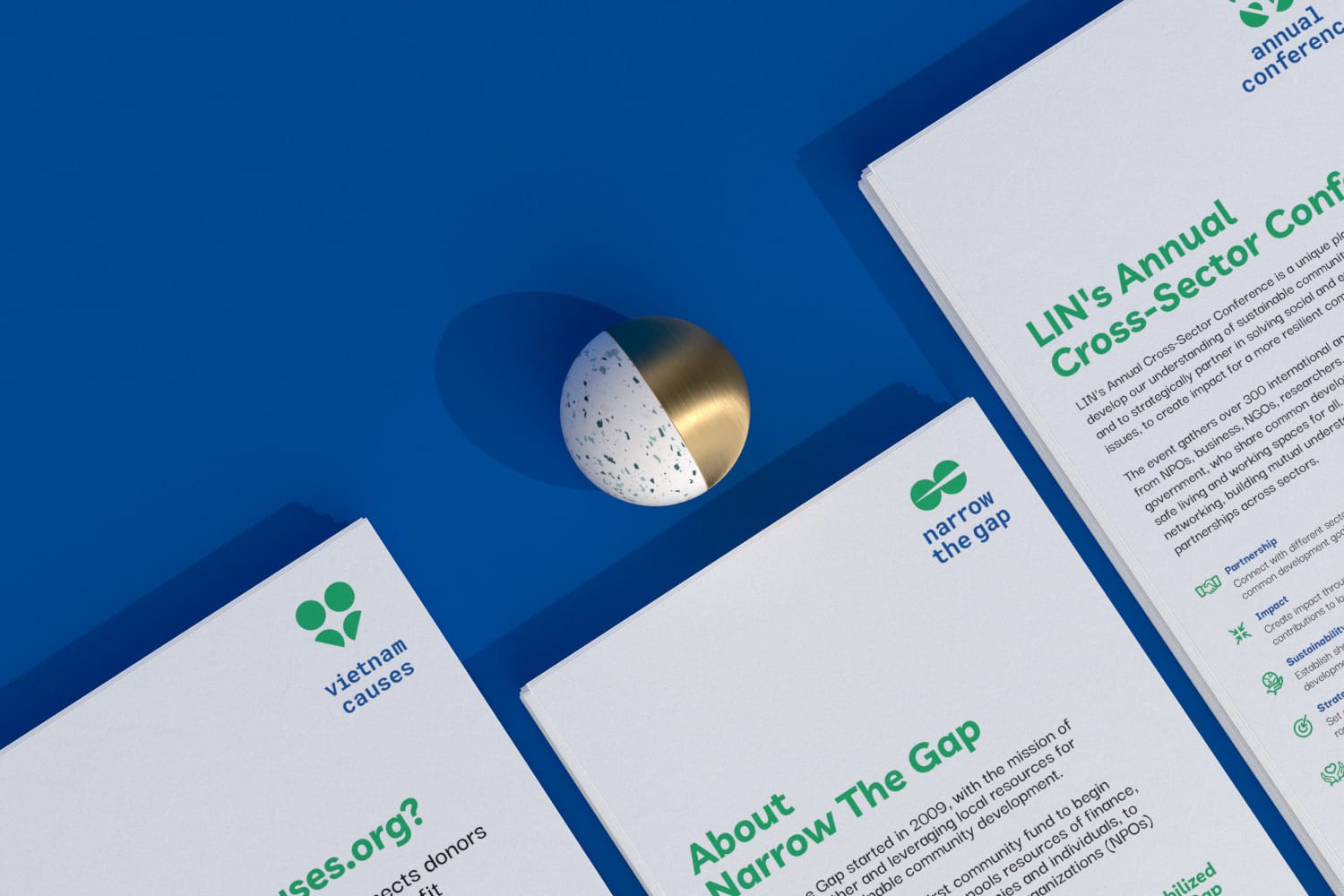
Founded in 2009, LIN Center for Community Development is committed to help local NPOs (non profit organizations), skilled volunteers, and donors to fulfil their potentials as vehicles for sustainable development, poverty alleviation, and citizen participation in Vietnam. After 10 year operating, LIN saw the need for a new visual representation that truly reflect their mission and values. In the middle of 2019, LIN approached us to redesign their new identity, together with all of its sub-brands.
Being the first of its kind in Vietnam, LIN exists in relation to its partners. LIN facilitates, ignites, partners, endorses, consult depending on the context of the project. The organization work towards its aim of creating independence for its partners to build partnership and networks among themselves. The first major makeover in over 10 year, designed by xolve, come from purpose and personality that help communicate and engage with its target audiences.
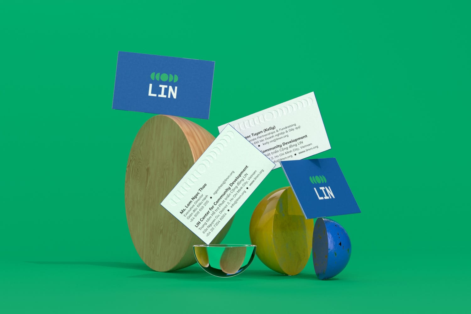
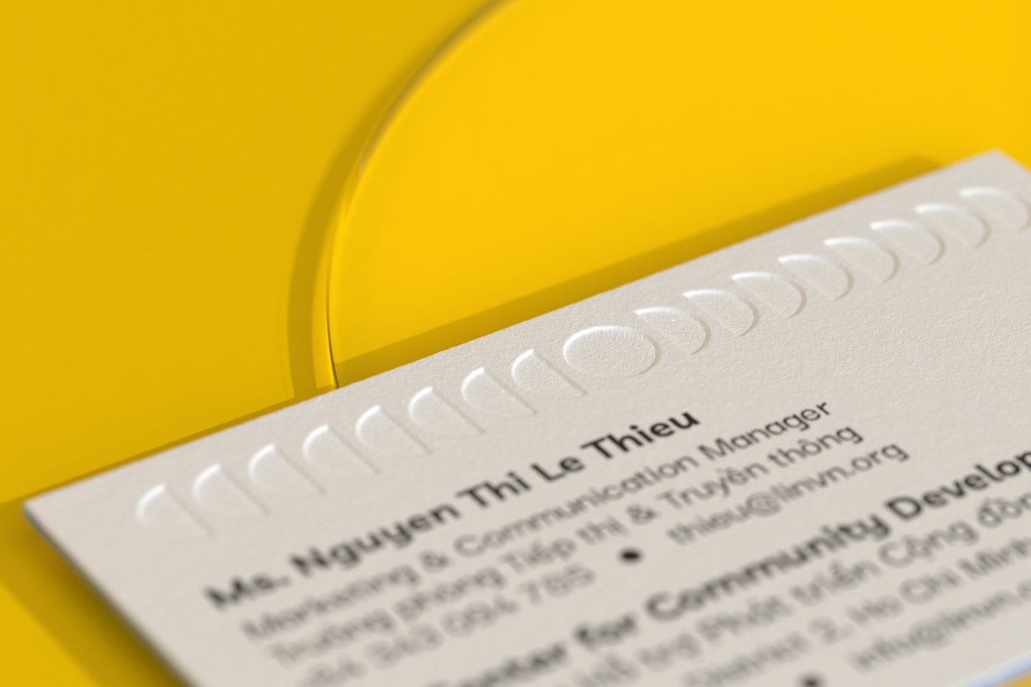
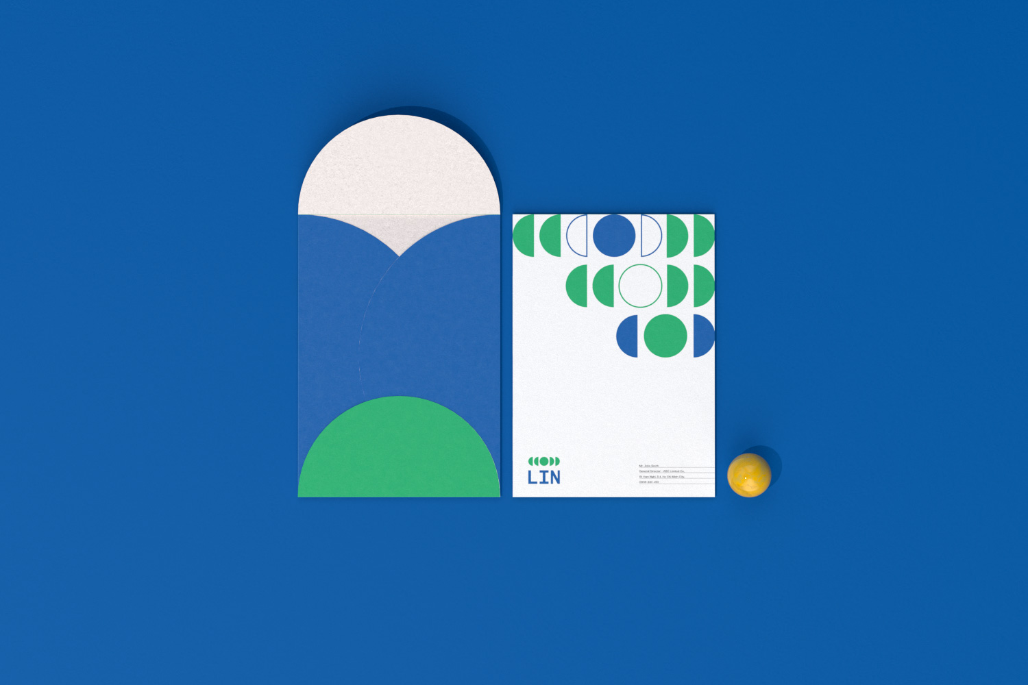
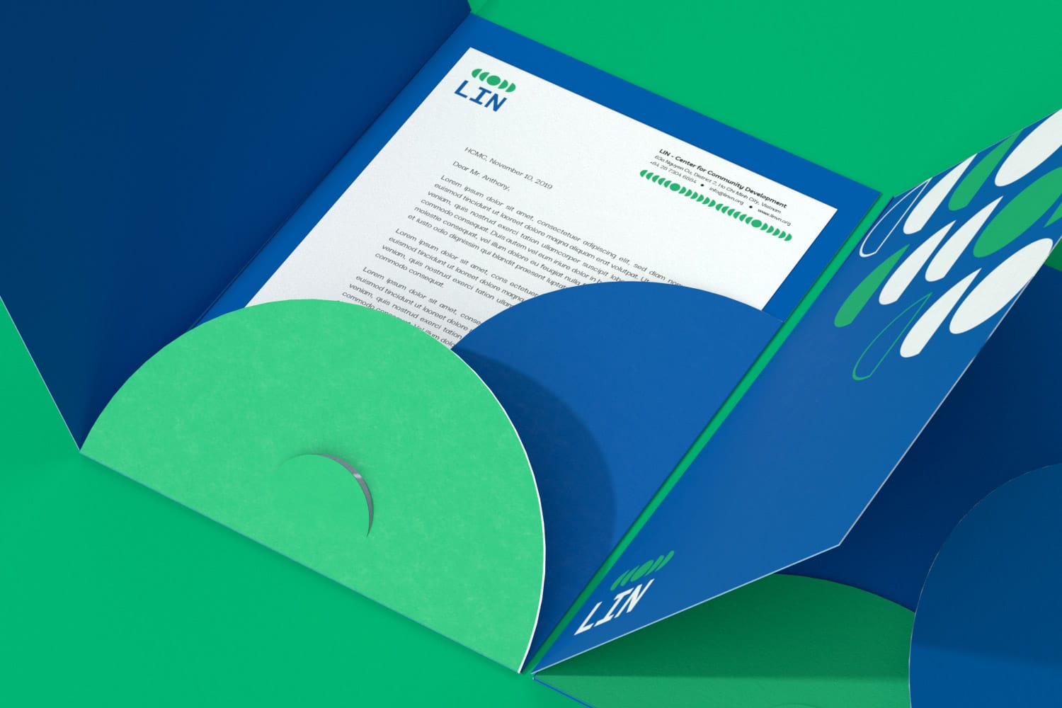
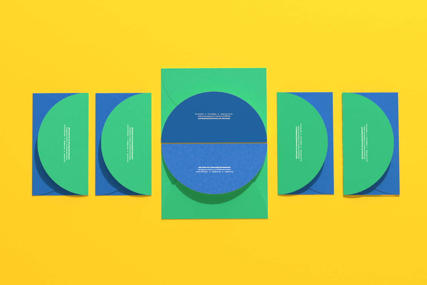
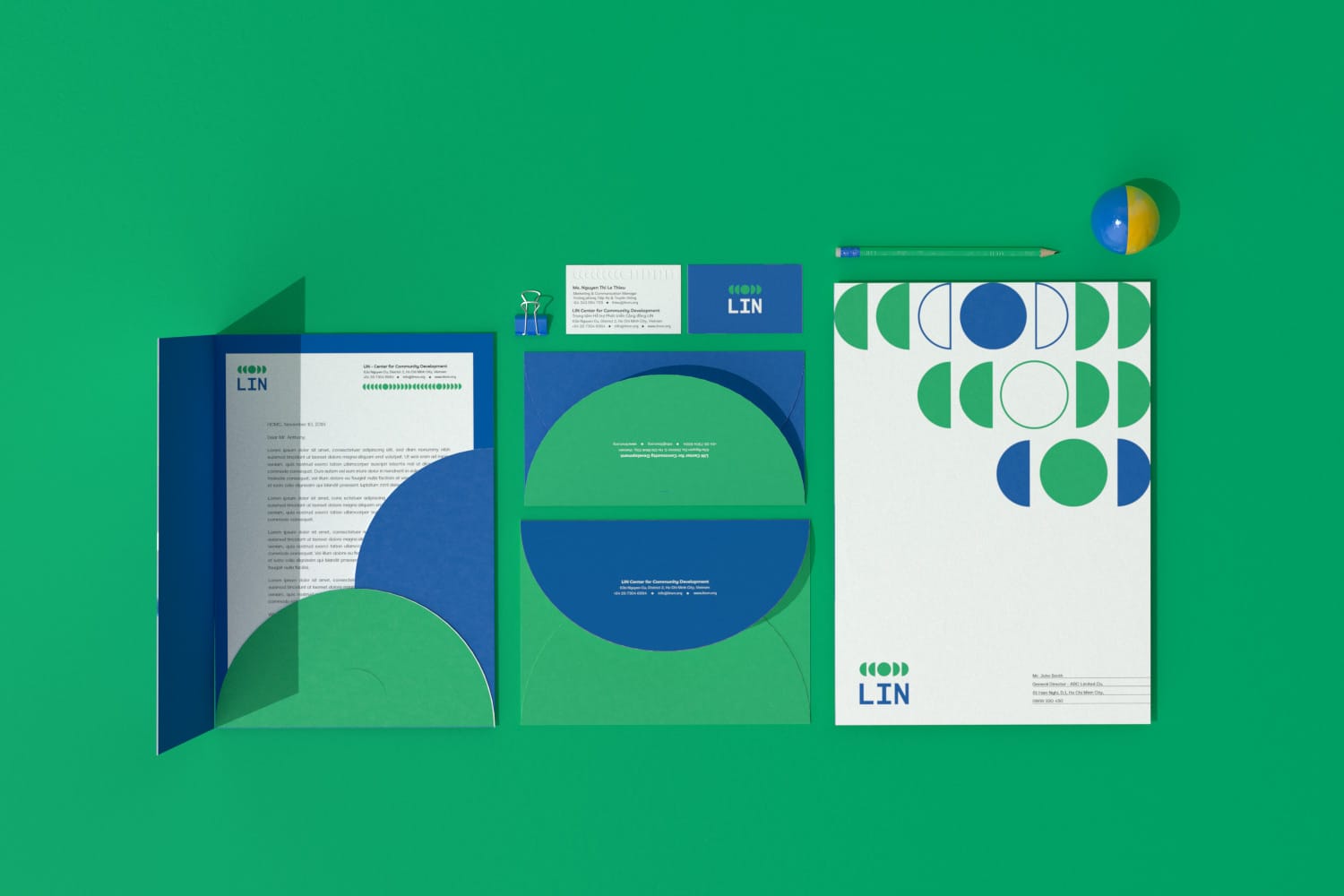
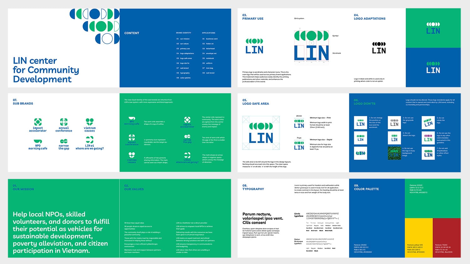
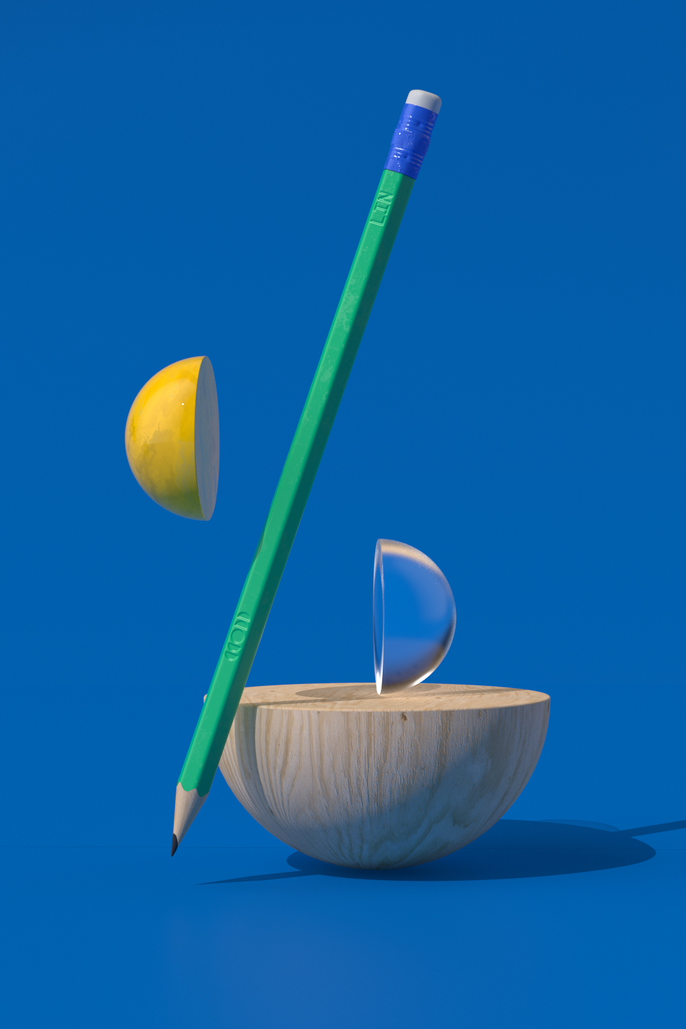
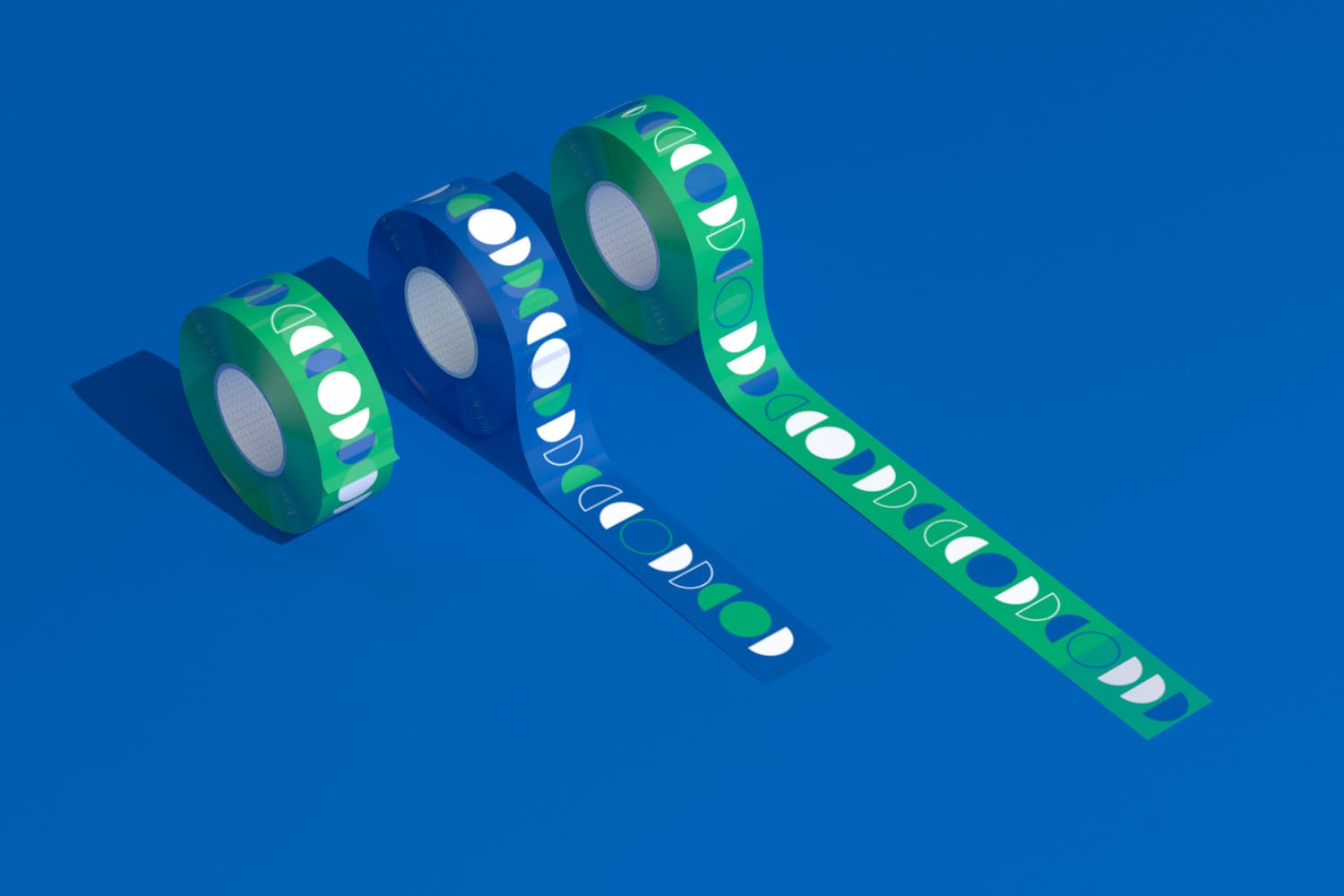
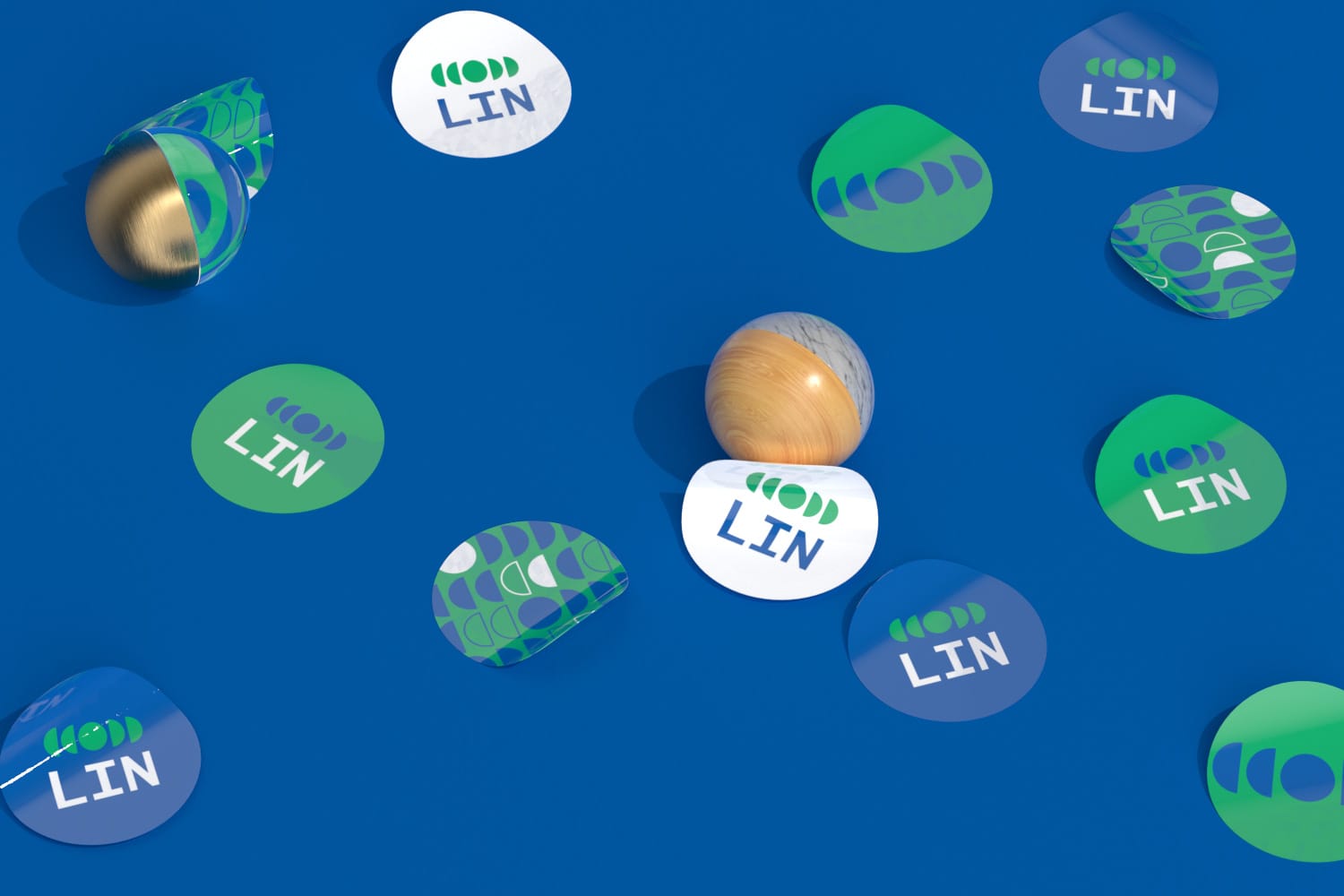
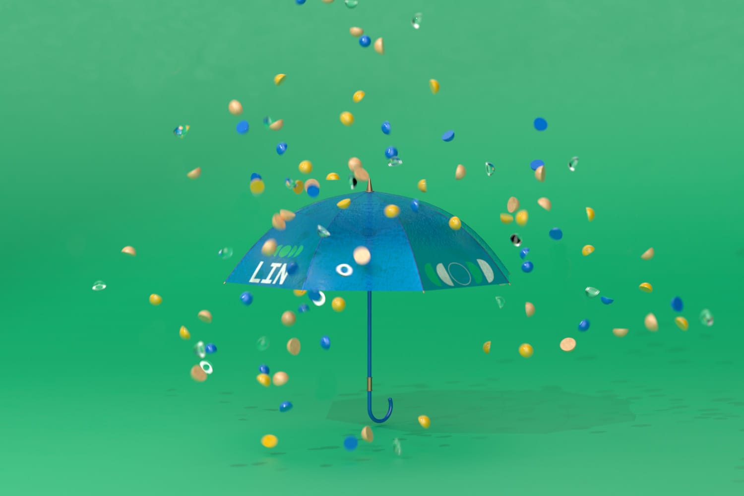
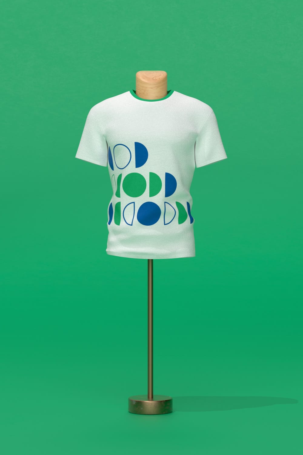
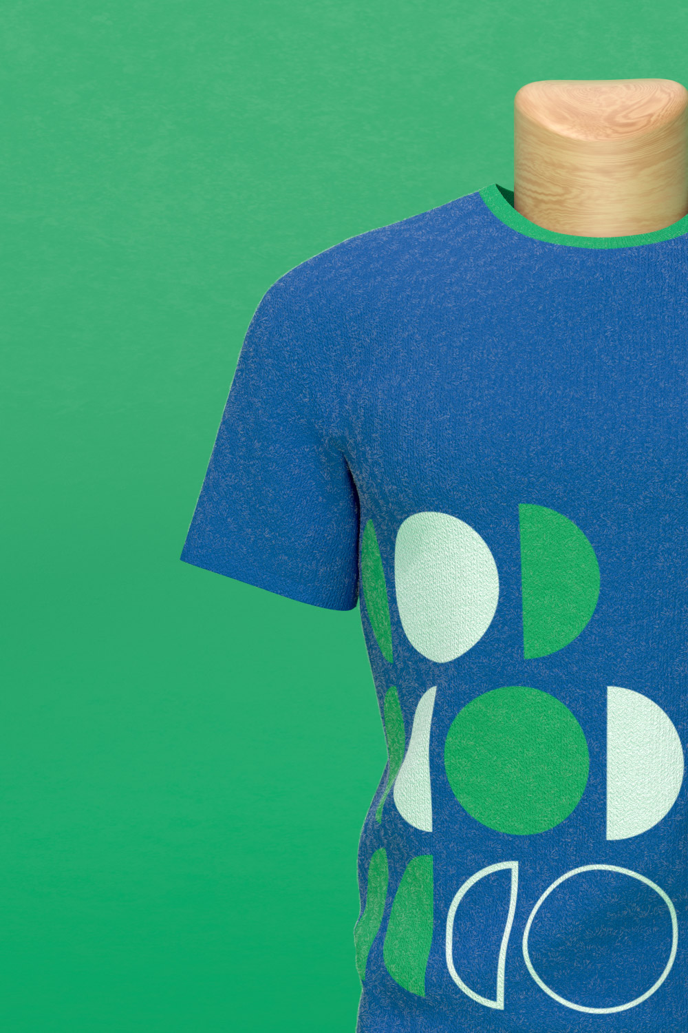
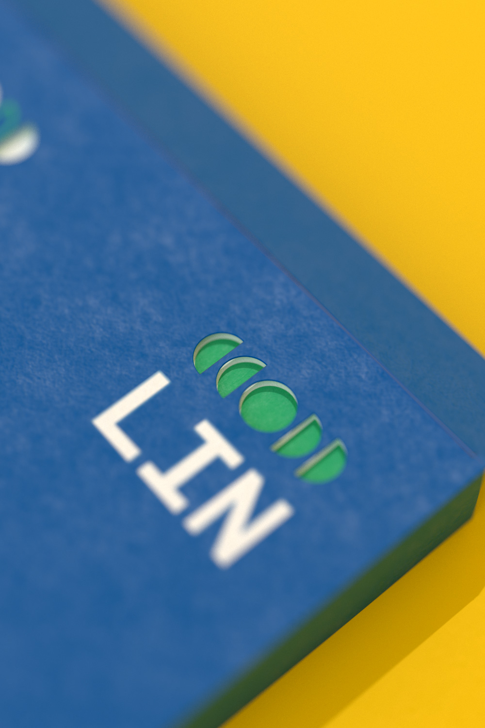
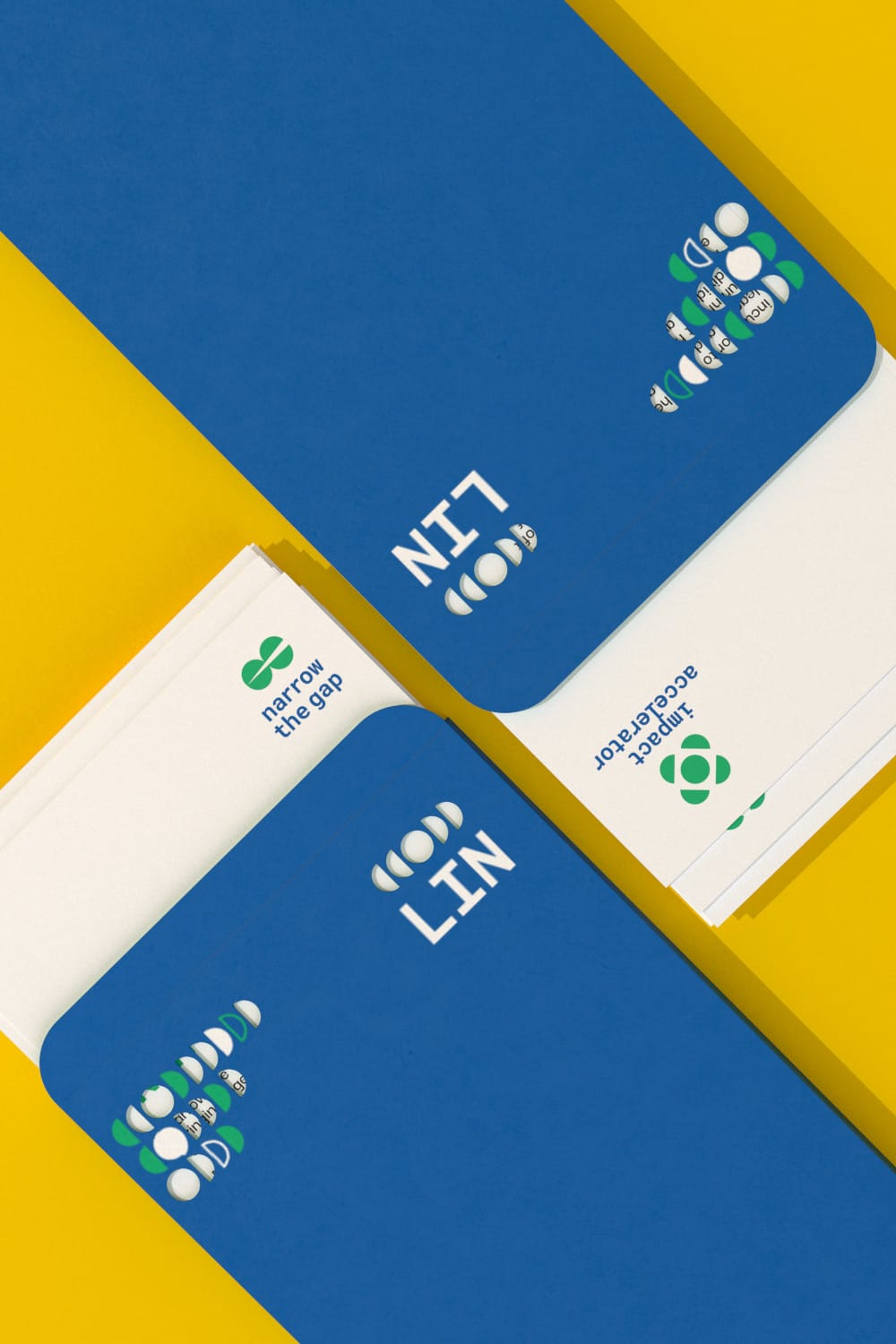
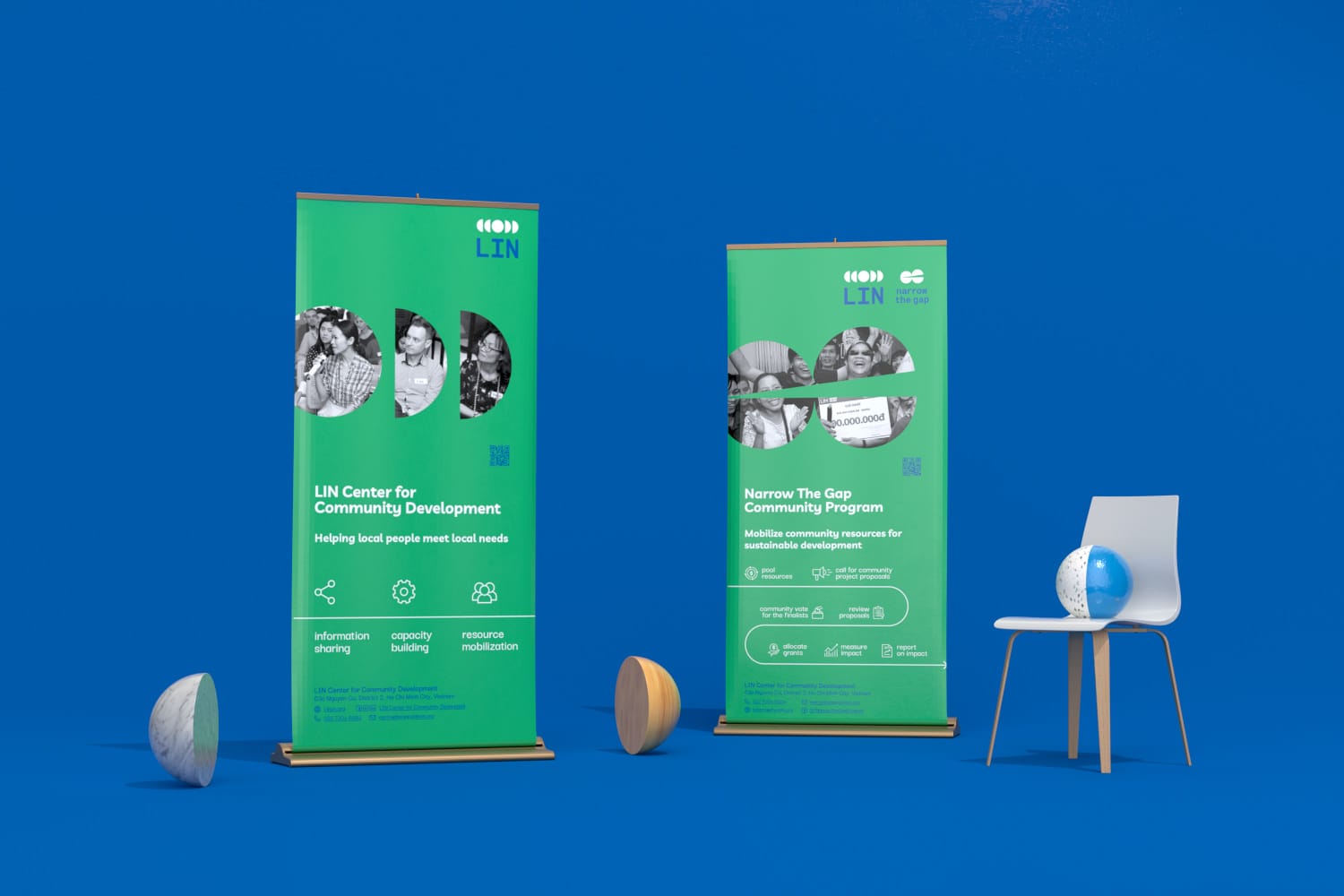
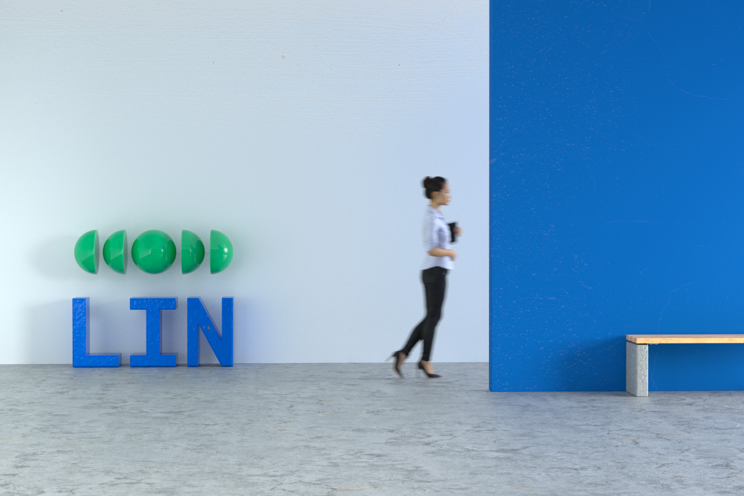
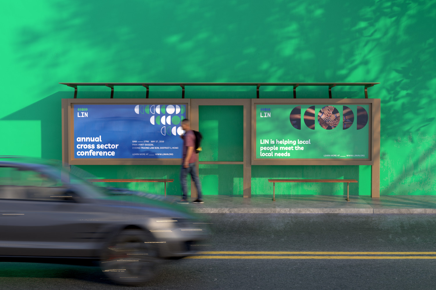
The logo visual system, comprise of a circle in the center that represent the community as a whole. The four symmetry semi-circles ignited from the centre conveys the flow of the energy and positive impact. When merging, these forms a larger community, connecting all the sector for a resilient community.
LIN is the fabrication of the Listening, Inspiring, and Nurturing. In the new wordmark, the three letters possess the same width and height which suggest a sense of equality. Apart from that, the spaces between the elements in the new system are deliberately multiplied to indicate the impactfulness. Altogether, the new look is modern, dynamic yet simple and purposeful which helps express and amplify LIN’s long term missions.