
McLaren, Jaguar and the question brand agencies should ask before changing what people already know.
Put McLaren’s old and new wordmarks beside each other and the reaction is easy to understand.
The outgoing mark is compressed, italicised and visually fast. Even without seeing a car, it belongs comfortably in the world of motorsport and performance engineering. The new wordmark is lighter, quieter and more spacious. Creative Bloq compared it to a luxury fashion brand. You can see the shift before anyone explains it.
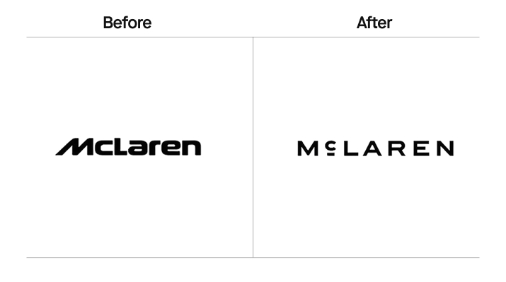
Look at the wider identity and the story becomes more complicated. According to McLaren, the new lettering comes from the sign above the service station run by Bruce McLaren’s parents in Auckland, where he worked on the car that brought him his first racing victory. The Speedmark remains. So do papaya and the Speedy Kiwi. The company says the system will bring Racing and Automotive together and give it more room for personalisation, experiences and community.
There is business substance behind that ambition. McLaren’s 2026 announcement includes a £500 million UK investment programme and plans for a performance SUV, taking the automotive business beyond its traditional two-seat range.
So the rebrand has logic. That still leaves a harder question.
If an identity becomes convincing only after someone explains the archive, the strategy and the applications, how much should that explanation count?
A customer who sees a badge on a car or a photograph circulating without context has none of that beside them. The identity has to connect what they’re seeing with what they already know. A beautiful origin story may be part of the value. It cannot be the only thing holding the design together.
This is where rebranding stops being a design question and becomes a market question. For an established business, our starting position is this: change as far as the business needs to move, and be able to explain what each important change earns. Customer memory took work to build. Giving it up deserves a reason.
A Brand Identity is Partly a Memory System
A logo has aesthetic value, symbolic value and expressive value. It also has a more mundane job: helping people know who they’re looking at.
Colours, shapes, packaging and sounds can become distinctive assets when people consistently connect them with a particular brand. The Ehrenberg-Bass Institute’s work makes a useful distinction here: an element needs both recognition and a strong link to that brand. Having used a colour for twenty years does not, by itself, tell you what customers remember.
When that recognition does exist, repetition has done something valuable. This is easy to forget inside a design team. After staring at an identity for years, familiar elements can feel tired. Customers may only encounter them occasionally. What feels overused inside the company may finally be becoming familiar outside it.
Internal boredom gets mistaken for external weakness.
There is a reason to look closely at whose reaction we’re measuring, too. A 2010 study involving 632 respondents and the Adidas and New Balance brands found that strongly committed consumers reacted more negatively as angular logos became more rounded, while less committed consumers reacted positively. That finding concerns particular logo-shape changes. Its useful warning is that the audience you already have and the audience you hope to attract may experience the same redesign differently.
Of course, some memories work against the business. A company may be remembered as cheap when it wants to move upmarket, or tied to a product it intends to leave behind. But a colour that identifies the company and a reputation for poor quality are different problems. Retiring the colour won’t necessarily repair the reputation.
Which existing associations help the future business? Which obstruct it? And which parts of the identity are responsible for either? Those questions make the usual argument about evolution versus revolution much less abstract.
How Much Work Can the Familiar Parts Still Do?
Consider BMW and Mazda.
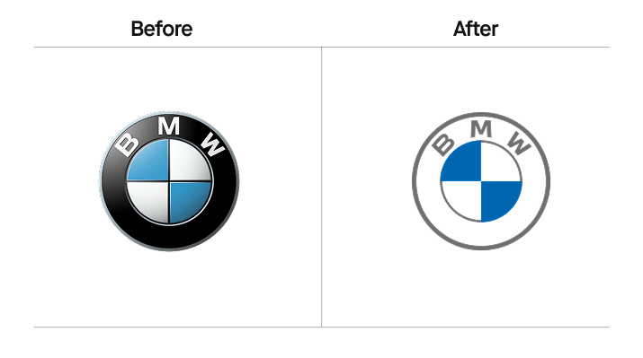
BMW introduced a flatter, transparent communication logo in 2020, then specified where it would be used. The existing badge would stay on vehicles and dealerships. The company could change how the brand appeared in communications without asking every physical encounter to change at once.
Mastercard took a different route. It simplified its identity in 2016 while keeping the interlocking red and yellow circles, then removed the written name from many applications in 2019. Mastercard said more than 80 percent of people spontaneously recognised the circles without the word.
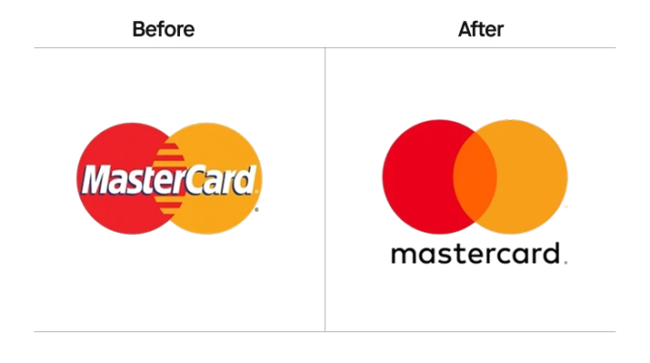
That sequence matters. The remaining element had evidence behind it. According to the company’s own research, the circles could carry the identification task when the name disappeared.
A company considering the same move needs its own answer to that question. Cleaner is a design preference. Whether people still know who they’re looking at can be investigated. Keeping an established asset can give a designer more freedom elsewhere, because the whole identity no longer has to carry the same burden.
BMW and Mastercard also show why the transition belongs in the design brief. The choice is rarely limited to keeping everything or replacing everything on launch day. Different applications can change at different speeds. The business can move decisively without making customers relearn every cue at once.
Sometimes the Business Does Need a Reset
Jaguar sits at the other end of the argument.
Its 2024 transformation was described by the company as a “complete reset”. The new wordmark, strikethrough device, colour system and monogram accompanied a planned move towards an electric-only luxury proposition, a dedicated vehicle architecture and new retail environments. Even here, a redrawn leaper remained as a mark of provenance.
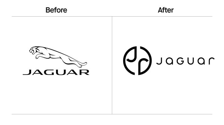
If Jaguar were continuing to sell roughly the same cars to roughly the same customers in roughly the same position, such a large identity break would be difficult to justify. The stated ambition is much more radical. Jaguar wants people to reconsider what kind of company it is and what they should expect to buy from it.
That gives the change a strategic argument. The commercial verdict needs more than a launch.
Jaguar’s August 2026 announcement showed the Type 01 interior and scheduled a full reveal for October in New York. The product intended to carry the new identity was still being introduced. Enthusiasm for a concept car could not establish demand for the production vehicle. Equally, a sales figure taken during a change of product range could not isolate the effect of the logo.
What makes Jaguar interesting is the difficulty it has chosen. It has to build recognition for the new expression while proving the product and persuading buyers that the proposition deserves its place in the market. A more conservative identity could make recognition easier. It could also keep pulling the brand towards associations the business is trying to leave.
We should be able to discuss that trade-off without pretending that liking or disliking the wordmark settles it.
The Costly Change May Be the One the Business Barely Needs
Tropicana brings the question down from the launch stage to the supermarket refrigerator.
In 2009, it replaced familiar packaging cues, including the orange with a straw. The Guardian reported a 20 percent sales fall after the change and the company’s return to the previous design.
The sales decline alone cannot tell us exactly which element caused what. But the buying situation makes the recognition question concrete. A pack has to help someone find the juice they came for, distinguish it from the products beside it and recognise the variant they want. Changing several familiar cues at once puts that task at risk.
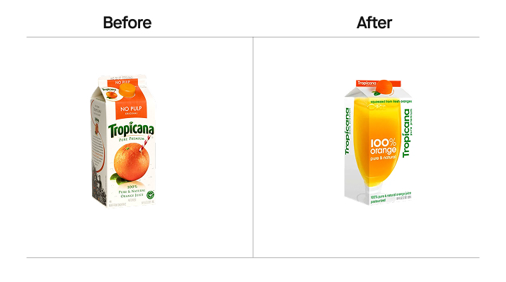
This is a different brief from Jaguar’s. Tropicana was still selling an established orange juice to people who already knew it. The reason to ask those buyers to relearn its appearance needed to be strong enough to justify the disruption.
“Bold” tells us very little here. So does “conservative”. Both words describe the look of a decision while leaving its purpose unanswered.
Kia Makes the Verdict Less Comfortable
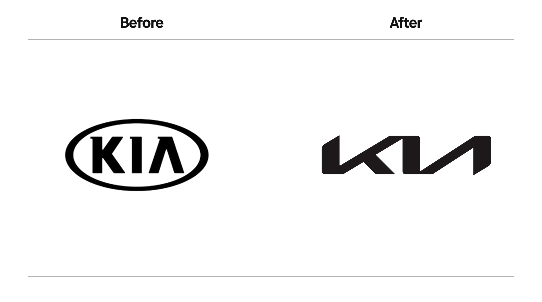
Kia’s 2021 name and identity change accompanied a stated move towards electrification and a broader mobility business. It also produced a specific problem: some people couldn’t read the name.
Rerev showed the logo to 1,062 survey participants. Only 56 percent identified the letters as Kia; 26 percent read them as KN. The publisher also reported searches for “KN car”. Its limited published methodology means we shouldn’t treat the results as a population estimate. We can still take the legibility question seriously.
Yet Kia reported record global sales in 2024, following a record in 2023. Its sales announcement pointed to new models, improved production conditions and vehicle supply.
Those results don’t make the lettering easier to read.
They do make a sweeping verdict harder to defend. Product appeal, availability, distribution and marketing can all affect what a company sells. A rising sales total cannot tell us that every design decision worked. A confusing wordmark cannot tell us that the wider repositioning failed.
A good agency should be capable of holding both conclusions at once: Kia had commercial momentum, and its logo presented a legibility problem for some viewers. The useful next move is to understand the friction and improve it. Calling the whole rebrand a triumph or a disaster leaves the team with much less to act on.
Which Brings Us Back to McLaren
The old wordmark is excellent at saying speed. McLaren now wants the brand to carry more.
That makes a quieter, more luxurious expression worth considering. But there is a difference between giving a brand more range and making it less particular. Historical authenticity does not automatically create contemporary distinctiveness. A viewer who has never seen the family service-station sign cannot retrieve that history from the lettering.
This is where our concern would sit.
Luxury branding already has plenty of restrained typography and generous spacing. Those choices can suggest a price tier without giving someone much reason to remember a particular company. Burberry’s 2023 identity under Daniel Lee offers a useful counterpoint: an archive-inspired wordmark and refreshed Equestrian Knight made specific house symbols prominent again. The question is what makes the expression belong to this business.
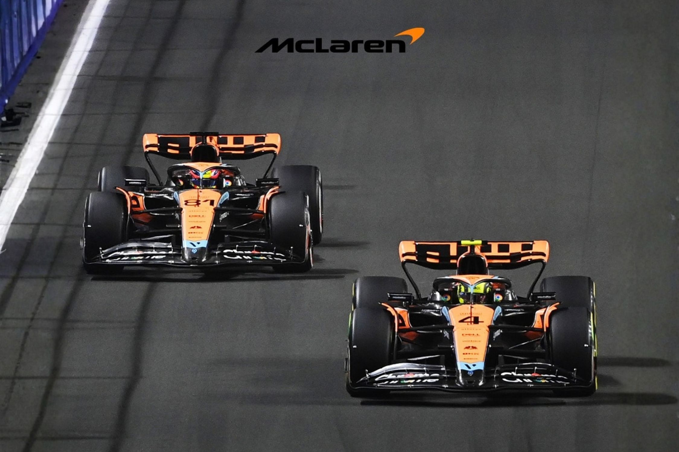
McLaren needs enough range to behave like a broader luxury company while retaining enough performance character that “luxury” doesn’t become “could belong to anyone expensive”. The full identity may achieve that. Colour, the Speedmark, racing imagery, the vehicles themselves and the way the brand moves can work together in ways a comparison of two wordmarks cannot show.
But the first reaction still matters. If someone sees a fashion brand in the new lettering, we would want to know whether that association helps the intended expansion, weakens an important existing cue, or does both. Creative Bloq’s reaction is one critic’s interpretation. It gives us a question to investigate, not an answer about customers.
Explaining the origin story cannot substitute for answering it.
The Brief Starts Before Anyone Draws the Logo
At xolve, we would begin by separating two judgments: how far the business is changing, and how much useful recognition it already has. These sound straightforward. They become less so when a room full of people has already fallen in love with a visual route.
A company with limited business change and strong recognition usually has a good reason to evolve what it owns. A company changing more substantially may need a different expression while keeping the identifiers that still help. A reset becomes easier to argue for when the business is making a genuine break and existing associations obstruct the new proposition.
The word “useful” matters. A familiar symbol can be worth retaining even when the wider reputation needs work. Equally, a symbol that means a great deal to the founder may mean very little to buyers. You have to establish recognition and meaning separately before deciding what to protect.
For McLaren, our starting judgment would be to explore how far the retained assets can carry the broader offer. The public material gives us a reason for expansion and evidence of continuity in the identity. It does not tell us how much recognition the old lettering carried relative to the Speedmark or papaya. That is the missing piece before declaring the change either too timid or too far.
We would compare the existing and proposed identities in real applications, including those with fewer supporting cues. If people still identify McLaren and the new expression opens up the intended associations, the case for the change strengthens. If recognition falls in an important setting, that is a reason to preserve more, alter the application or introduce the change more gradually.
For an established manufacturer launching a premium line, the same questions may lead somewhere else. The new range could need a different presentation while the parent brand and existing products keep their identifiers. Calling the whole company a transformation would make the design assignment larger than the business decision.
Before launch, let people encounter the work without the presentation.
Can they identify it? What do they think it sells? What disappeared from their understanding of the company, and what appeared? Look separately at the people the business needs to retain and those it hopes to attract. Then ask where the product, service or experience will make the new promise believable.
Those answers tell us more than a vote between Logo A and Logo B. They also give the design team something more useful than a request to make the identity “feel more premium”.
When the Explanation Disappears
Recognition built over years came from products, packaging, stores, sponsorships and countless encounters that nobody recorded in a design case study. A rebrand can ask the customer to do some of that learning again. Sometimes the business needs precisely that. The mistake is treating the effort as free.
The market is also allowed to see something the presentation didn’t intend. That is why the first encounter deserves attention, even when the strategy is sound and the archive reference is authentic.
People should not need to understand the design process. They need to recognise the company, understand enough of what has changed and find evidence that the new promise is real.
The rebrand has to work when the explanation is gone.