Client
Hyper
Sector
Consumer Goods
Discipline
Brand Strategy
Brand Identity
Packaging Design
Website Development
Project team
Thao Nguyen
Quyen Tran
Tieu Anh
Anh Chu
Nhan Pham
Hoang Vu
Nguyen Thong
Quan Nguyen
Khoa Huynh
Photographer
Minh Khang
Meet Hyper: Power Up Your Day, The Fun Way
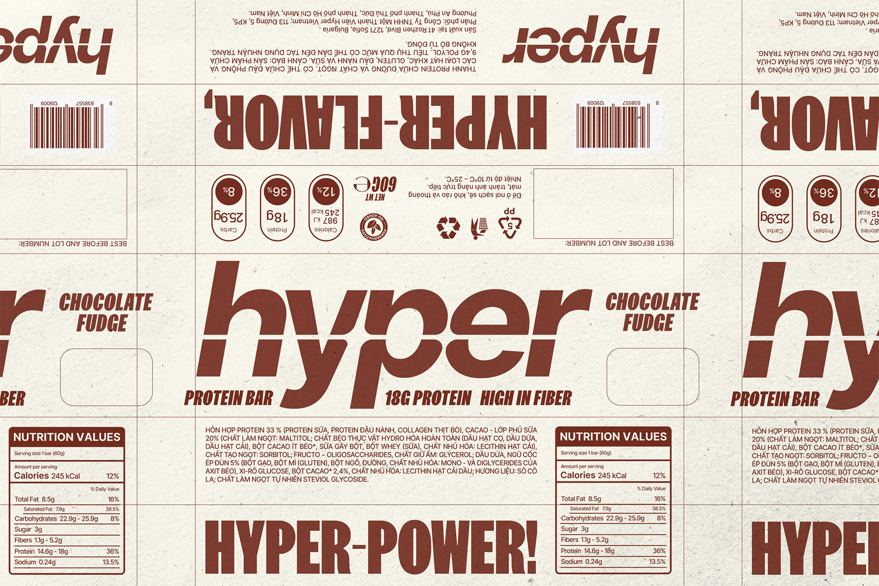
Hyper, a newcomer to the healthy snack market, set out to make a bold entrance with its range of protein bars. But with so many brands vying for attention, the challenge was to create a brand identity that stood out—one that communicated both nutritional quality and a genuine commitment to sustainability. xolve developed a vibrant, energetic identity rooted in the idea of a “burst of energy,” capturing Hyper’s promise of delivering a powerful boost through high-quality products. The centerpiece is a slanted logo featuring an integrated burst symbol, designed to convey vitality and forward momentum. This identity was brought to life across all touchpoints—from packaging to website design—through bold colors, clear typography, and enticing photography, delivering an engaging and informative experience that resonates with consumers.
A Dynamic Logo that Sparks Vitality
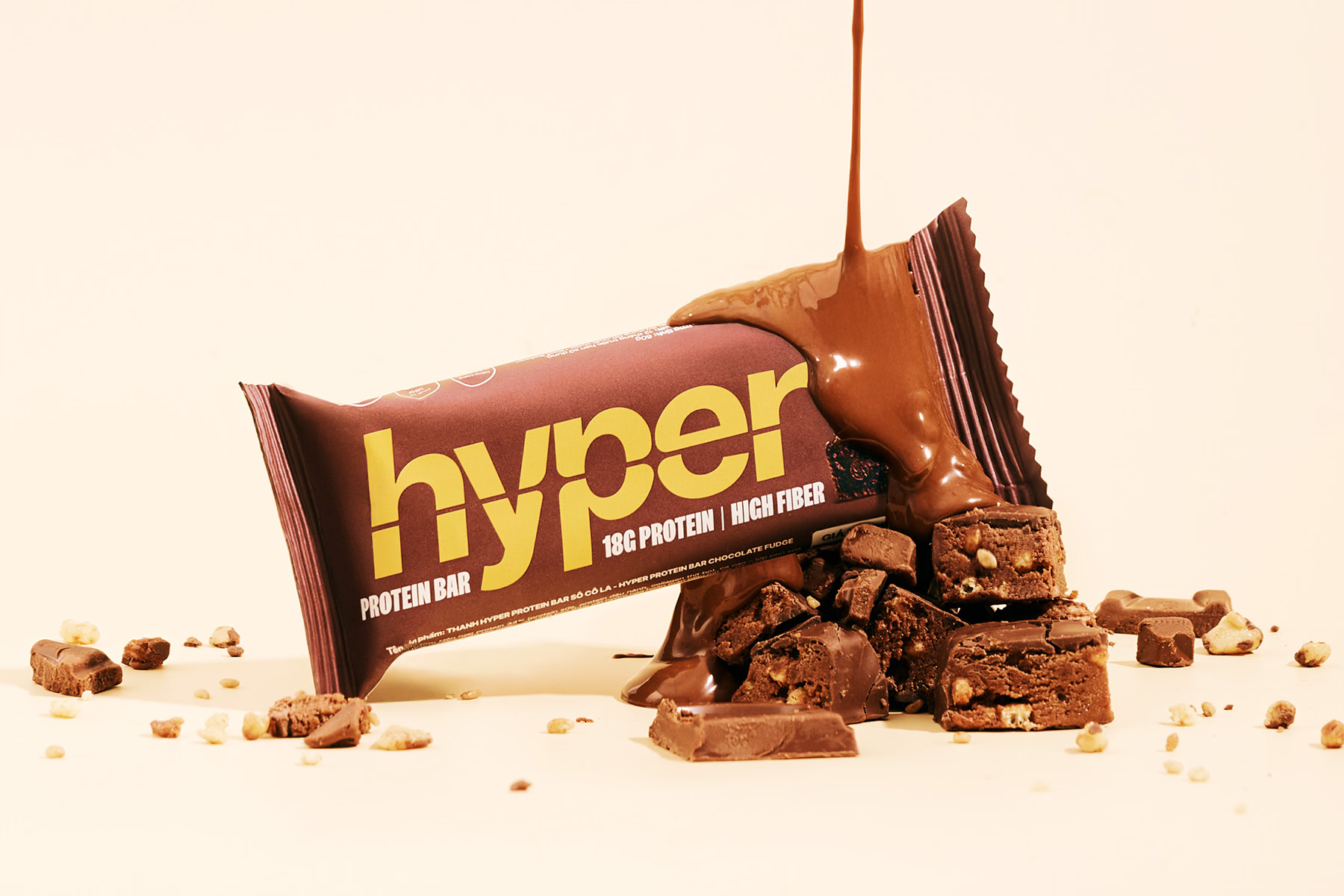
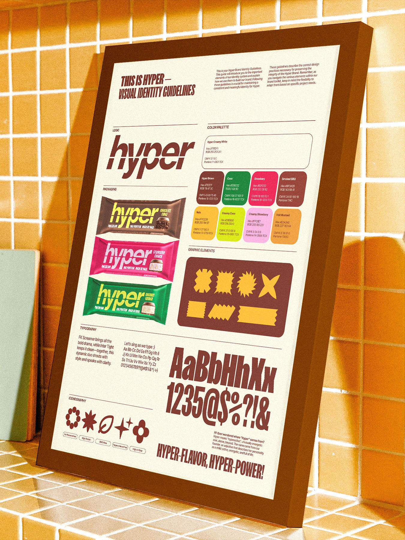
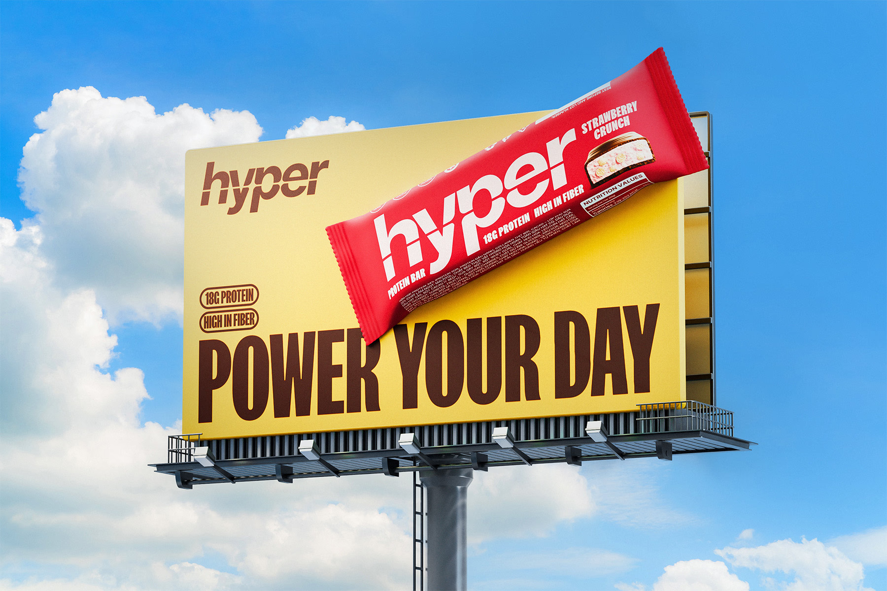
At the core of Hyper’s brand identity lies its bespoke logotype—an emblem of energy and movement that takes center stage across every product packaging and brand touchpoint. The bold, slanted lettering captures a sense of forward momentum, while the integrated burst motif symbolizes an explosive surge of energy and vitality. This design not only reflects Hyper’s mission to invigorate and empower but also commands attention, standing out confidently on crowded shelves. Spanning across the protein bars, the logotype becomes a dynamic visual statement—powerful, energetic, and unmistakably Hyper.
The Type Duo that Speaks Loud and Clear
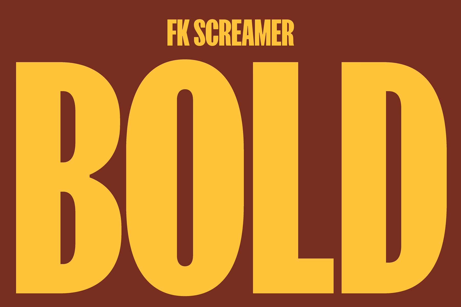
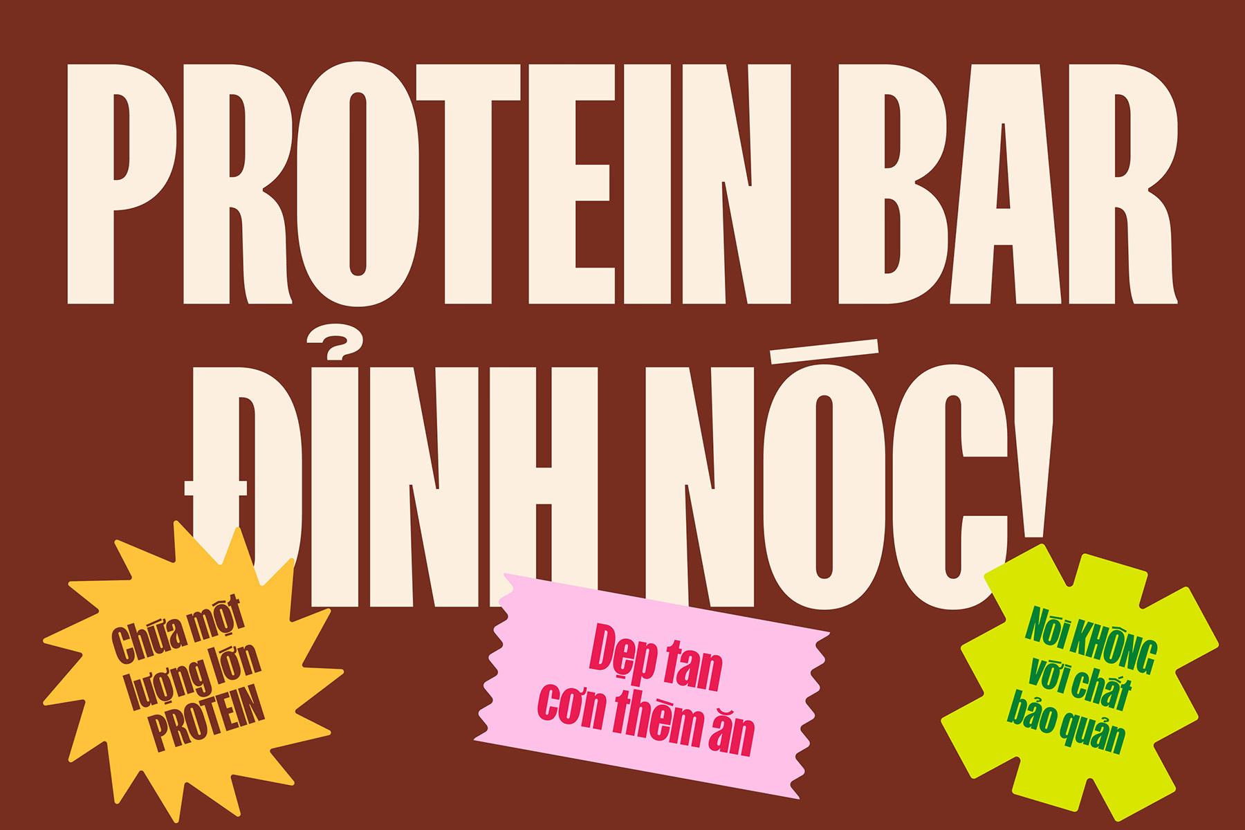
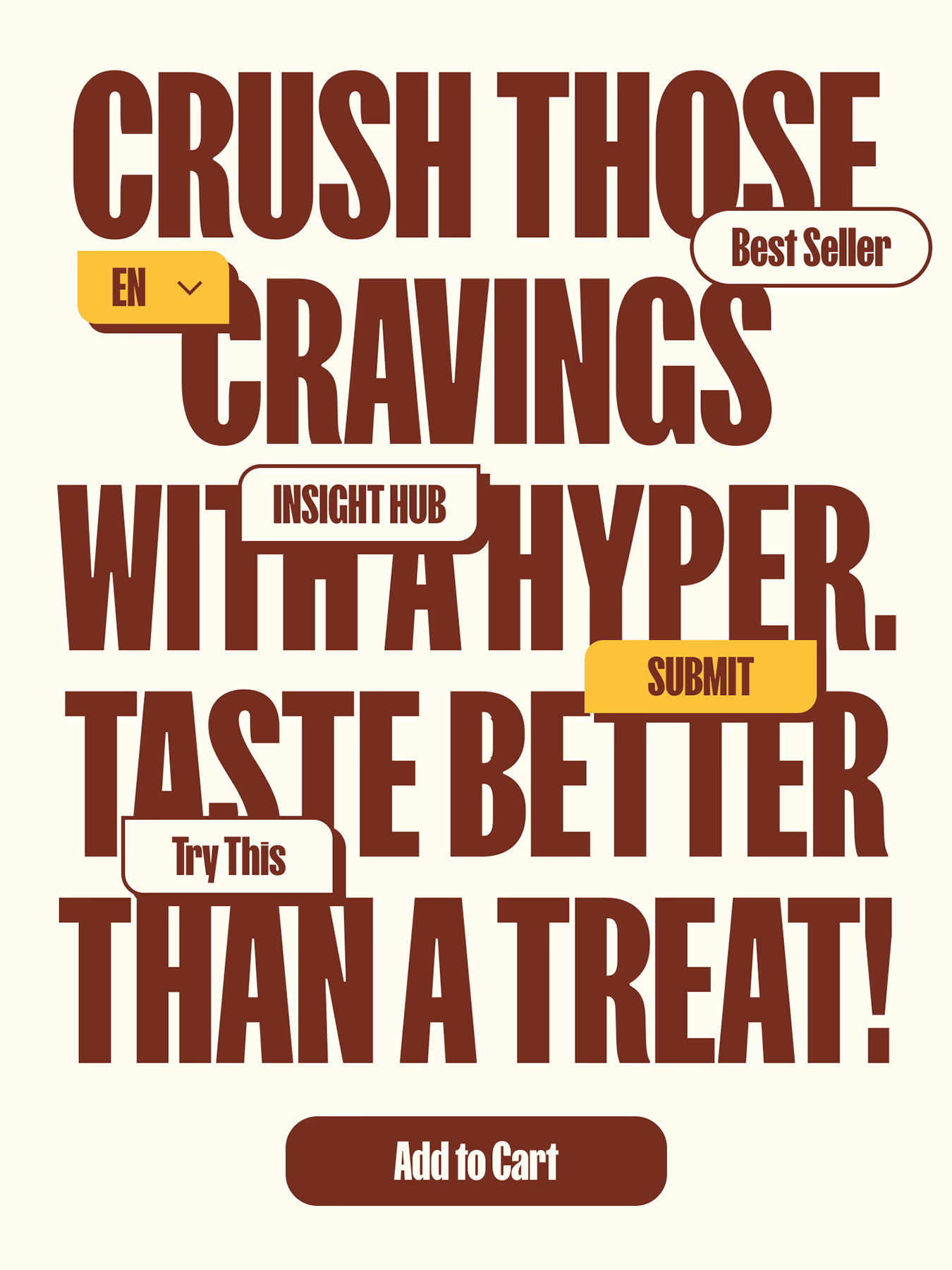
Hyper’s voice takes shape through a bold typographic pairing. At the forefront is FK Screamer, the brand’s primary typeface—an unapologetically expressive sans that commands attention in all the right ways. It’s loud, bold, and playful when needed, injecting high-impact energy into campaign headlines and packaging. To balance this expressive force, Inter Tight steps in with composure and clarity. Clean, modern, and highly legible, it brings structure and ease to moments where information takes the lead. Together, this duo forms a dynamic system—shouting with personality, speaking with precision, and ensuring Hyper’s voice resonates at every touchpoint.
Vibrant Flavors That Own the Shelf
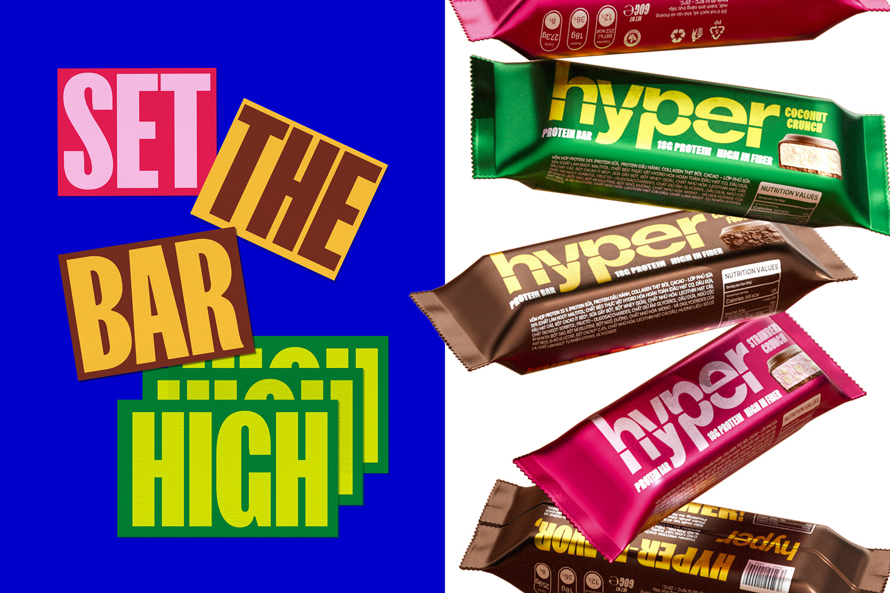
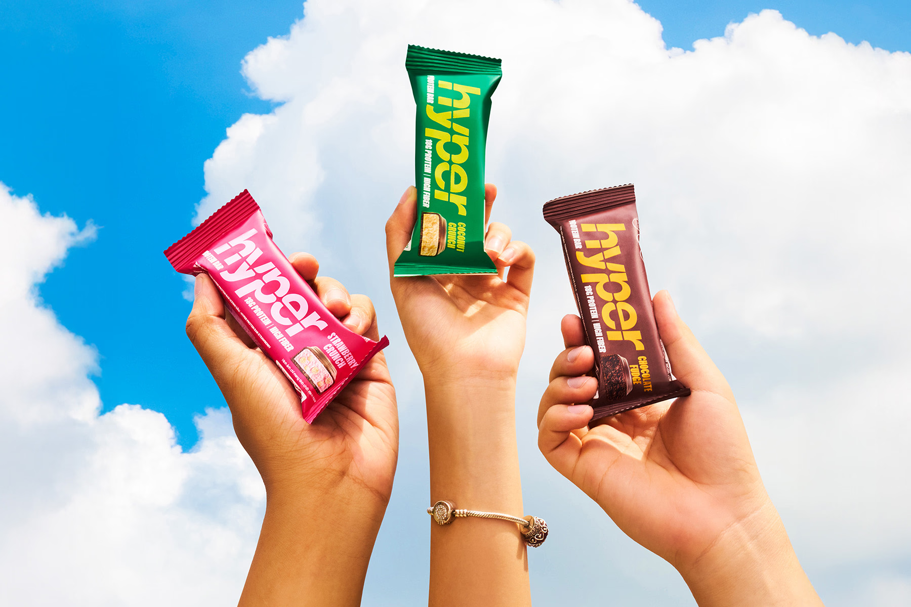
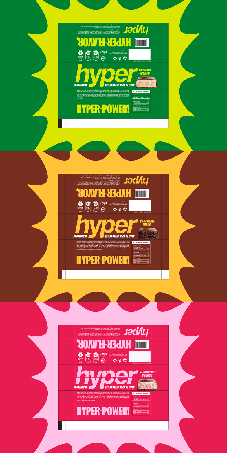
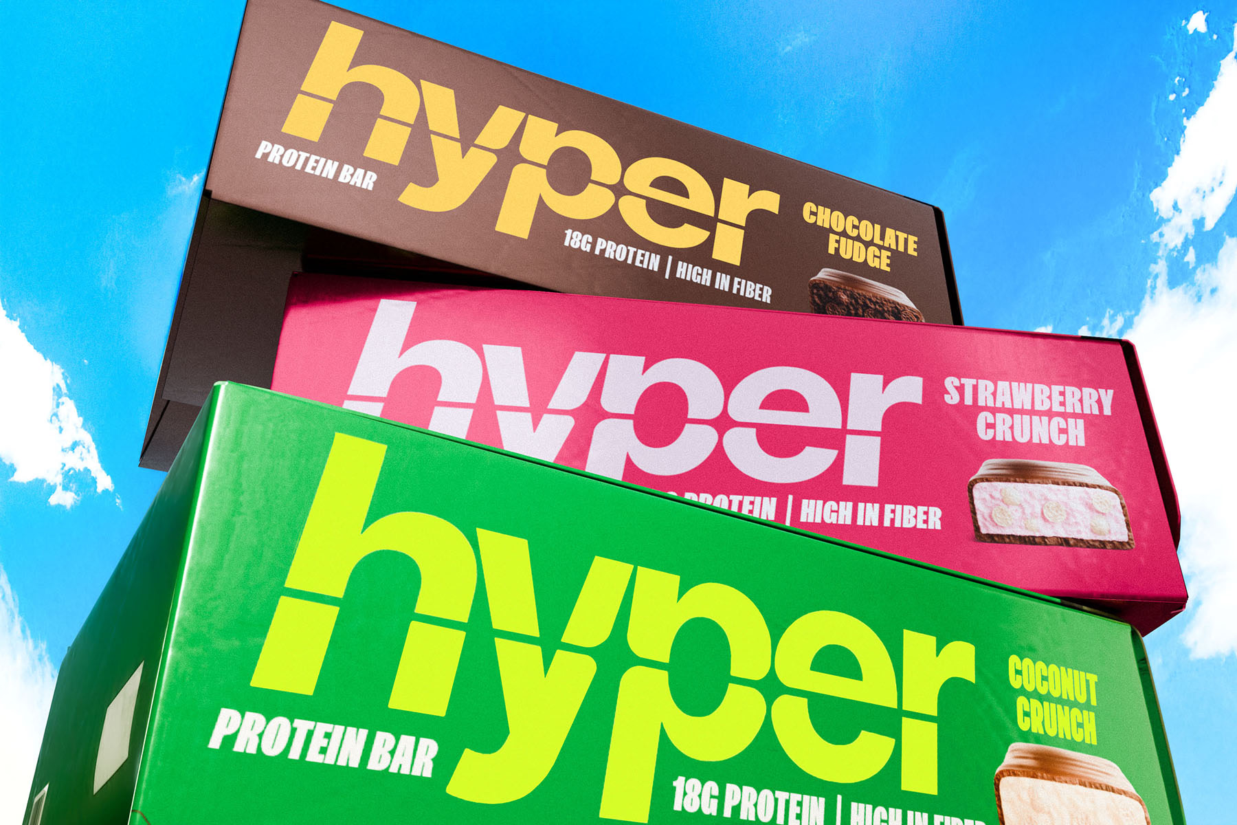
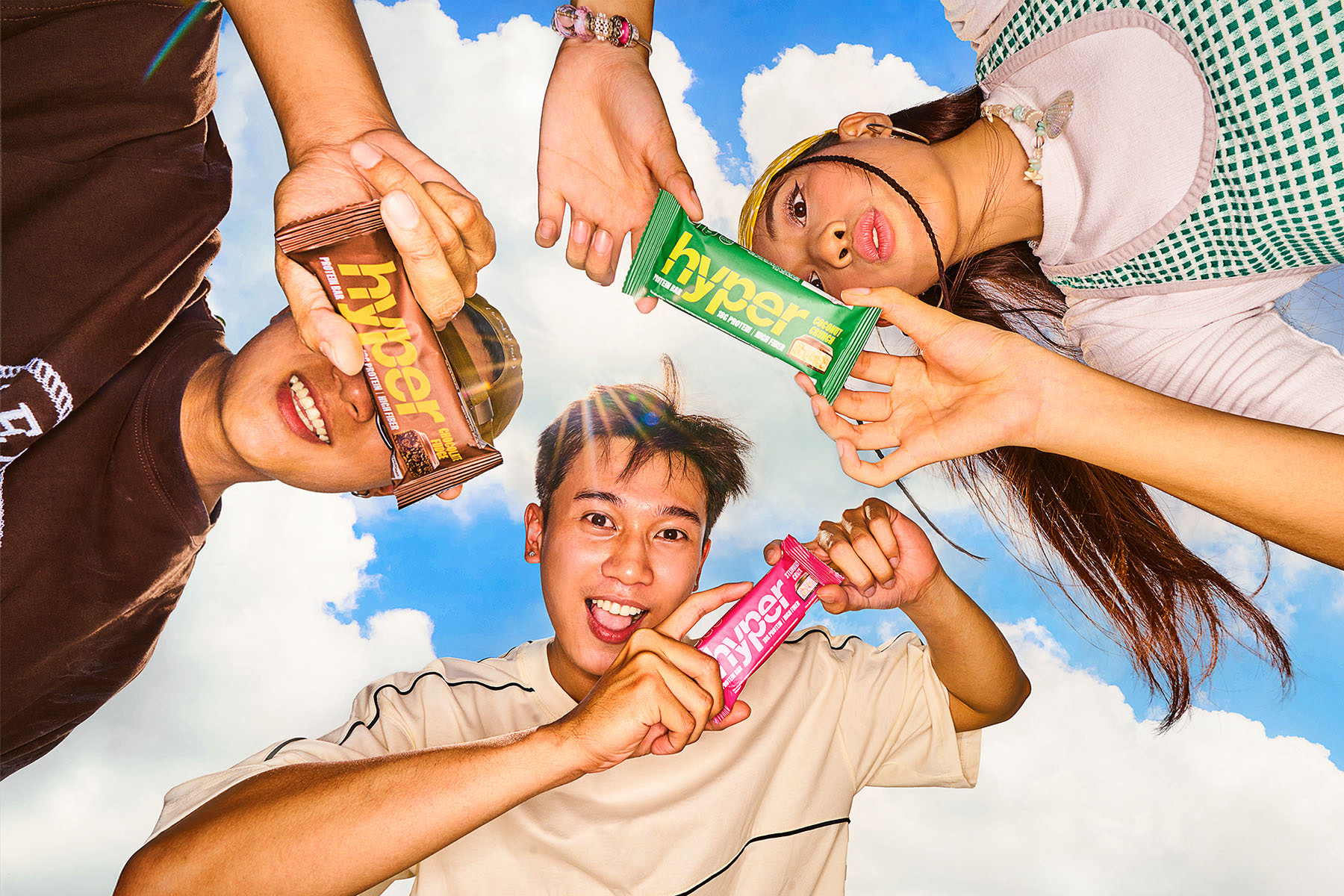
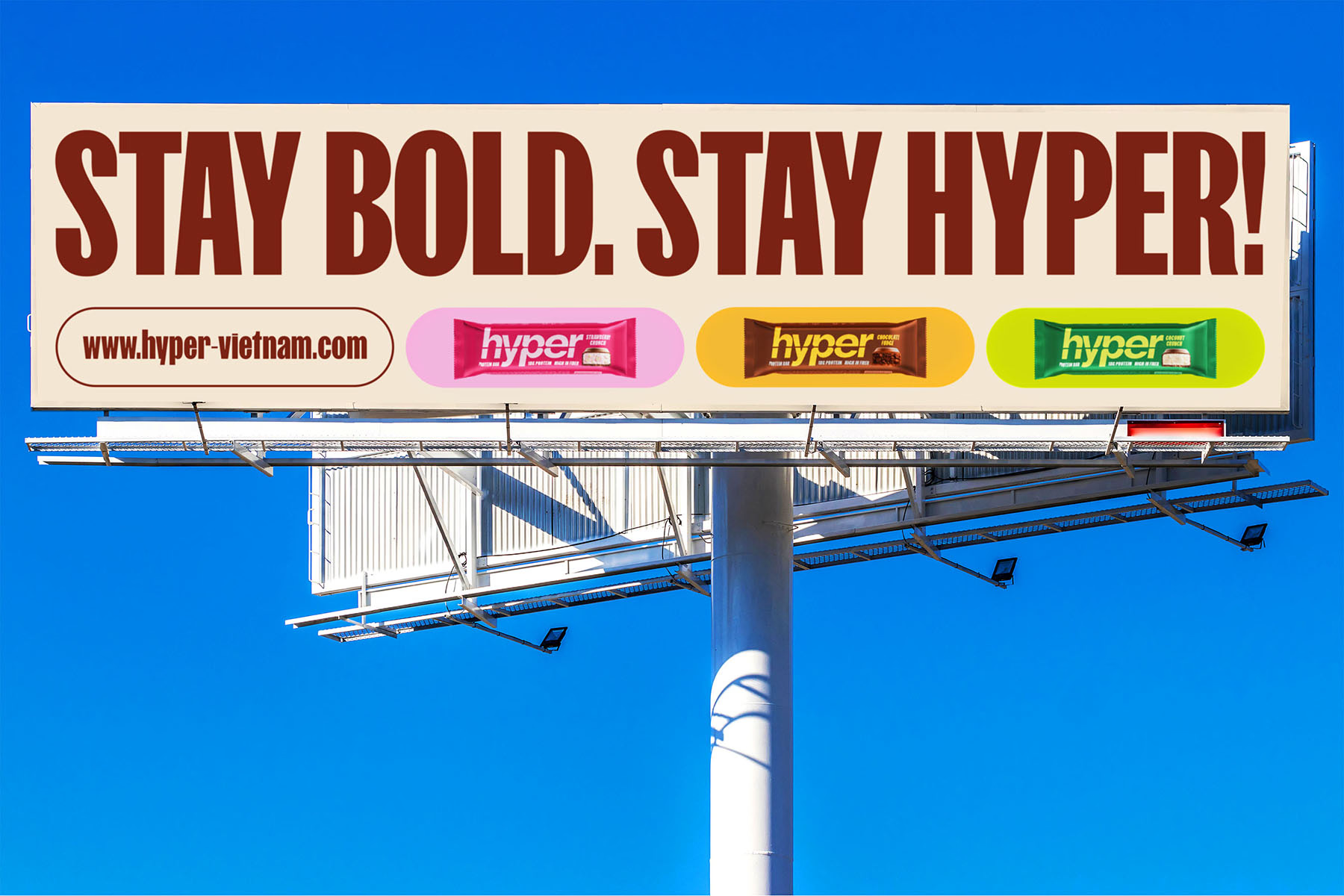
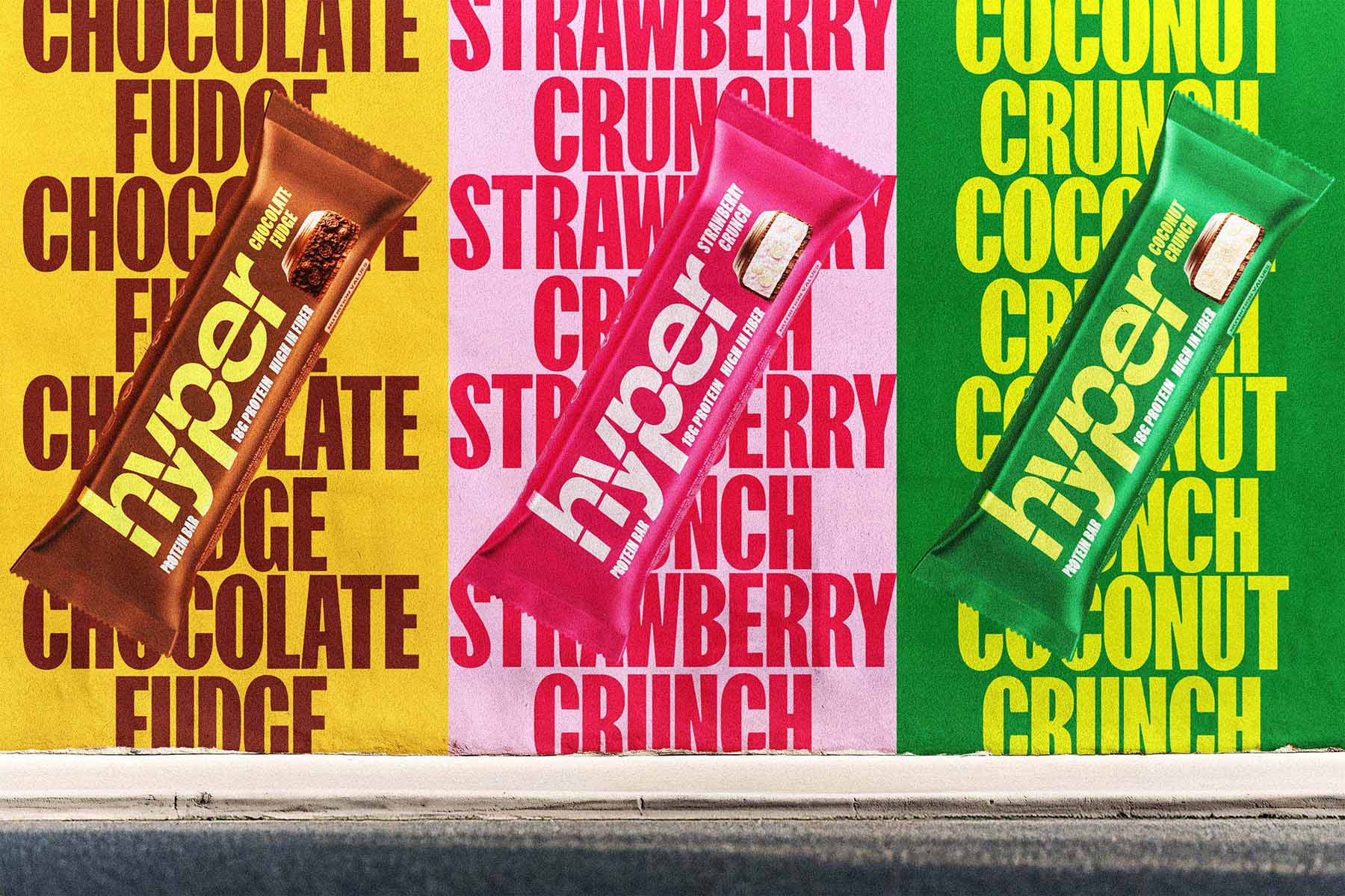
Hyper’s color palette is a bold celebration of flavor—each shade thoughtfully curated to evoke the energetic burst of taste in every bar. It begins with two signature tones: Hyper Brown grounds the brand with richness and depth, echoing the satisfying indulgence of a well-earned treat, while Creamy White brings balance, softness, and approachability—adding a clean, modern brightness that lets every other hue shine. Building on this foundation, each flavor takes on its own bold expression: Strawberry Crunch comes alive through playful shades of pink, Coconut Crunch refreshes with vivid greens, and Chocolate Fudge blends velvety brown with a hit of golden yellow. More than just eye-catching, these colors create instant recognition and flavor association, transforming each bar into a beacon of vitality on the shelf. The colors do more than distinguish—they express.
Over, Above, Beyond
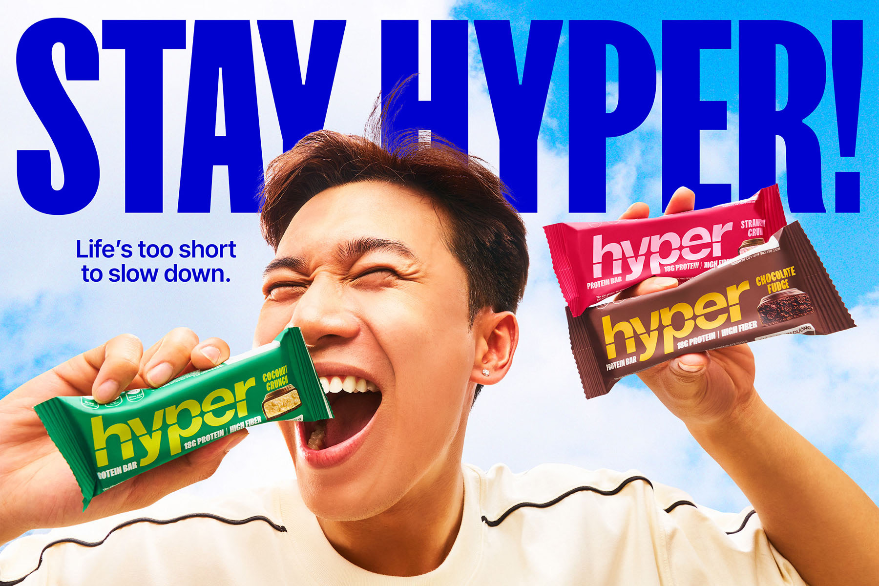
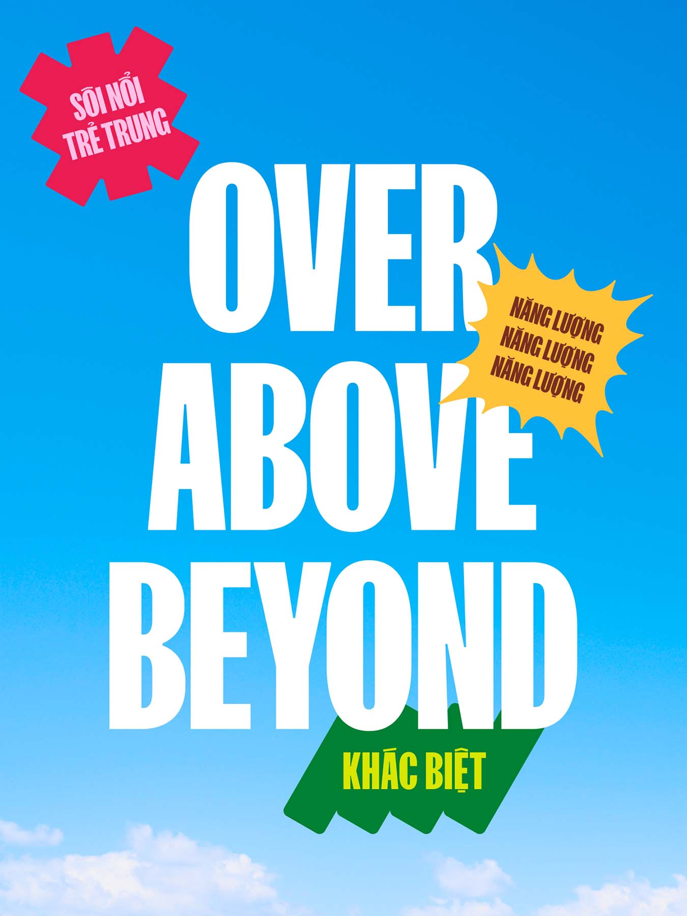
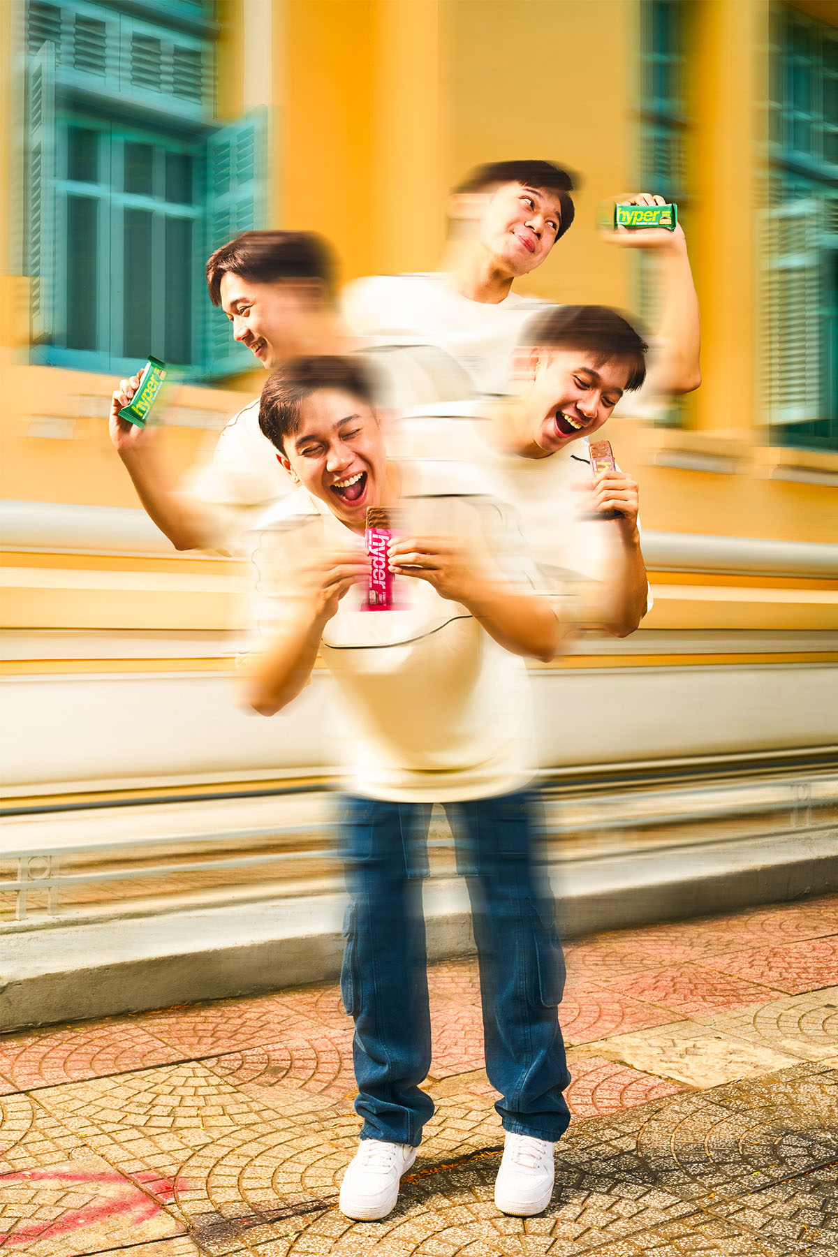
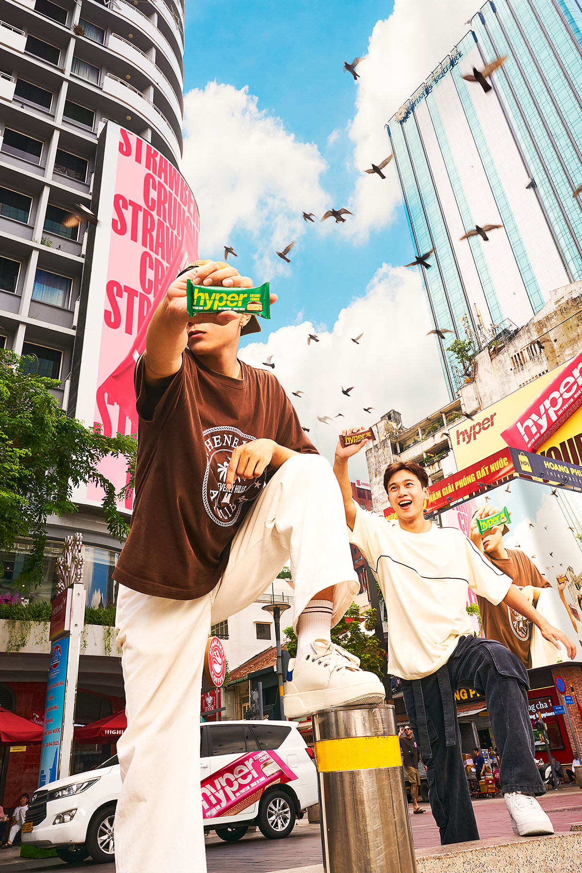
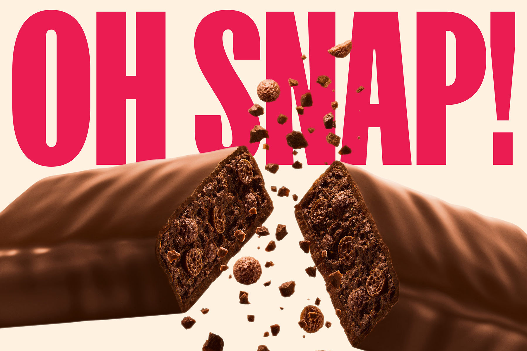
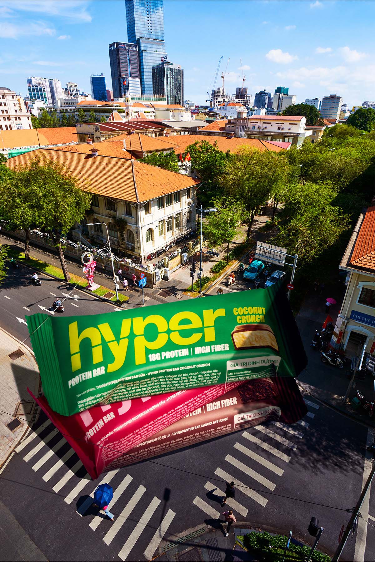
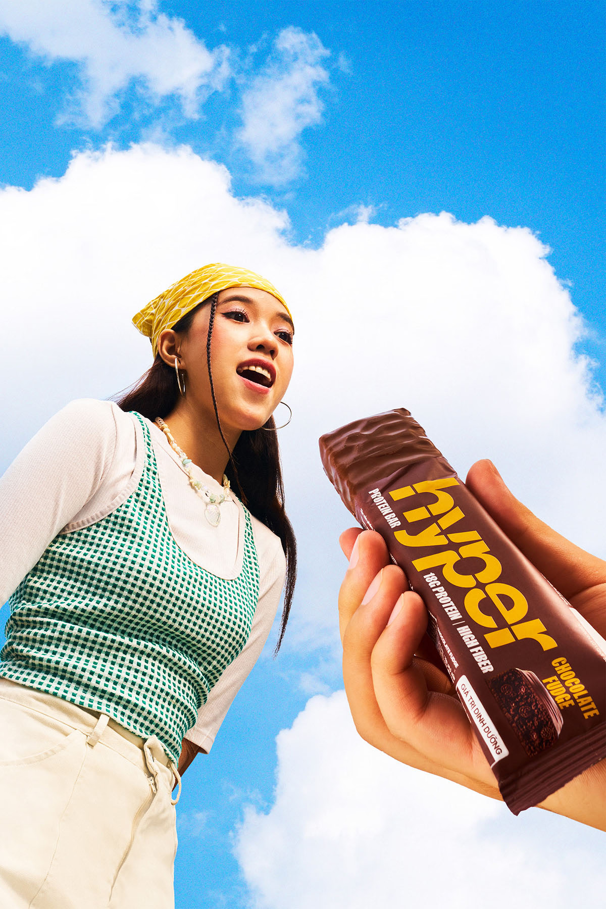
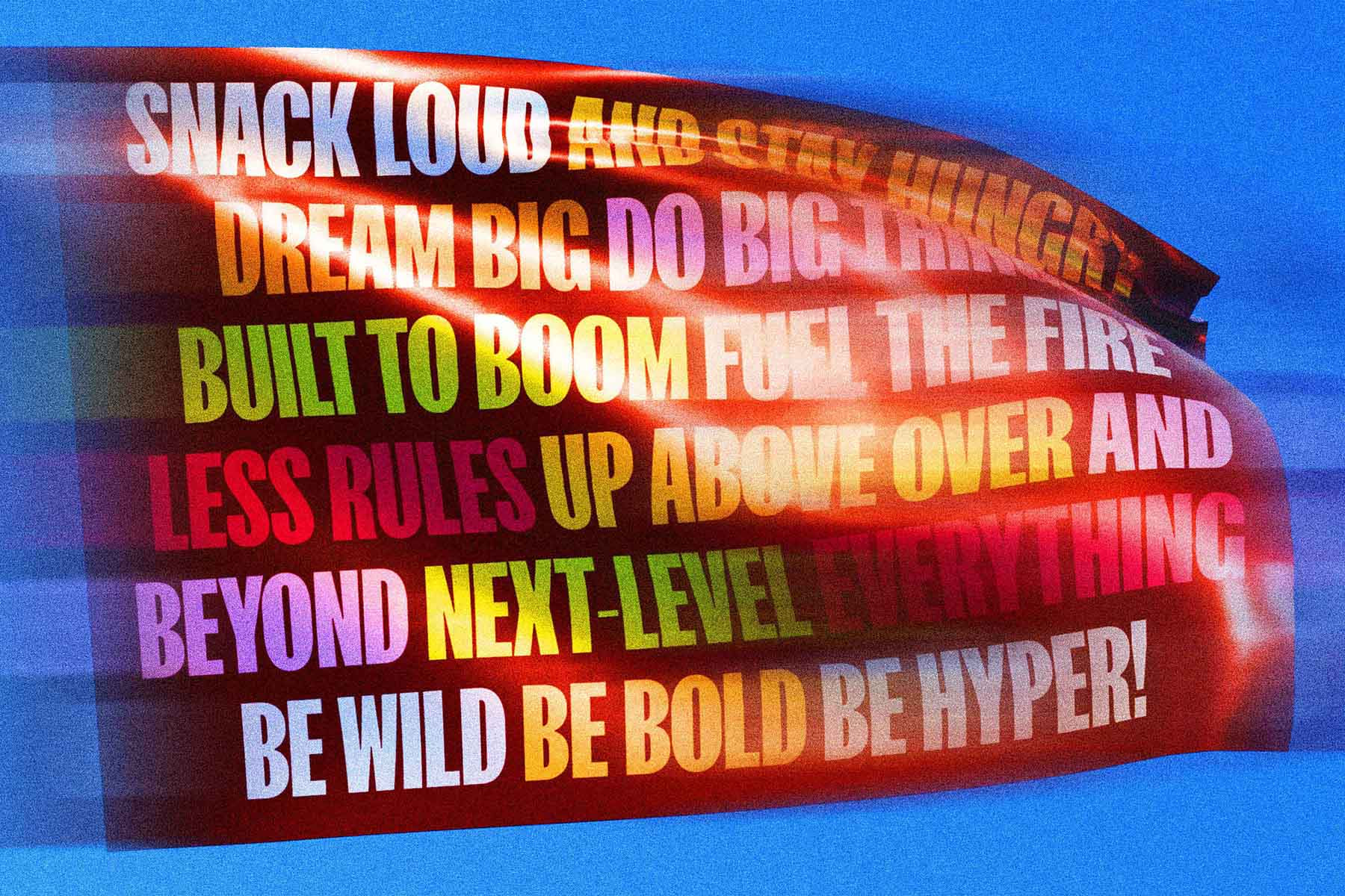
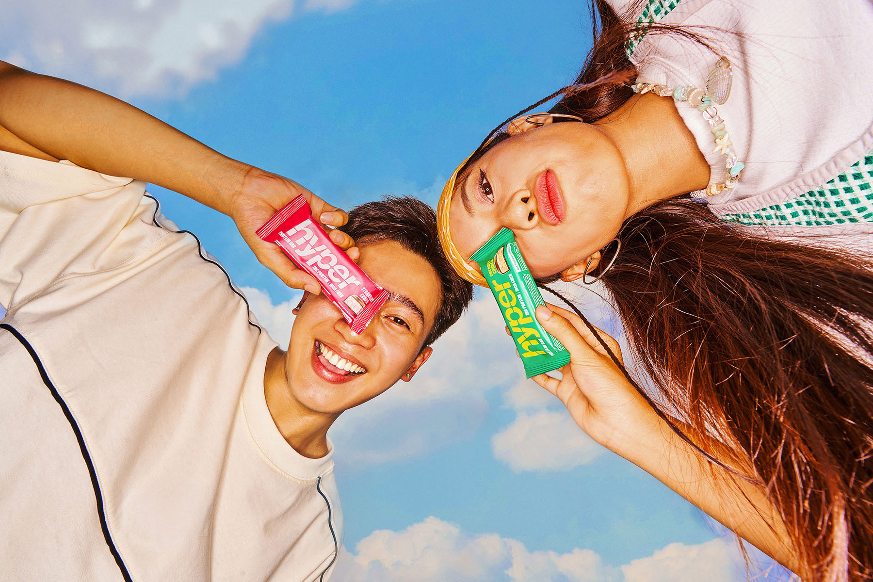
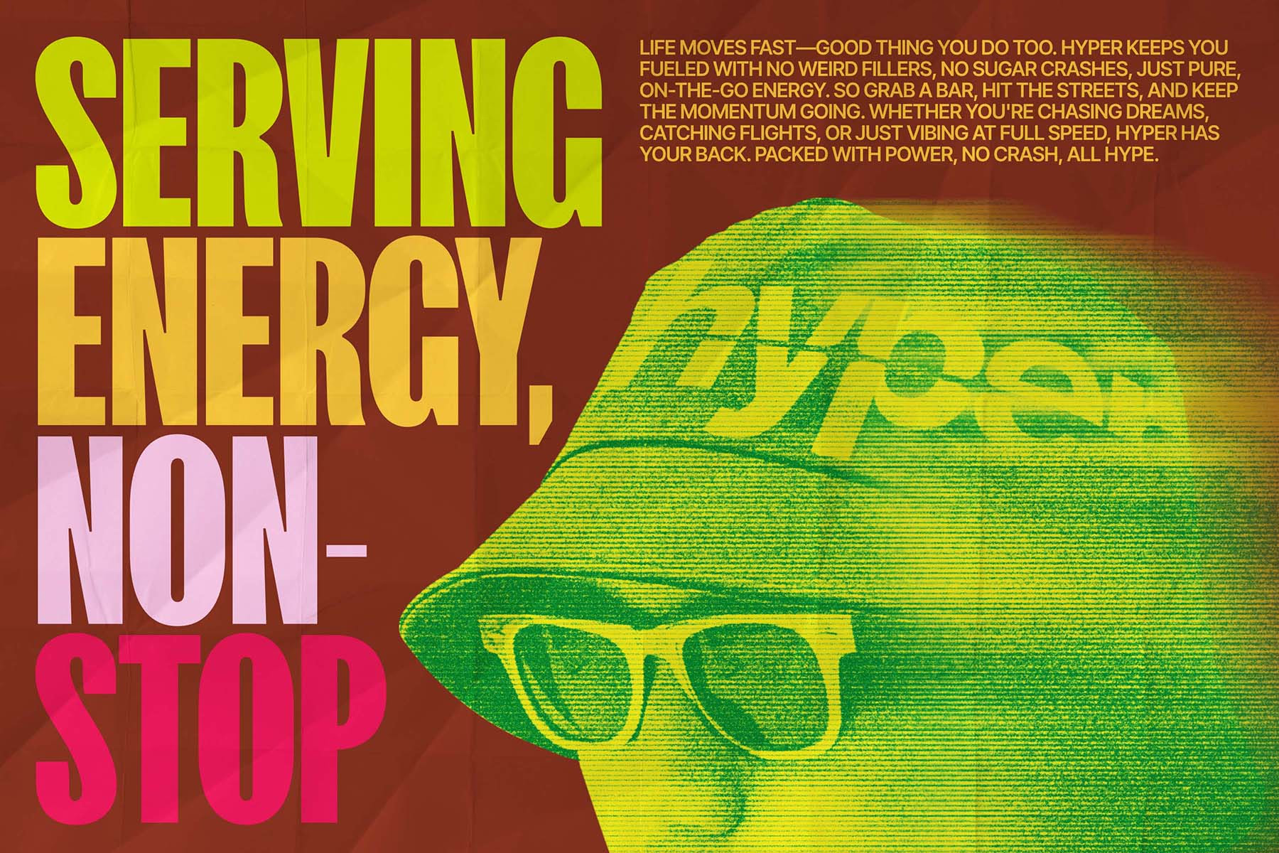
The visual direction for Hyper is a bold, kinetic celebration of unstoppable energy—vibrant, relentless, and alive—embodying the spirit of a hyper-active young individual who constantly pushes beyond limits. Through dynamic, high-contrast lifestyle photography, playful 3D concepts, and striking, vibrant communication design, every element pulses with motion and intensity, transforming the visual narrative into an experience that transcends the flat and static. This visual language embodies the essence of “Over, Above, Beyond,” challenging the ordinary and demanding attention at every turn. With every creative choice, Hyper reflects a boundless drive—never settling, always pushing further—becoming a powerful manifesto for those who live fast, move hard, and crave every ounce of life’s energy.
