Client
be:yondflair
Sector
Fashion & Beauty
Discipline
Brand identity
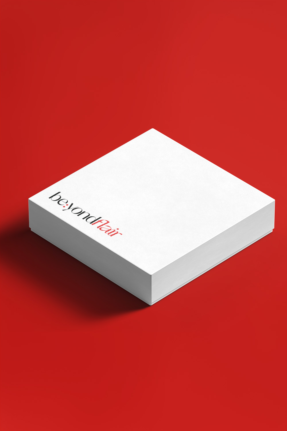
Packaging
Project team
Lam Na Ny
Tri Nguyen
Tien Bui
Duc Quy
Khoa Huynh
Production team
Canh Tuan Ho
Hang Pham
Nguyen Cong Phuong Mai
Thanh Hoa Truong
Khoi Huy
Phuong Anh
Bobbi Nguyen
Challenge
be:yondflair emerged from a vision inspired by the allure of London, the chic essence of Paris, and the lively charisma of Seoul. This brand, designed by and for women, aimed to offer a distinct experience. Their objective was crystal clear: empower women to embrace confidence and beauty within their unique skin. To embark on this journey, be:yondflair collaborated with xolve to craft a brand identity that transcends mere fashion, redefining it as a lifestyle statement. The challenge lay in infusing sophistication into the identity, steering away from fast-fashion while preserving accessibility.
Solution
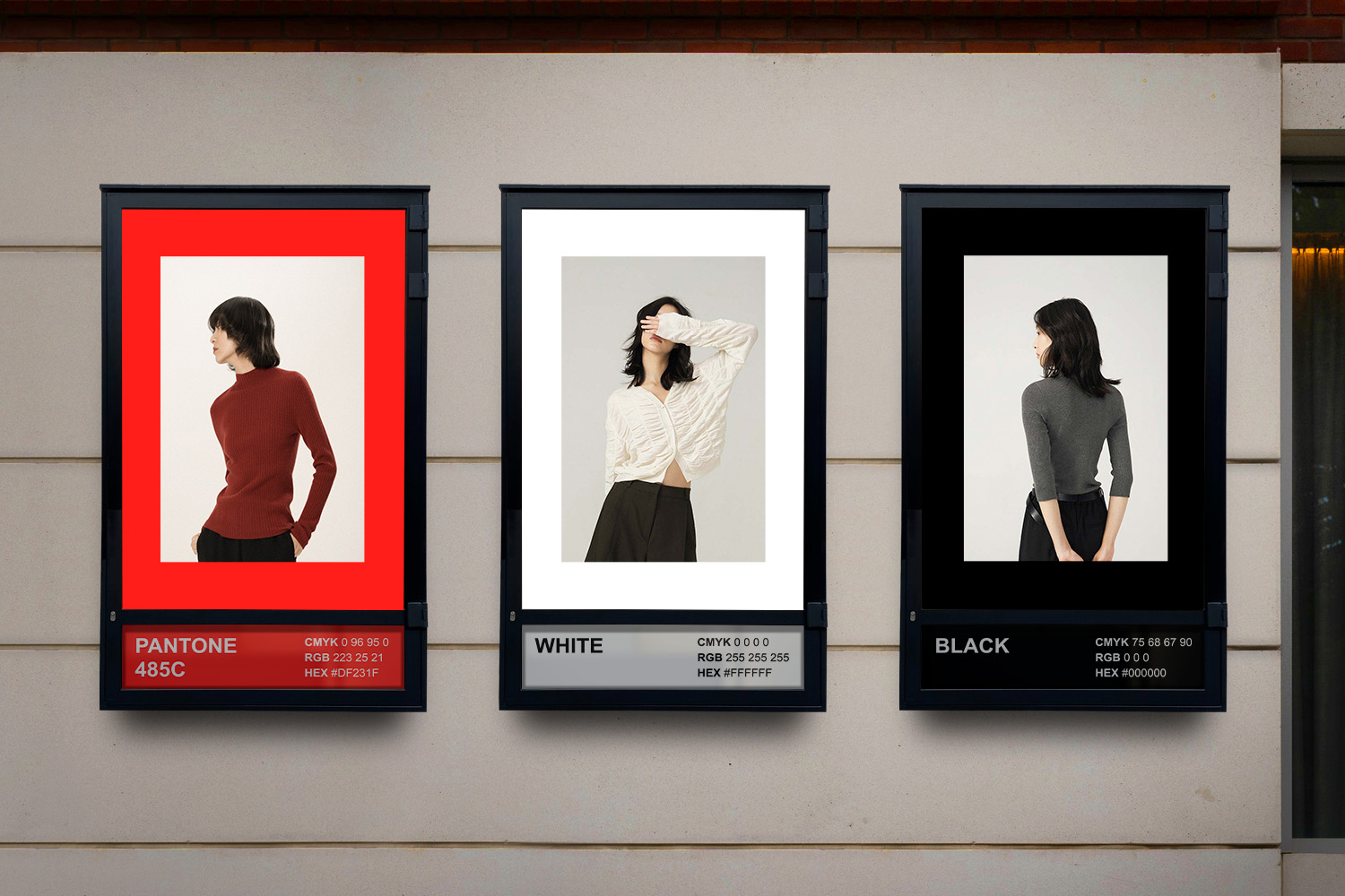
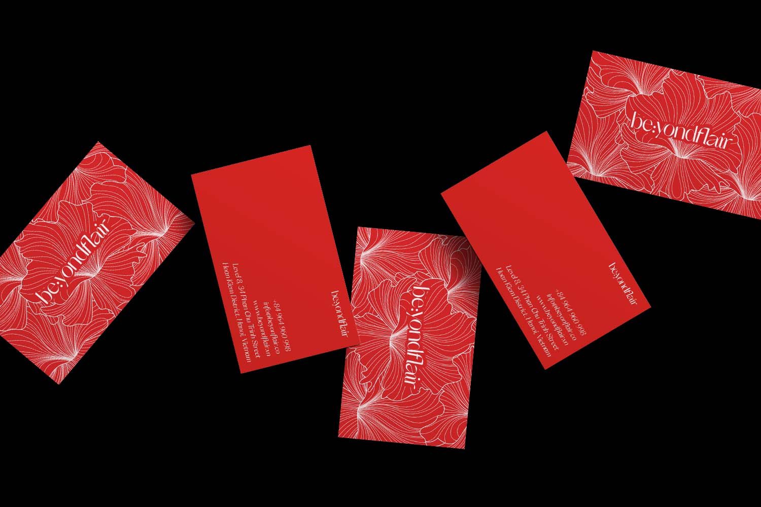
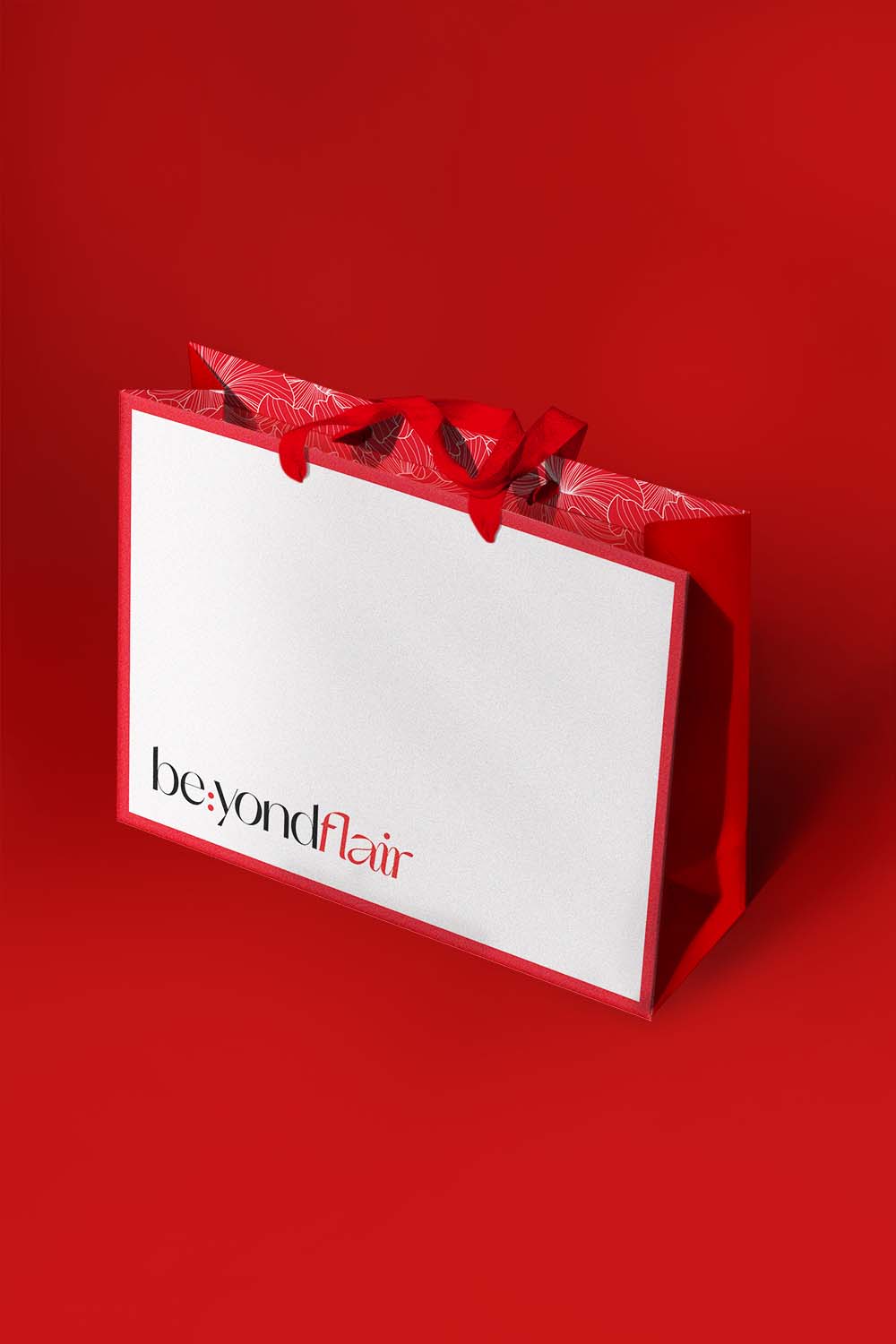
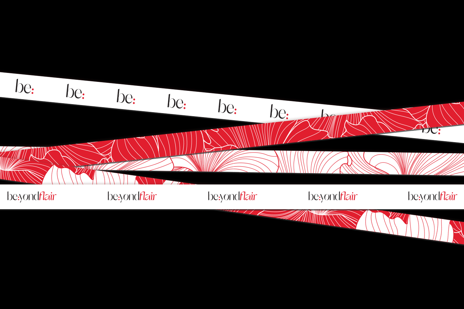
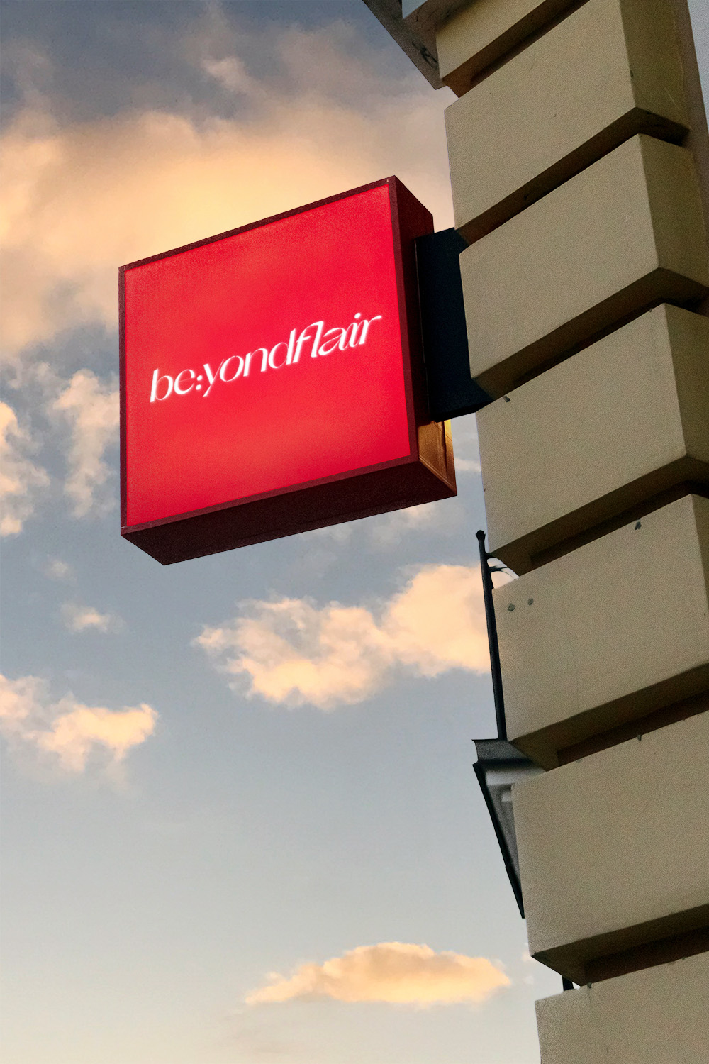
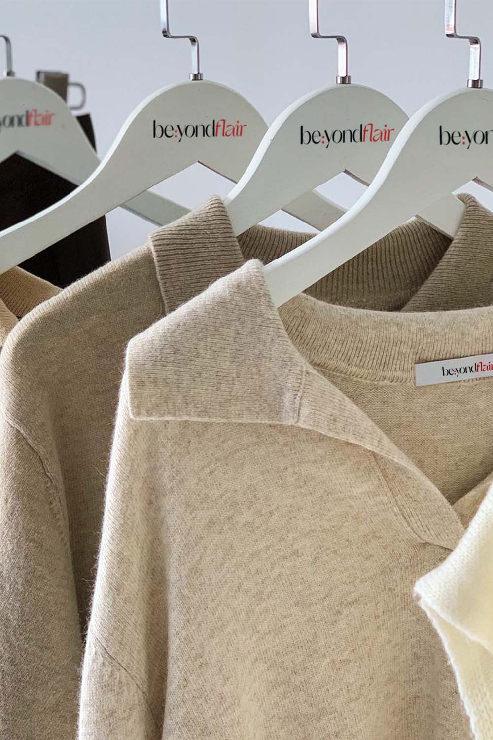
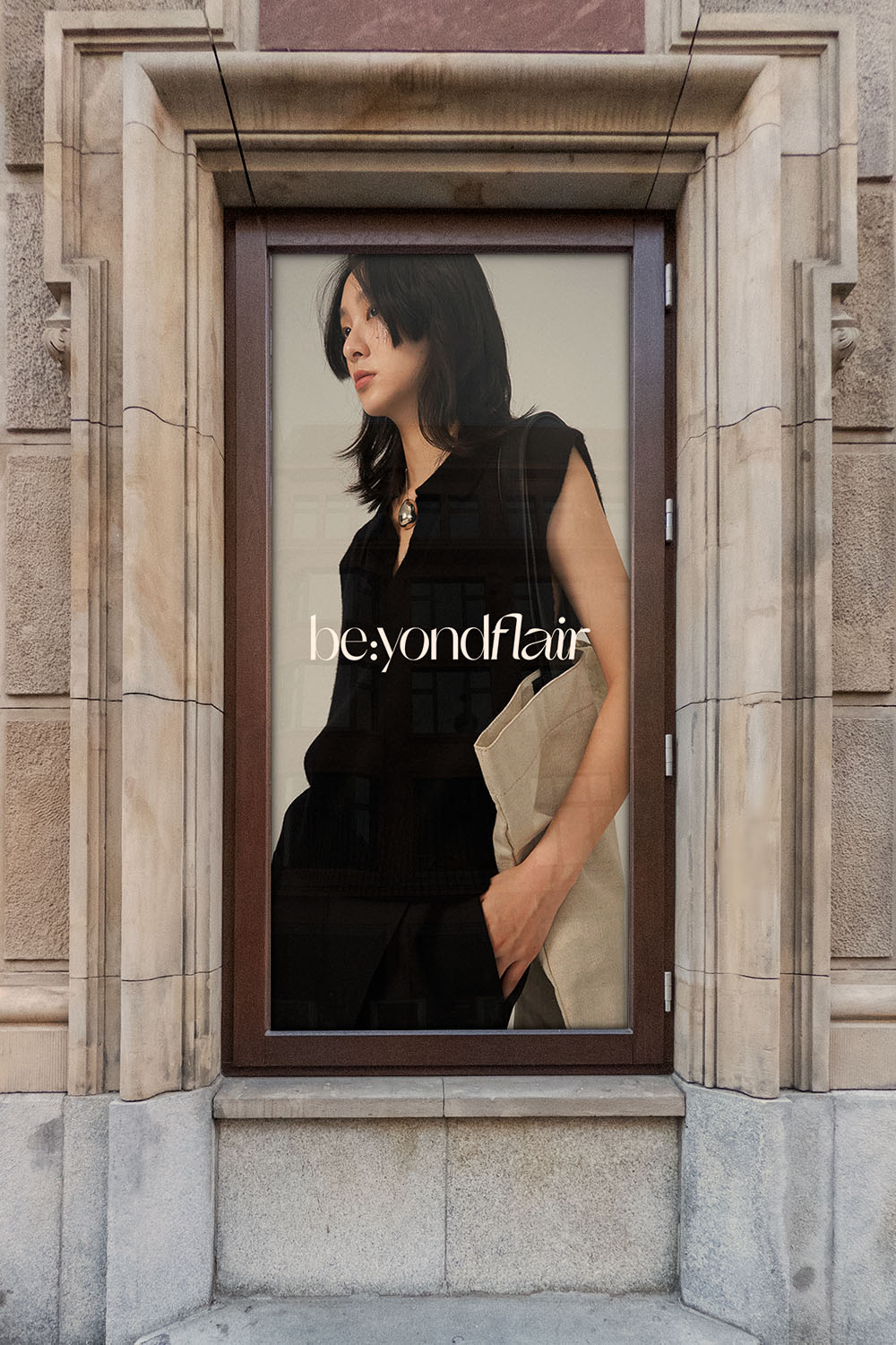
xolve embarked on a creative journey to fashion a brand that mirrors a lifestyle, not just apparel. The mission of be:yondflair resonated with the vision of celebrating individuality through fashion and lifestyle aesthetics. This philosophy guided the design process, where every element was meticulously chosen. The color scheme, a classic trio of red, black, and white, invoked timeless elegance and modern simplicity.
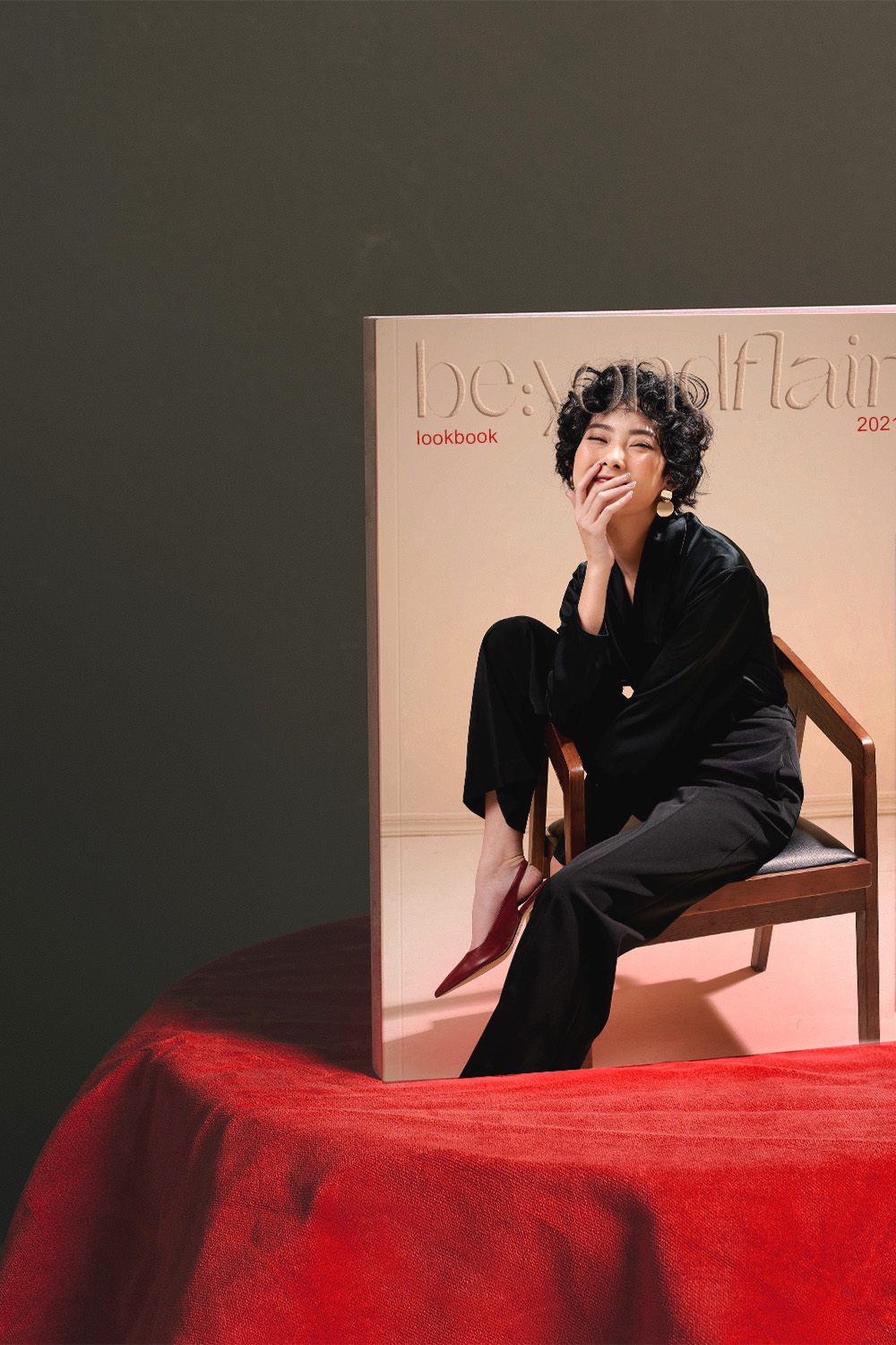
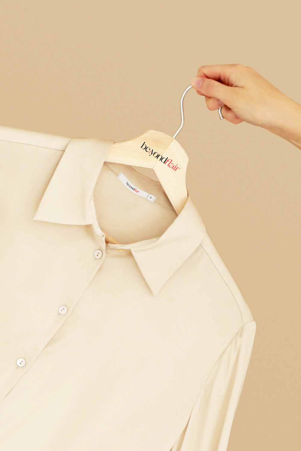
The brand name, punctuated by a colon, symbolized the liberation of women from limiting definitions, encouraging them to ‘be’ whatever they aspire to. Custom wordmarks and flowing ligatures were carefully crafted to exude sophistication effortlessly, complementing the minimalist essence of Orelo, the primary font chosen for its soft, graceful touch.
Result
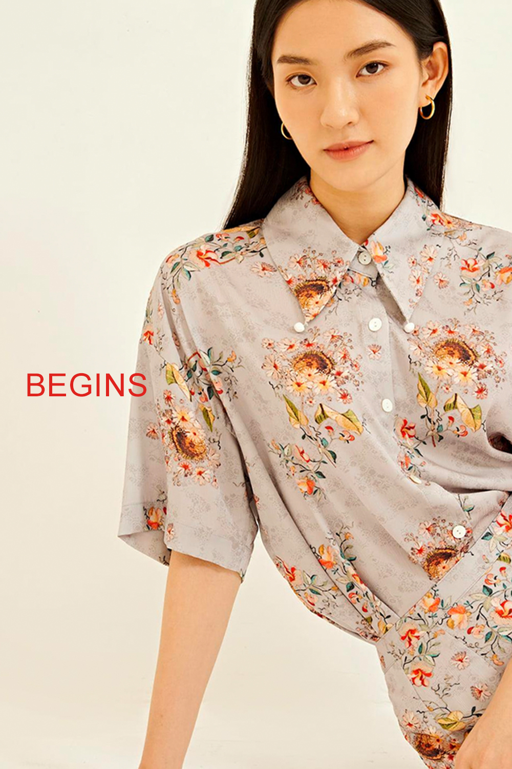
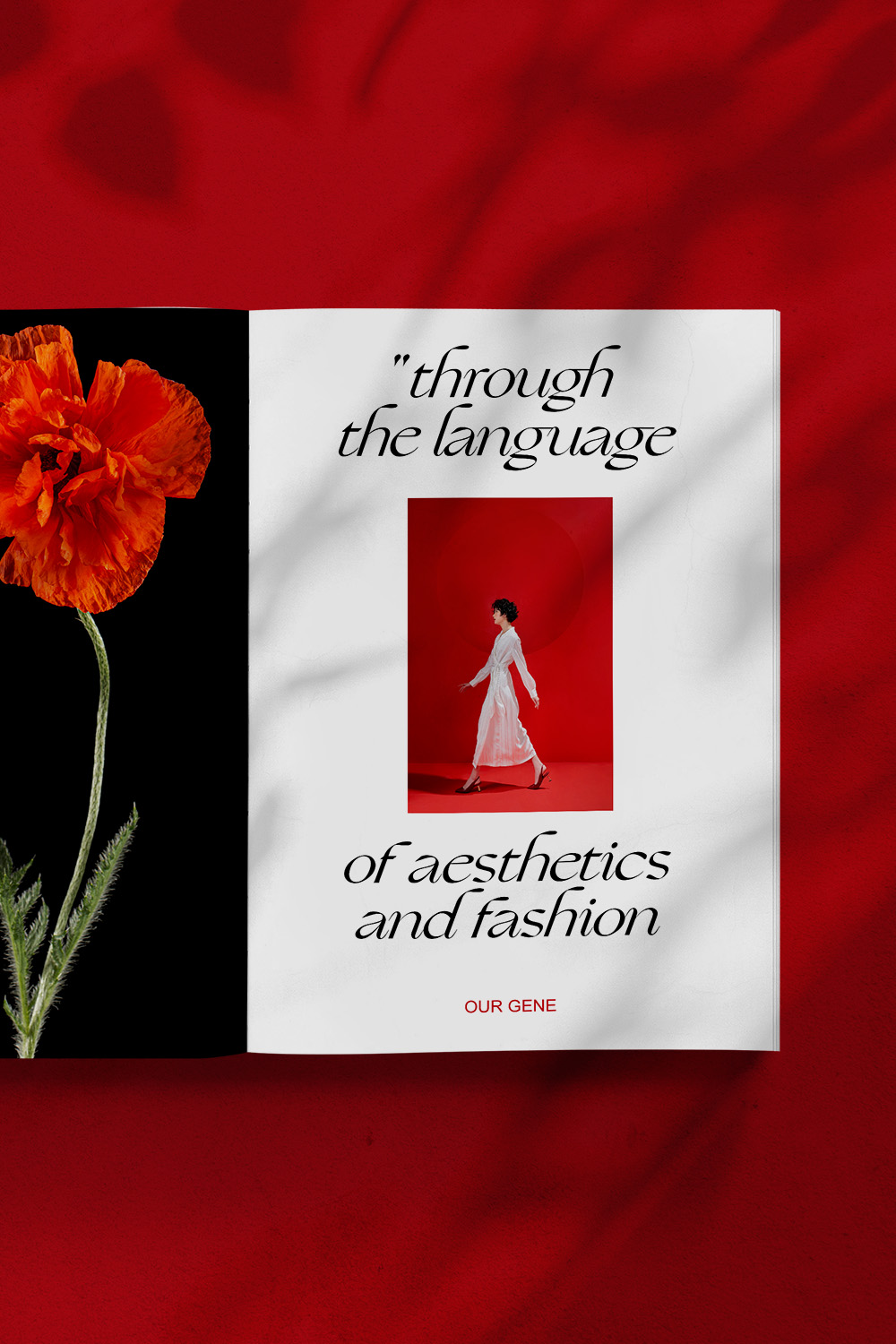
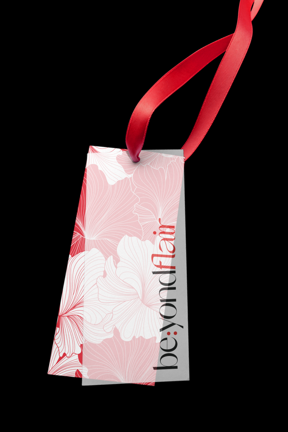
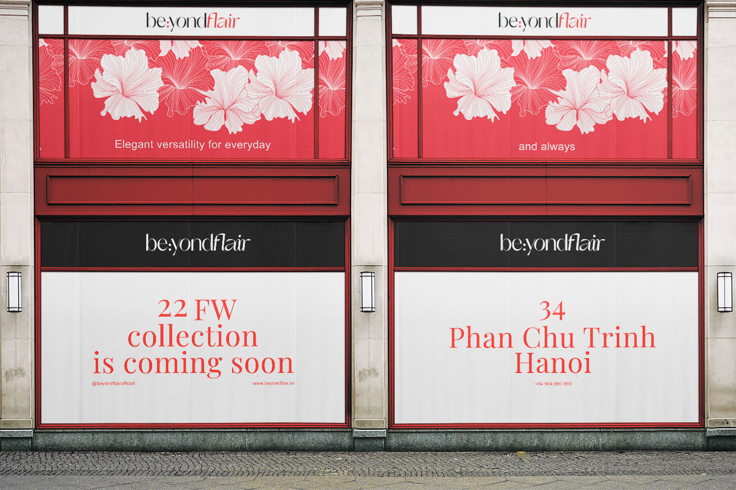
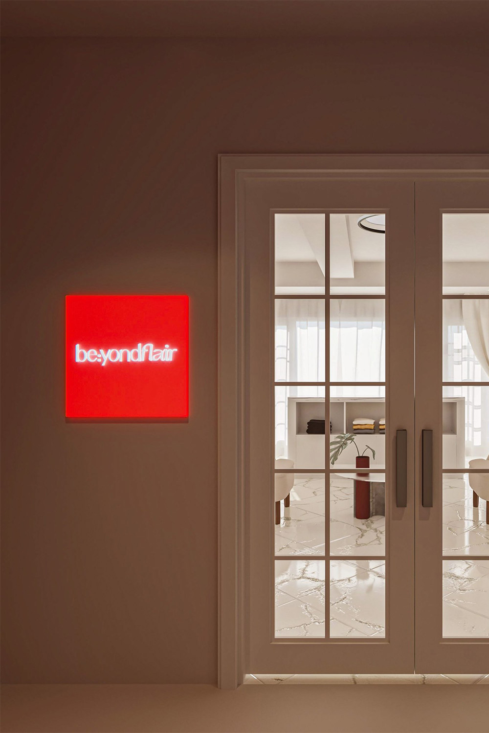
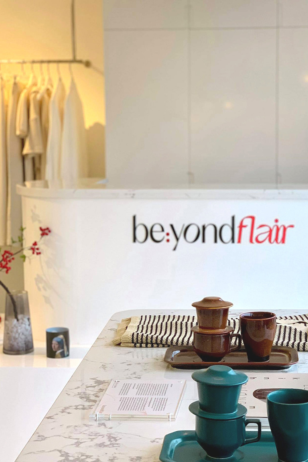
The result of this collaboration birthed an expressive yet minimalist brand identity. The fusion of be:yondflair’s logo with floral graphics depicted blossoming elegance, elegantly enhancing the brand’s message. This vibrant logo, animated to signify the brand’s ‘blossoming’ essence, encapsulates elegance and femininity. Launched in 2021, be:yondflair embarked on its aesthetic journey, aiming to weave narratives into daily lives. Their concept store in Hanoi signifies their commitment to self-discovery, knowledge sharing, and empowerment, which epitomizes the essence of be:yondflair.
