Client
Westway
Sector
Healthcare
Discipline
Brand identity
Packaging
Project team
Lam Na Ny
Tri Nguyen
Khoa Huynh
Challenge
Westway, a new high-end international dental clinic in Ho Chi Minh City, sought to establish itself as a premier destination for Western tourists and expatriates. The clinic’s founders, having already achieved success with another dental practice, aimed to create a brand identity that would not only resonate with their target audience but also convey a sense of luxury, professionalism, and trust.
Solution
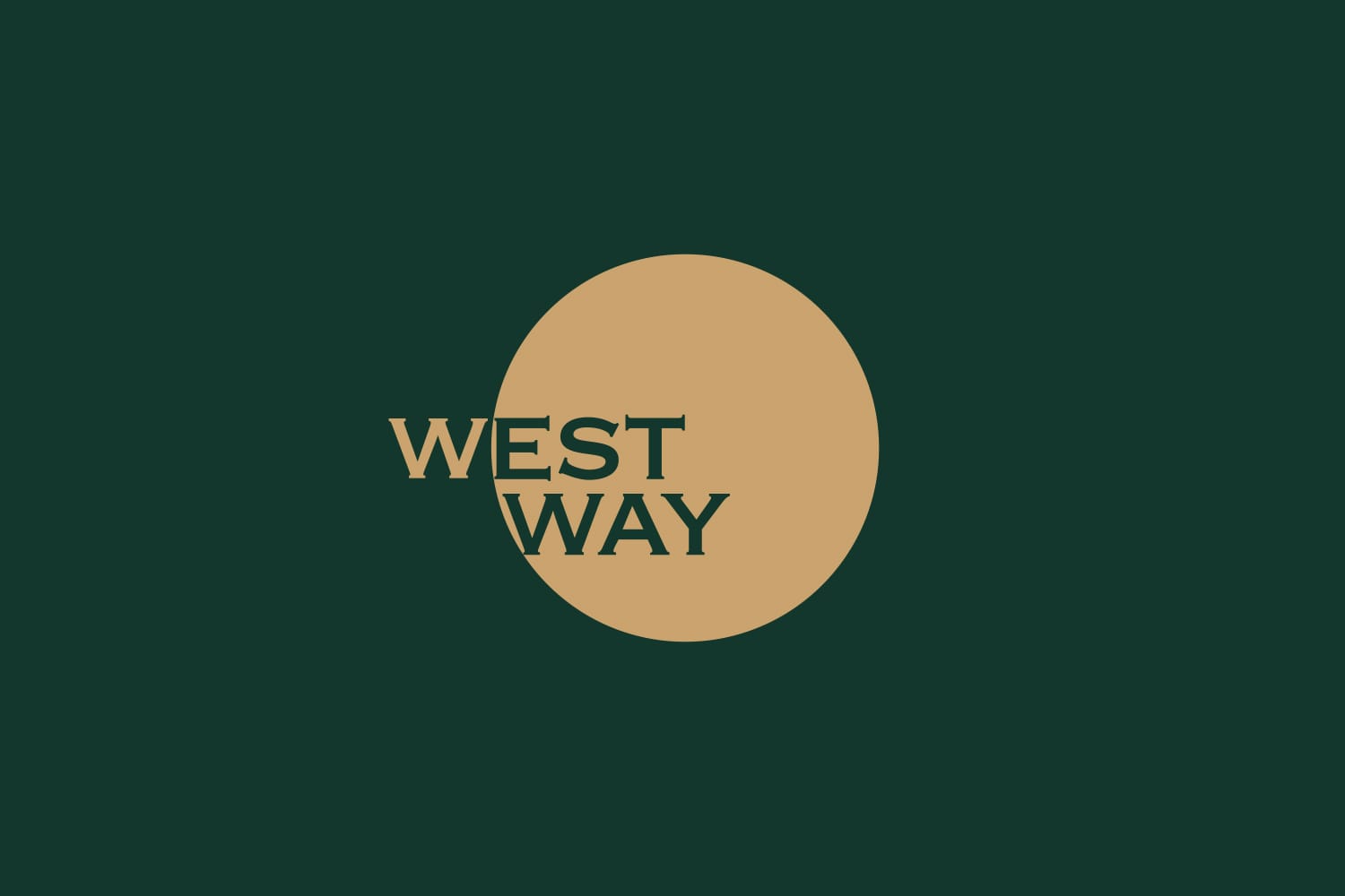
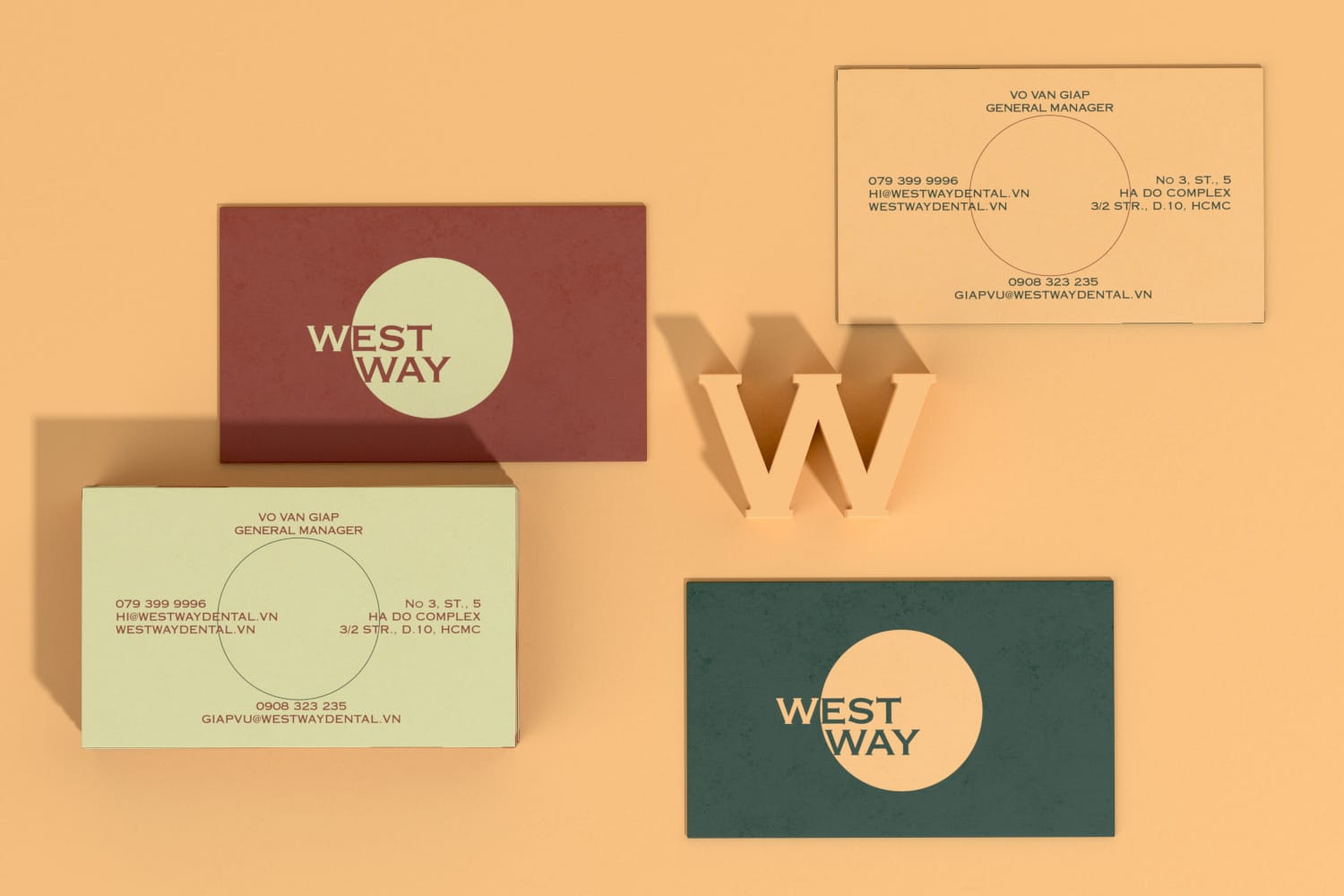
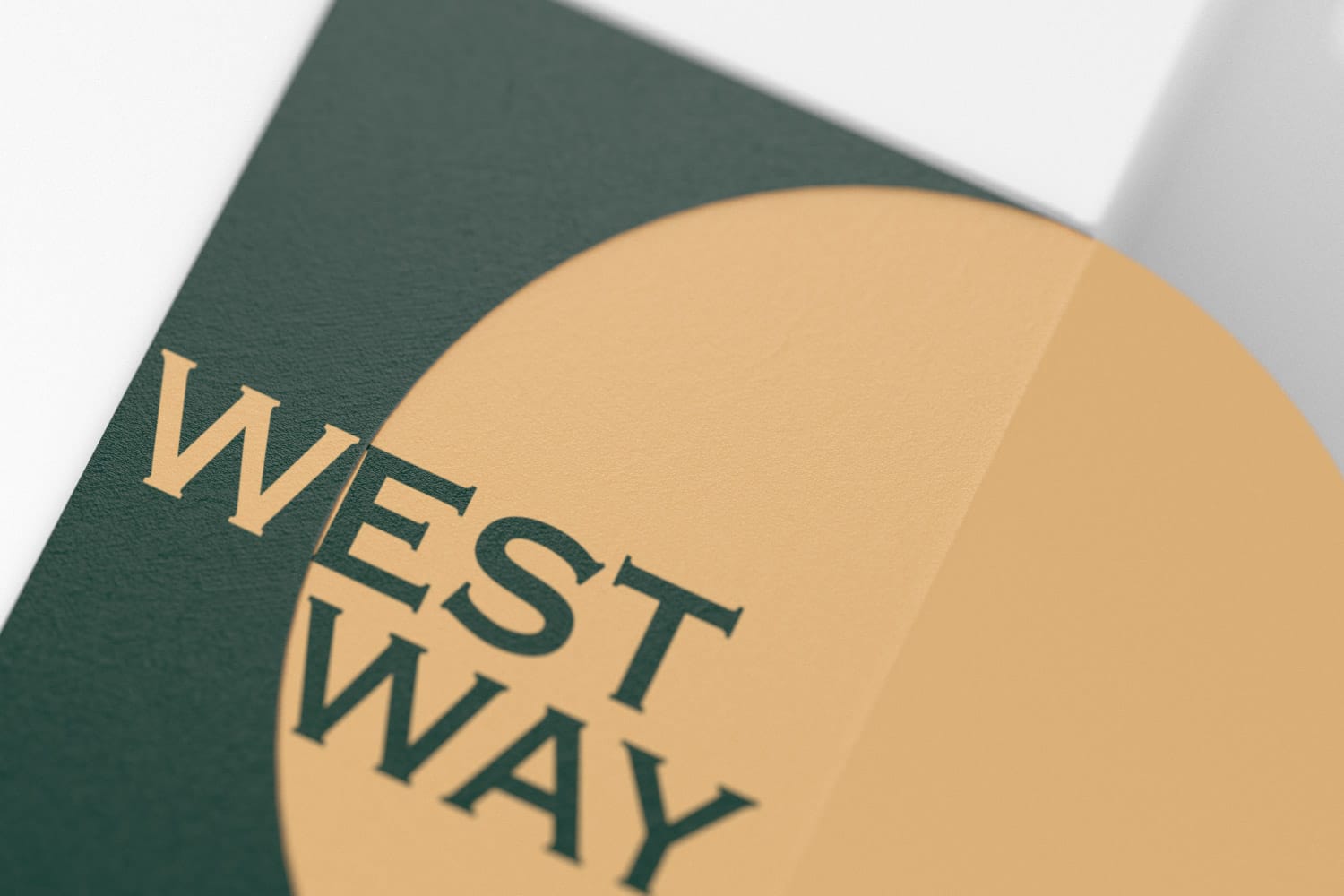
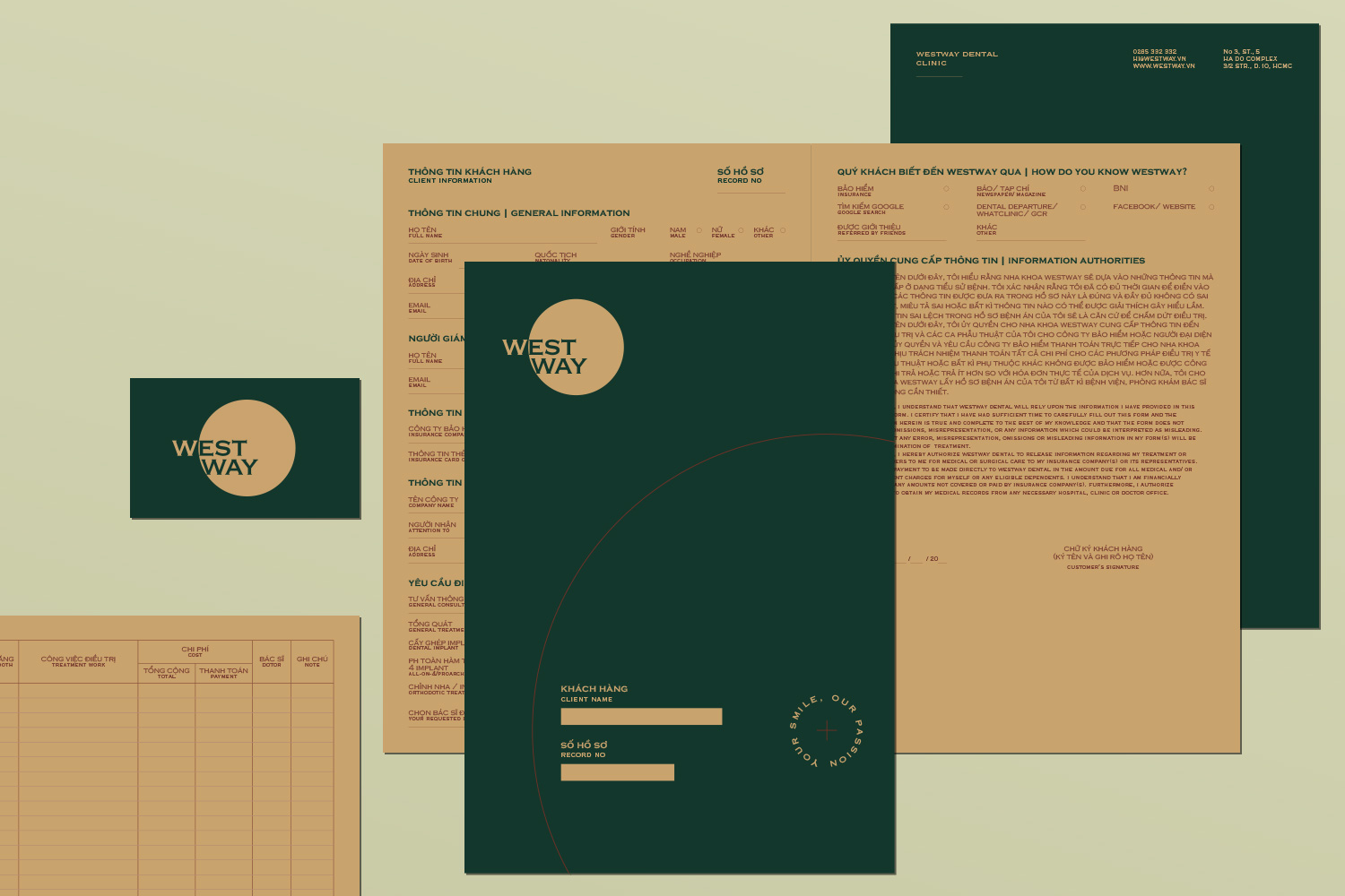
xolve partnered with Westway from the outset to develop a comprehensive visual identity that would set the clinic apart. The design team crafted a logo centered around the concept of a circle, representing the sun – a powerful symbol associated with the West (“the sun sets in the west”) and health (vitality). The logo’s circular form also draws inspiration from a compass, with the letter “W” strategically positioned in the West direction.
The logotype, set in the elegant Copperplate typeface, evokes a sense of tradition and craftsmanship. Its design, reminiscent of stone carving and copperplate engraving, adds a touch of sophistication and historical gravitas to the brand.
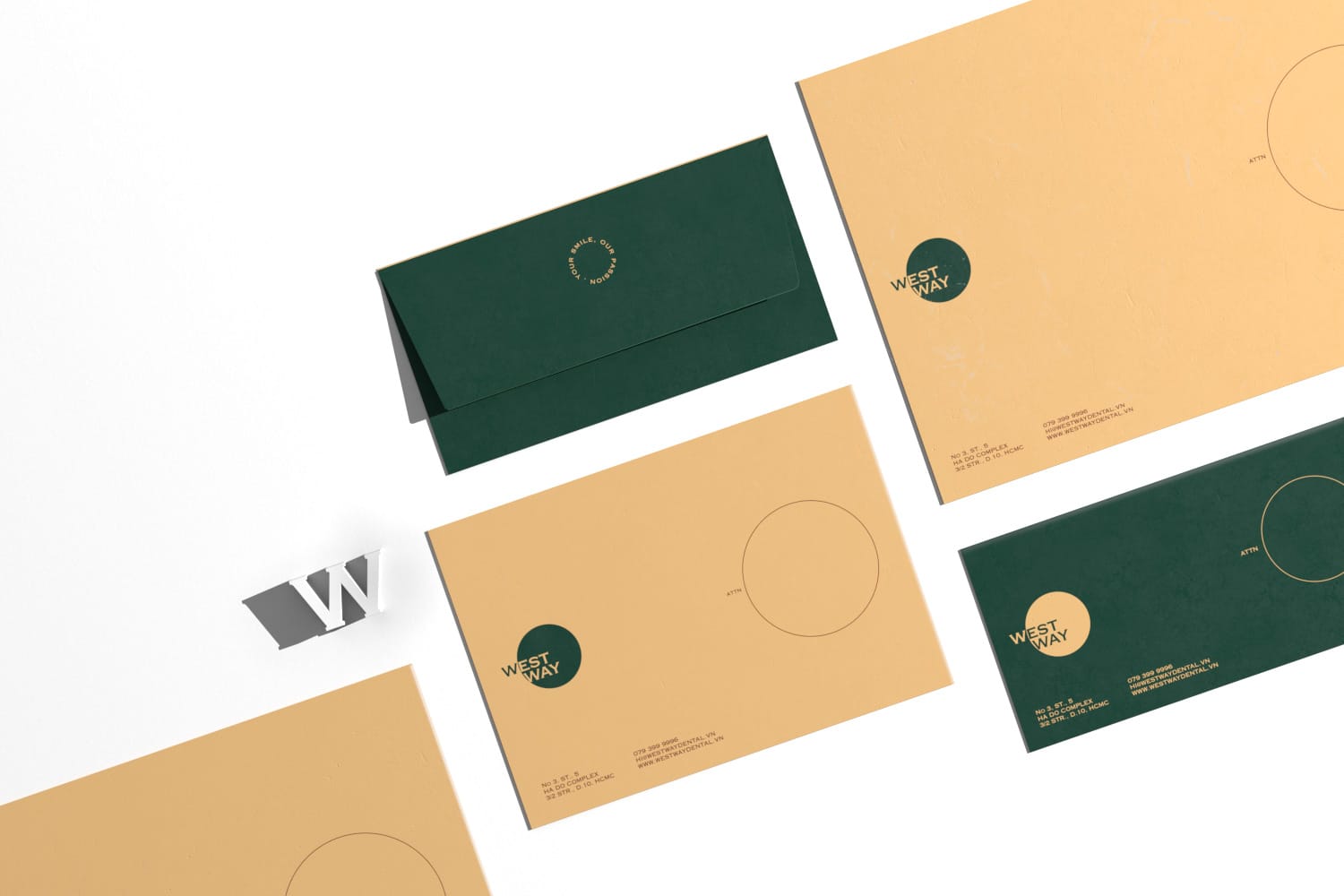
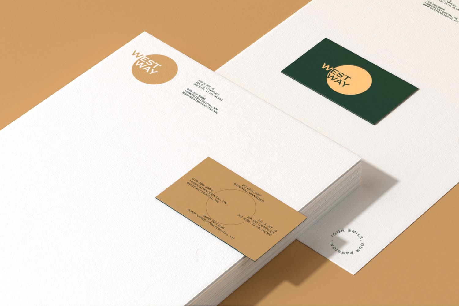
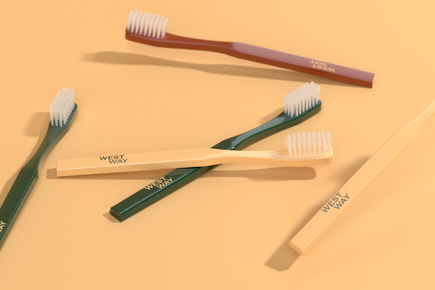
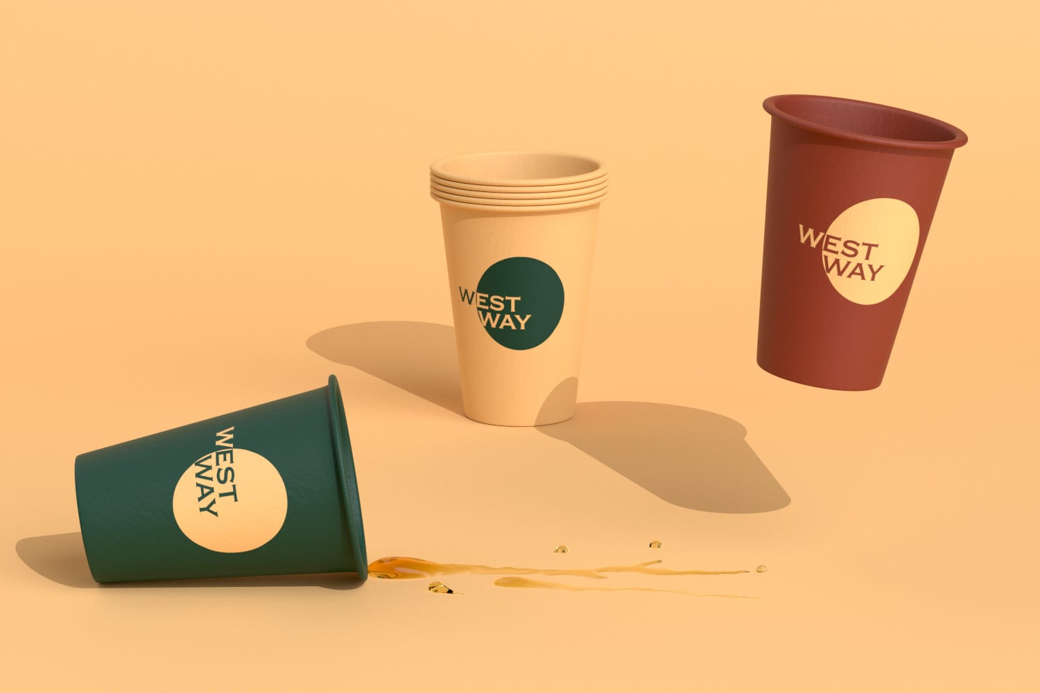
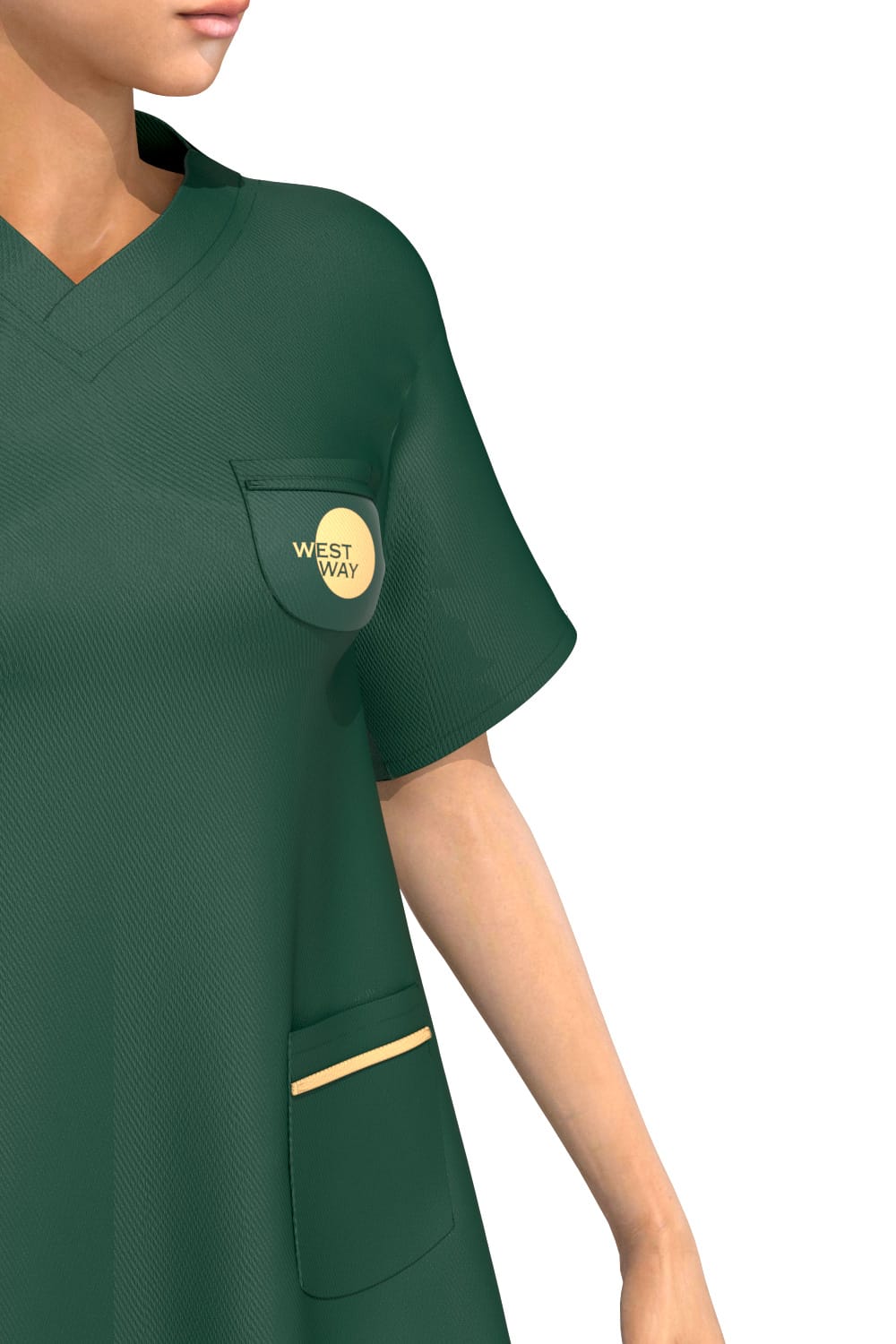
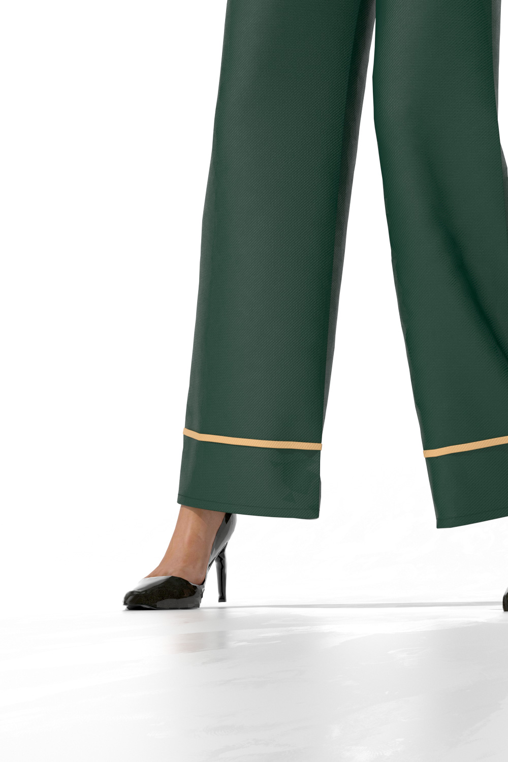
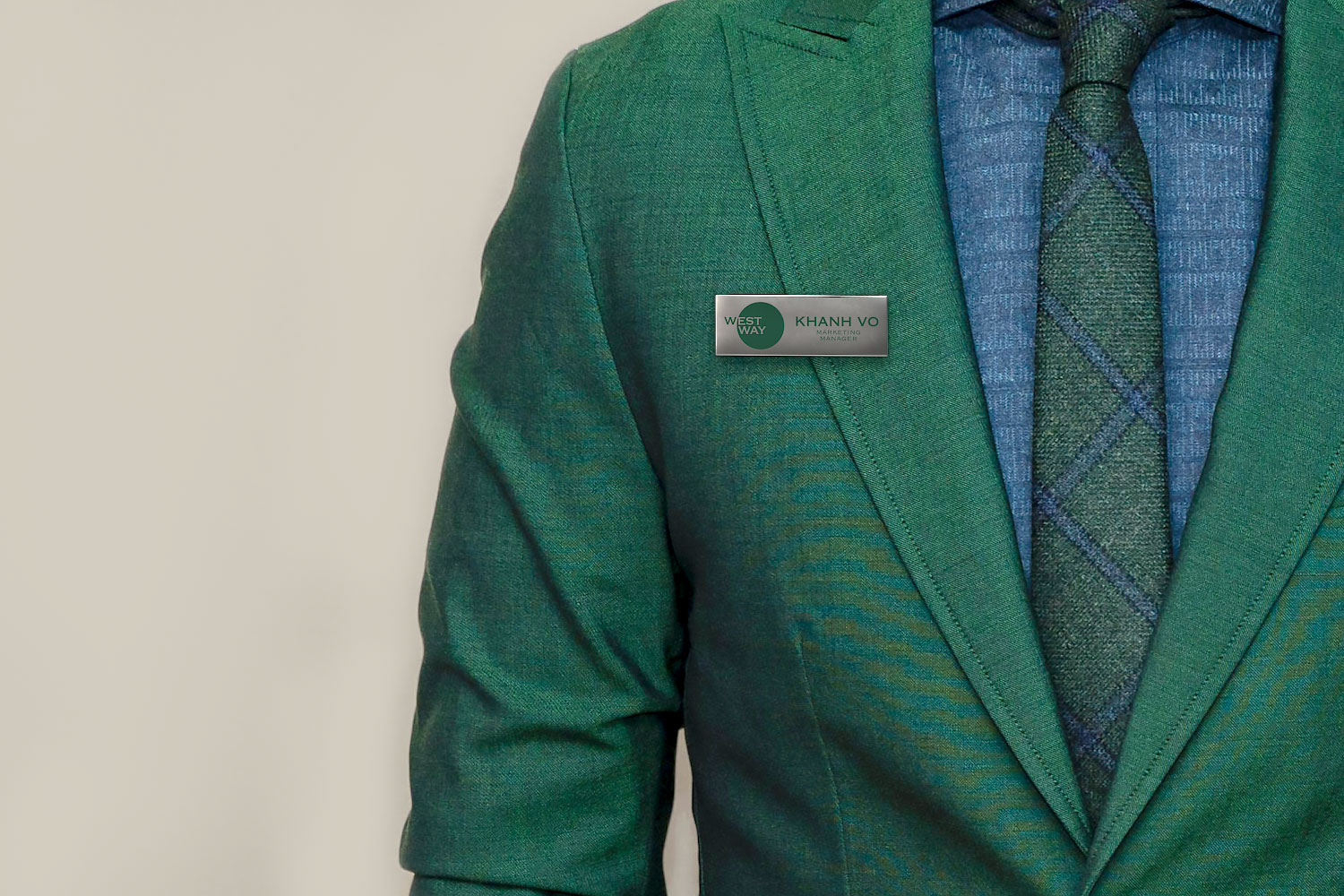
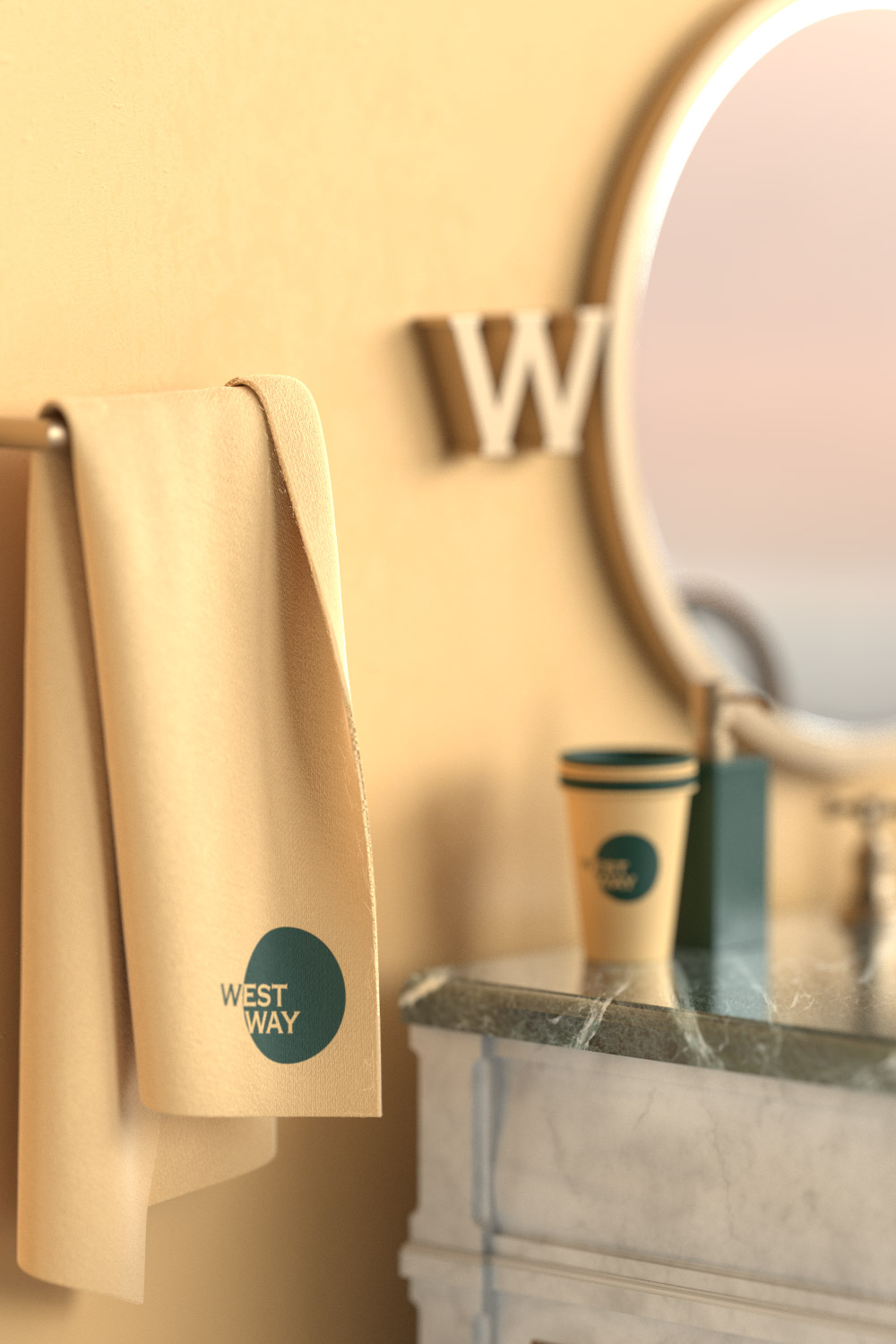
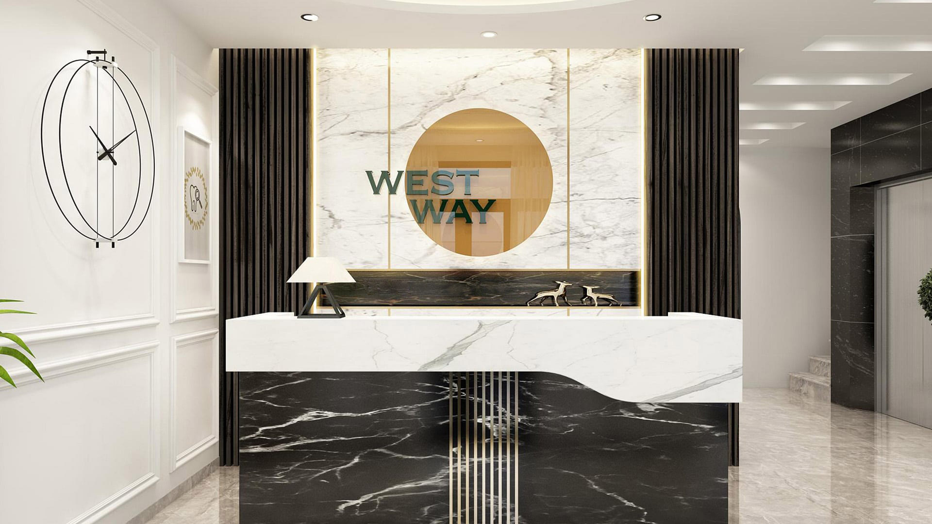
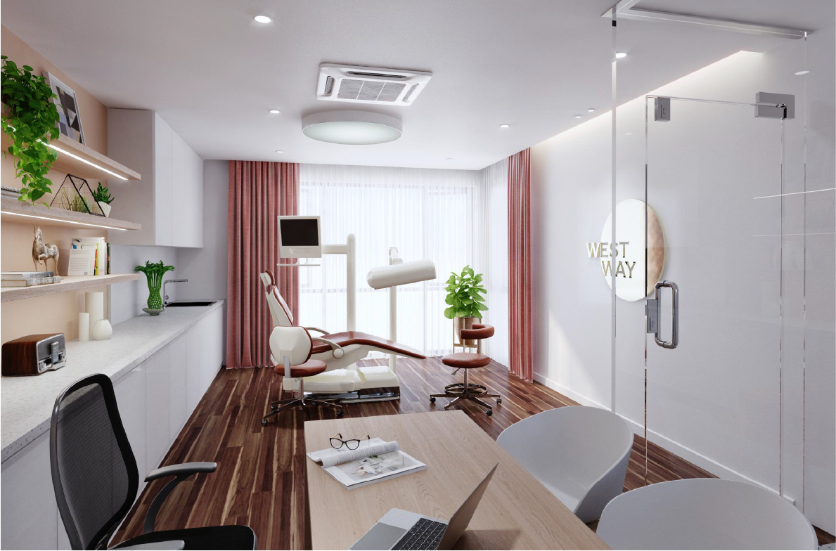
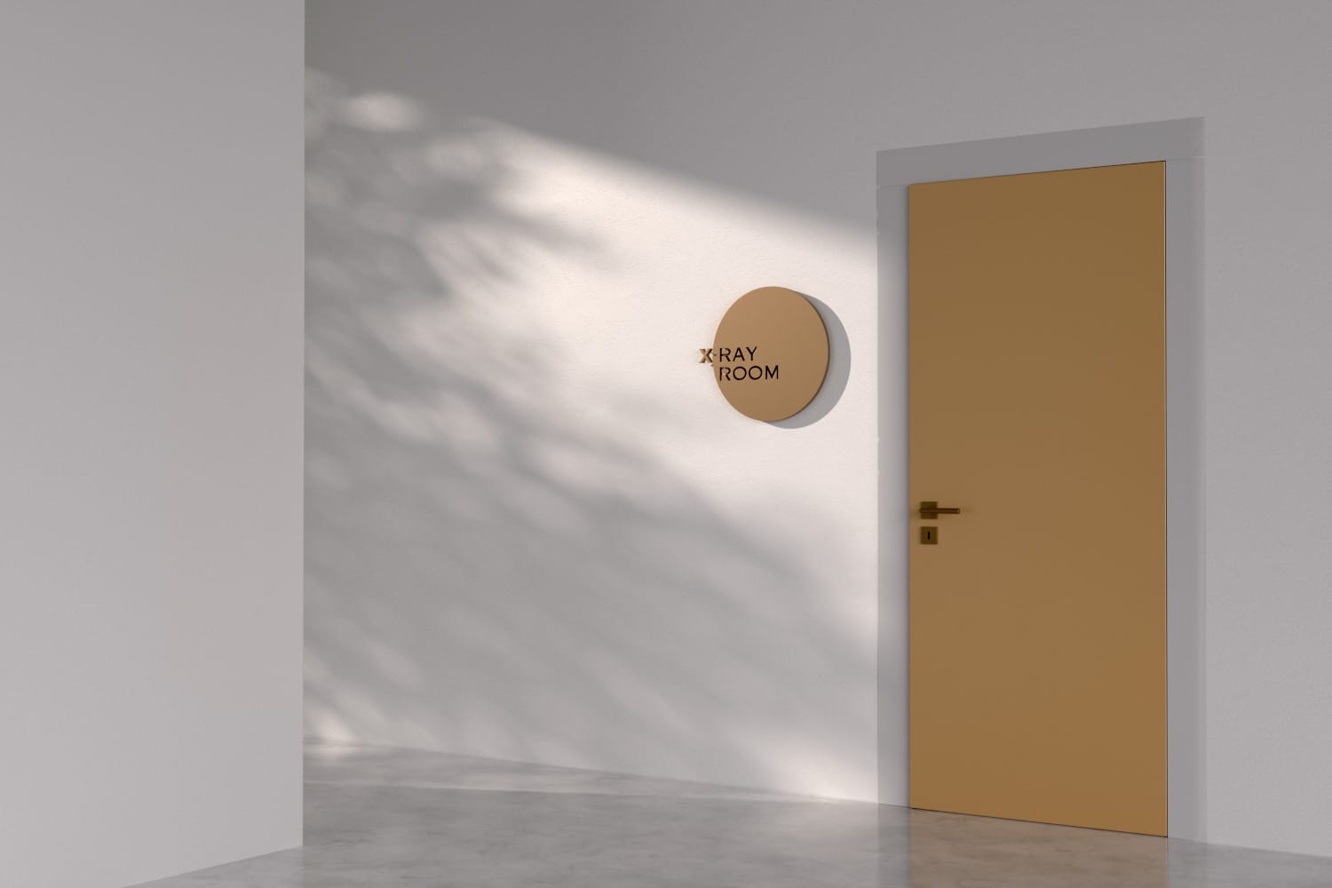
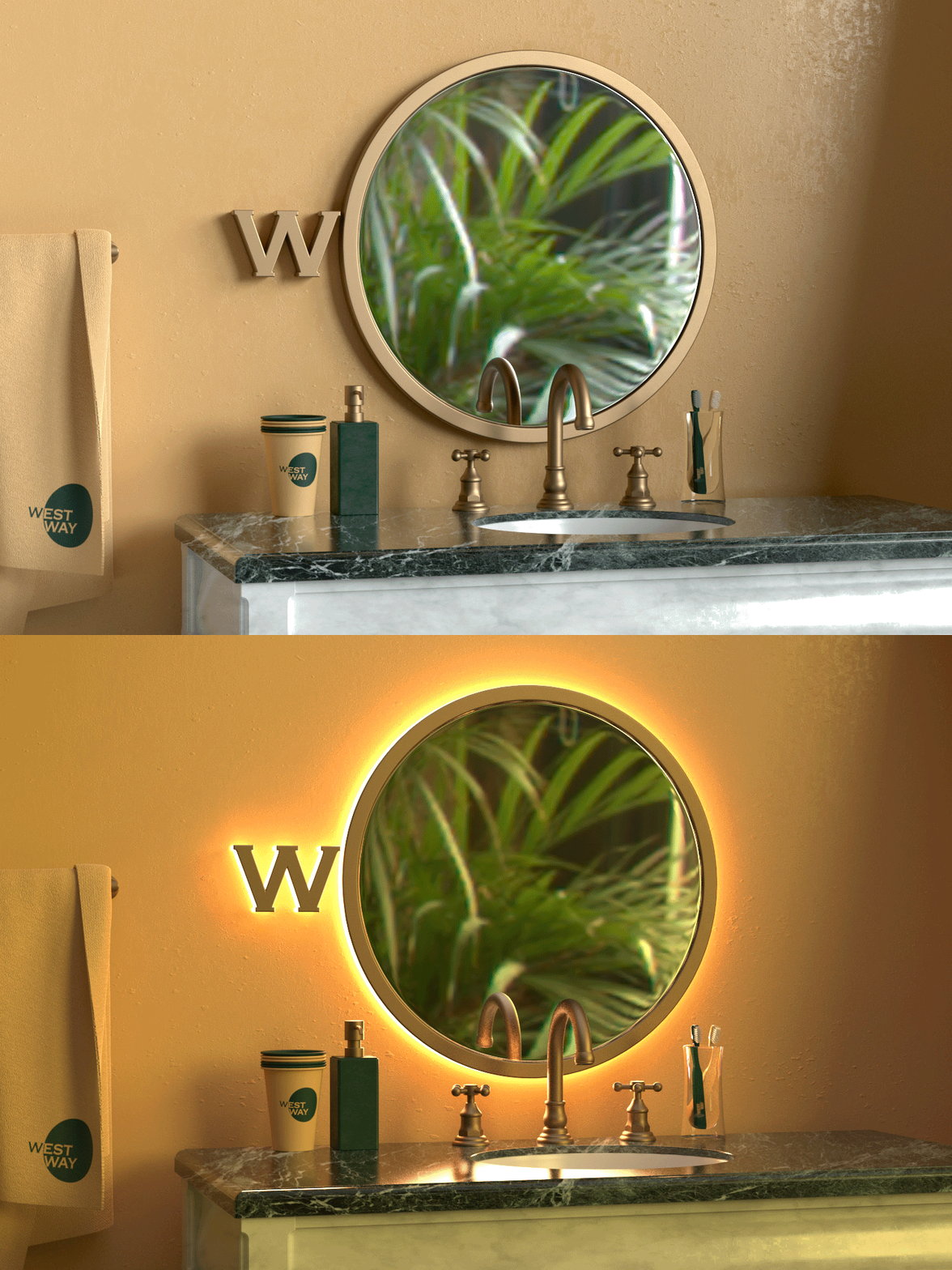
xolve extended this visual language across various applications. For indoor and outdoor signage, the logo is cut out on copper plate and illuminated from behind, creating a radiant effect that mimics the sun. Emerald green and golden hues, chosen as the brand’s primary colors, further reinforce the connection to nature and well-being.
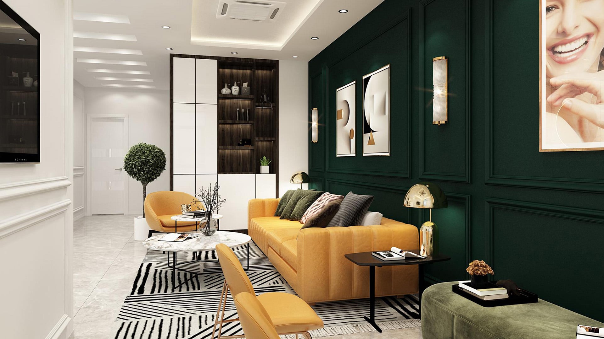
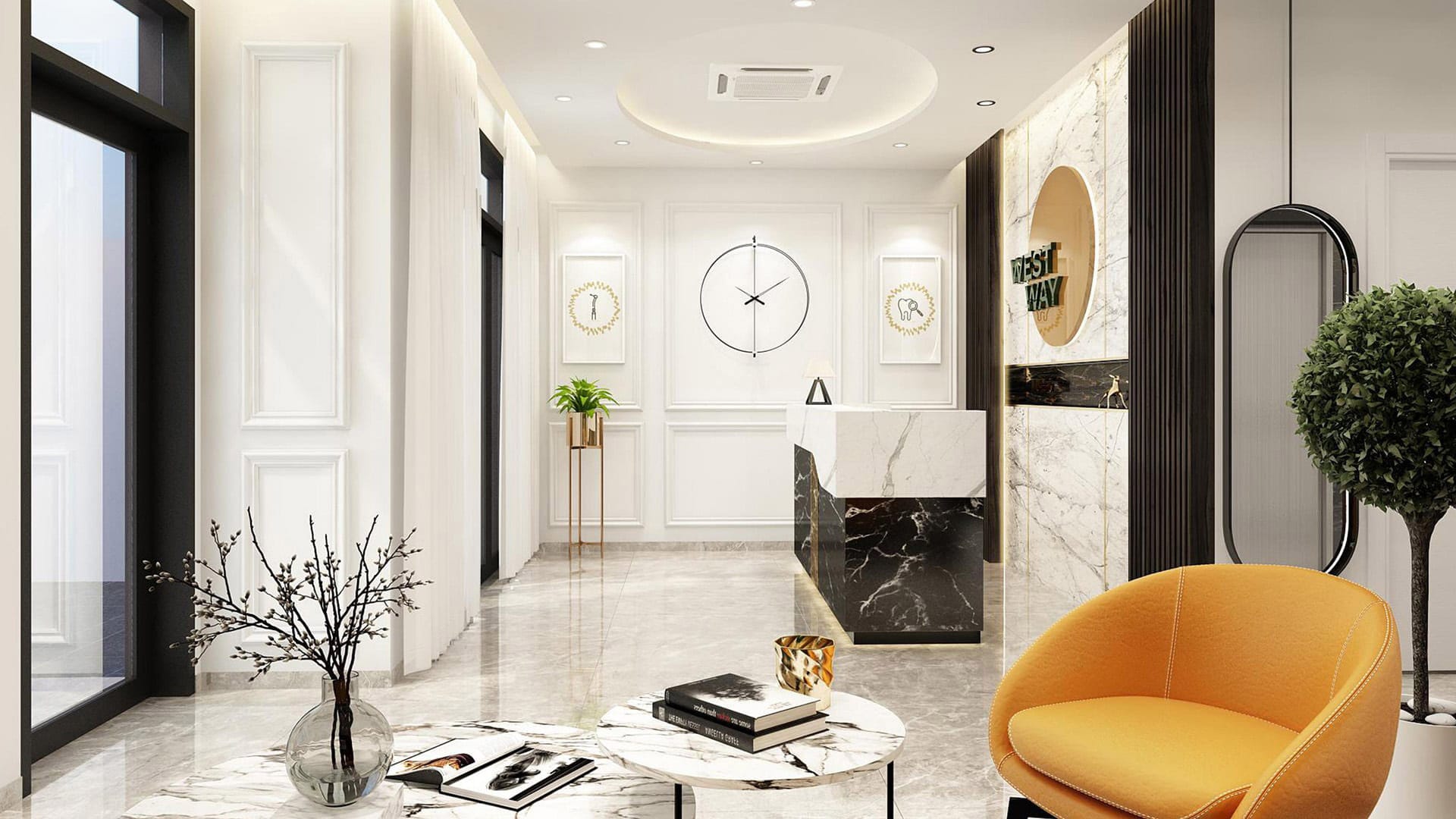
The interior design of the clinic complements the brand identity, blending modern luxury with neoclassical elements. Copper accents, vintage décor, and calming green tones in the waiting room create a serene and sophisticated atmosphere.
Result
Within two years, Westway has expanded to six locations across Ho Chi Minh City, a testament to the brand’s resonance with its target audience. The thoughtfully crafted visual identity, from the symbolic logo to the elegant applications and inviting interior design, has successfully positioned Westway as a leading dental clinic, known for its exceptional care and refined aesthetic. The brand’s strong foundation paves the way for continued growth and success in the competitive dental market.
