
Client
Ambrosia
Sector
F&B
Discipline
Strategy
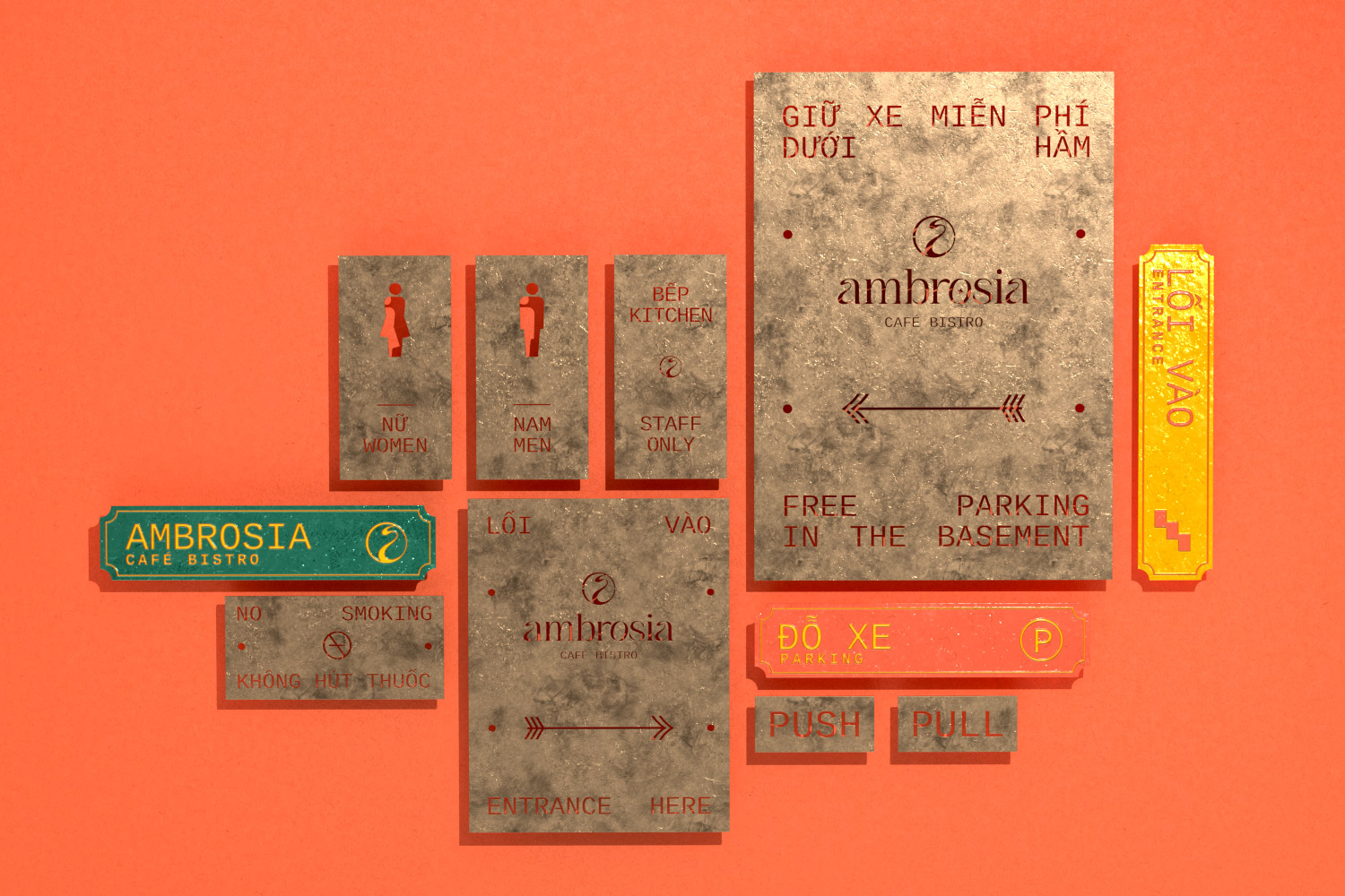
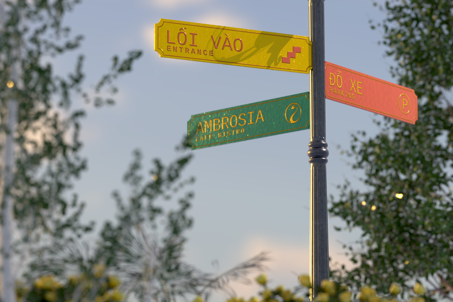
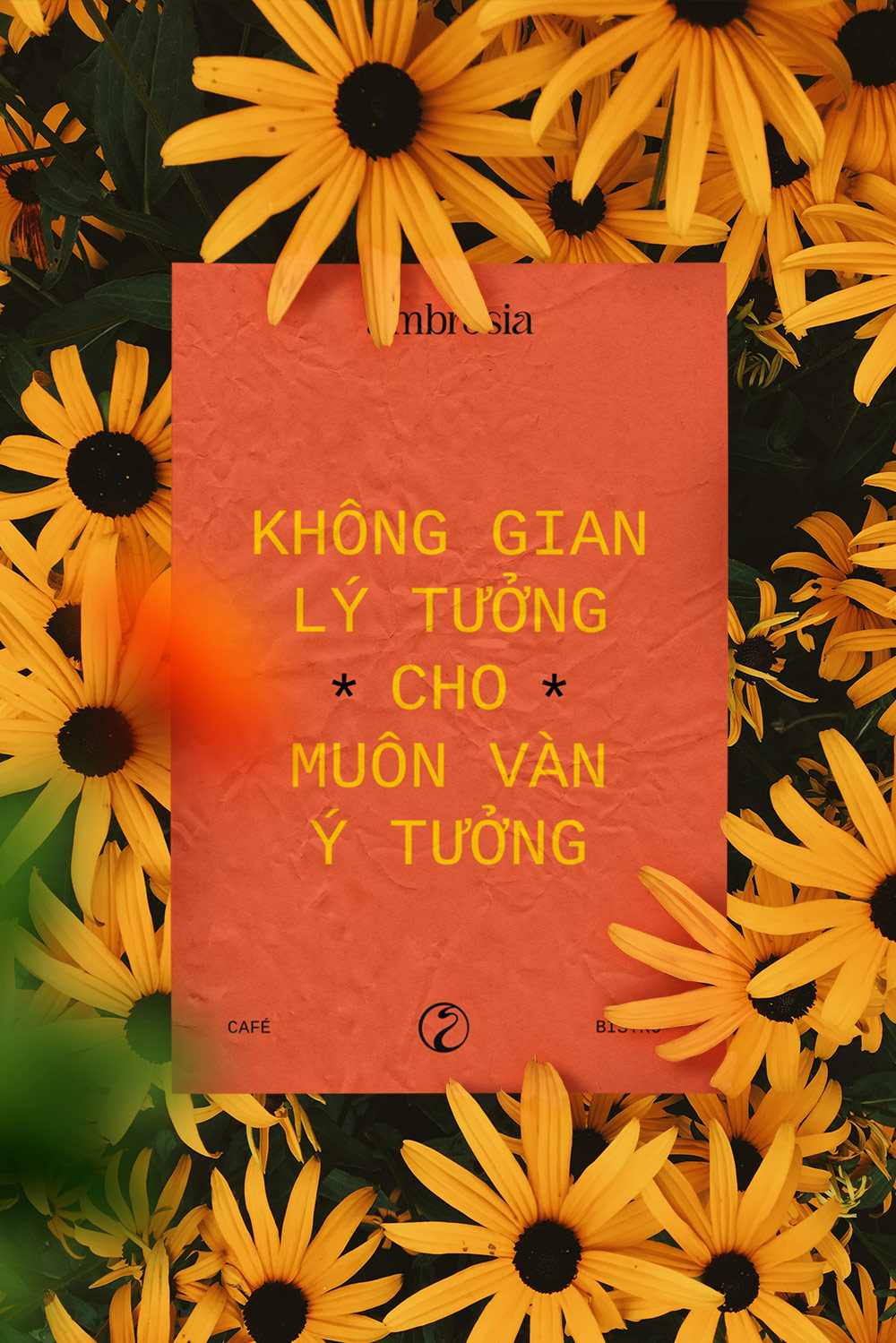
Brand identity
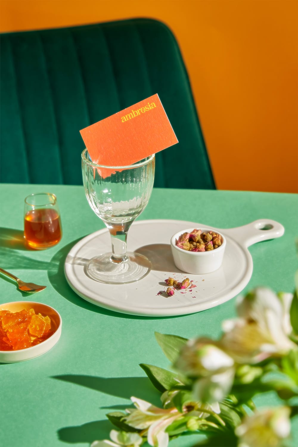
Packaging
Communication
Project team
Sophie Watson
Khoa Huynh
Cindy Le
Lam Na Ny
Tri Nguyen
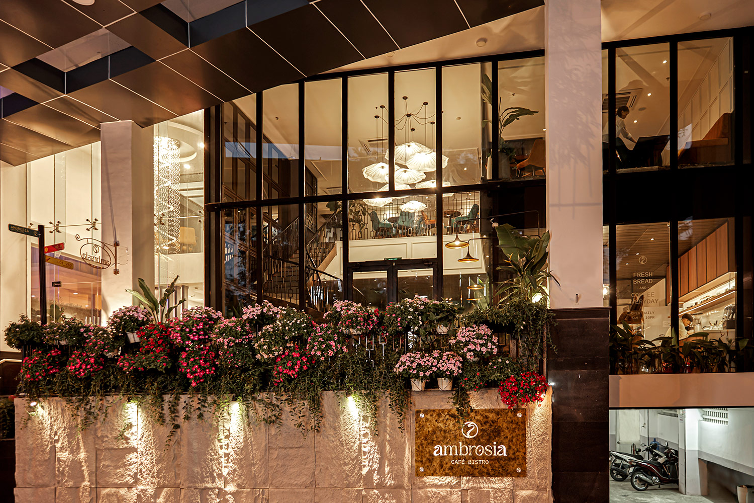
Delightful tastes. Inviting aromas. A sensory experience. Cue Ambrosia Cafe Bistro. Opened in December 2020 and nestled in the heart of Ho Chi Minh City, Ambrosia Cafe Bistro is an up-and-coming cafe serving local Vietnamese and fusion cuisine.
xolve was approached to create this brand from the ground up as a full scope project. Starting from scratch, our team worked on naming, brand identity, key visual development, brand application, and managing the interior design process. Our objective was to create a cohesive design concept that sets Ambrosia apart from every other café in Ho Chi Minh City.The solution began with the naming strategy. ‘Ambrosia’ has its origins in Greek mythology, where the term is used to describe the food and drink of the gods.
Our team wanted to communicate that Ambrosia is not just a meal, but rather a full experience defined by a tasty menu, attentive service, and complementary design.
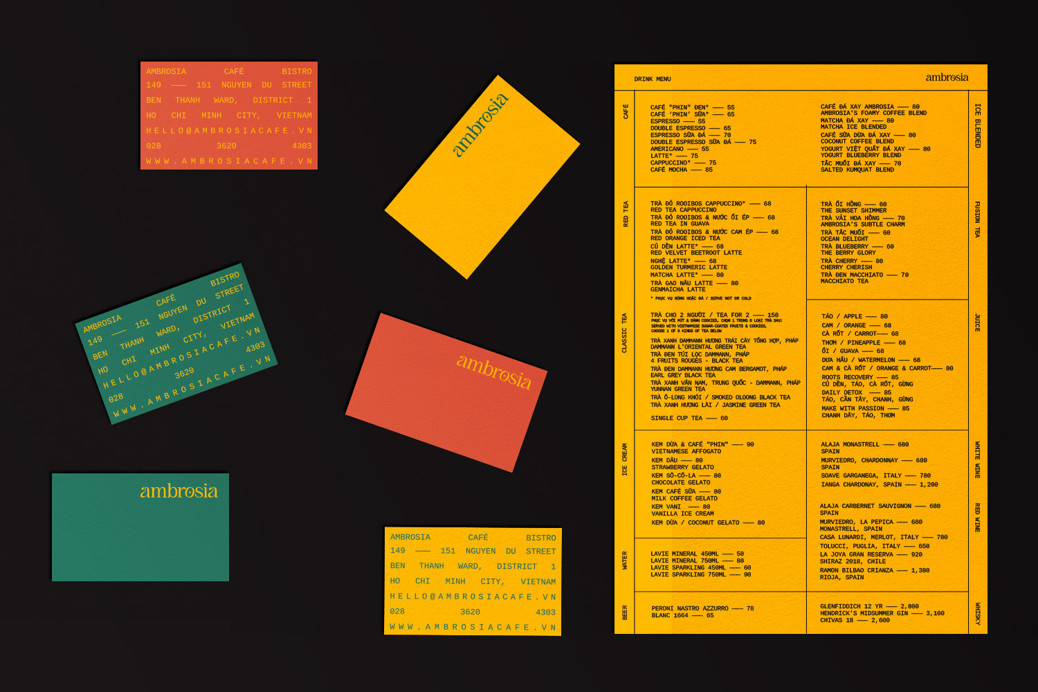
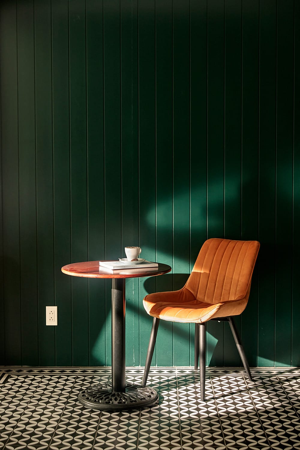
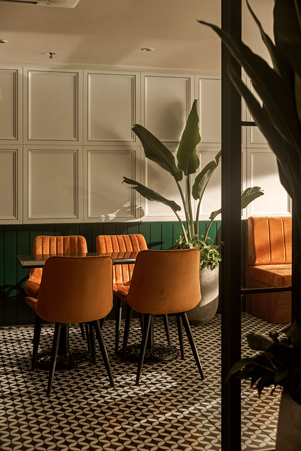
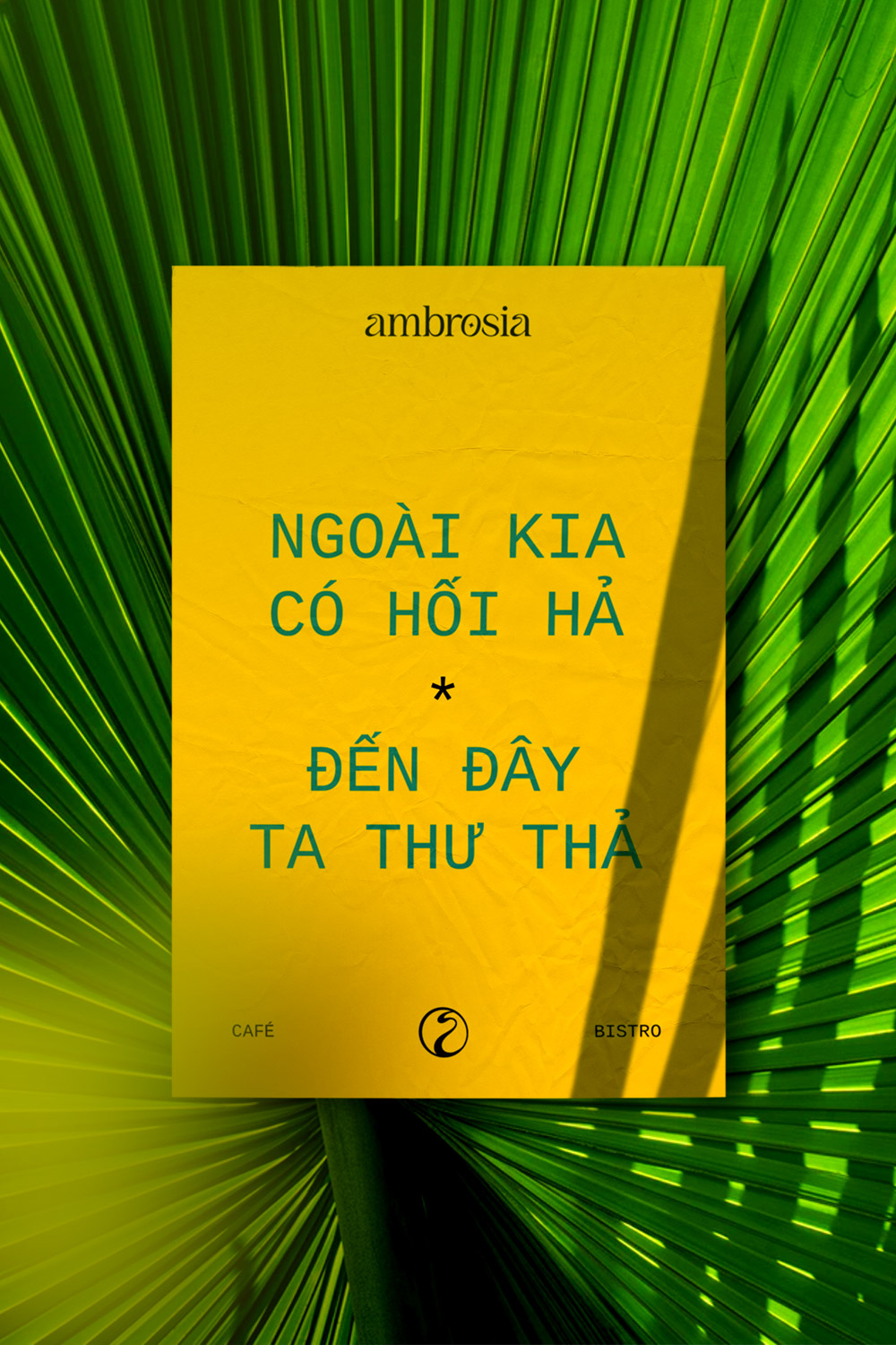
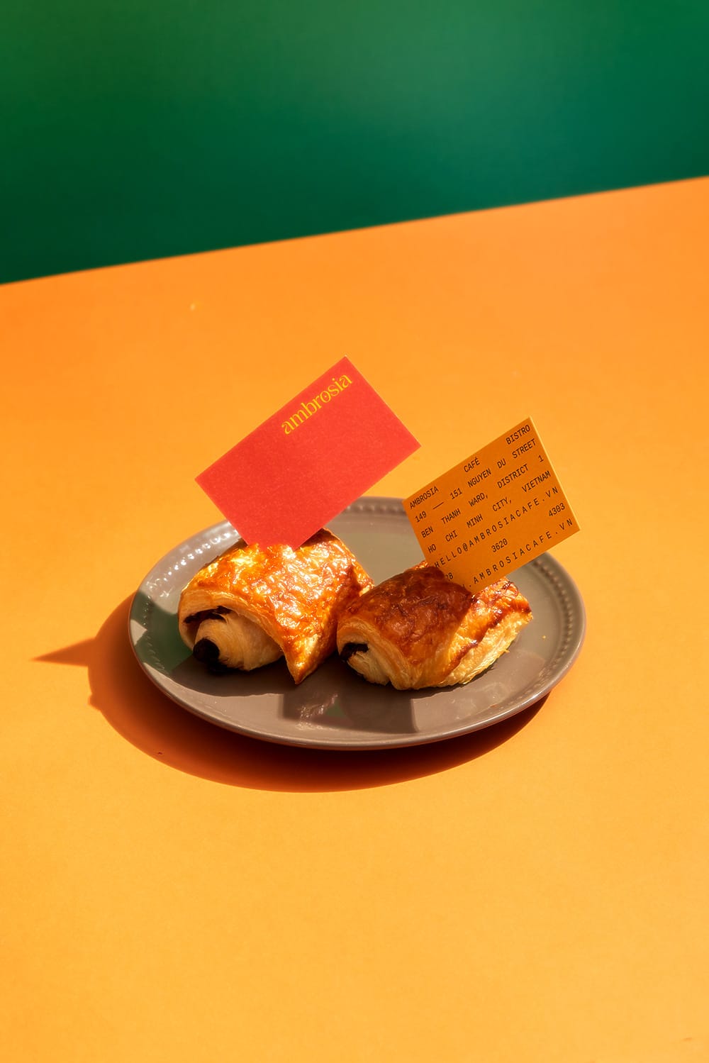
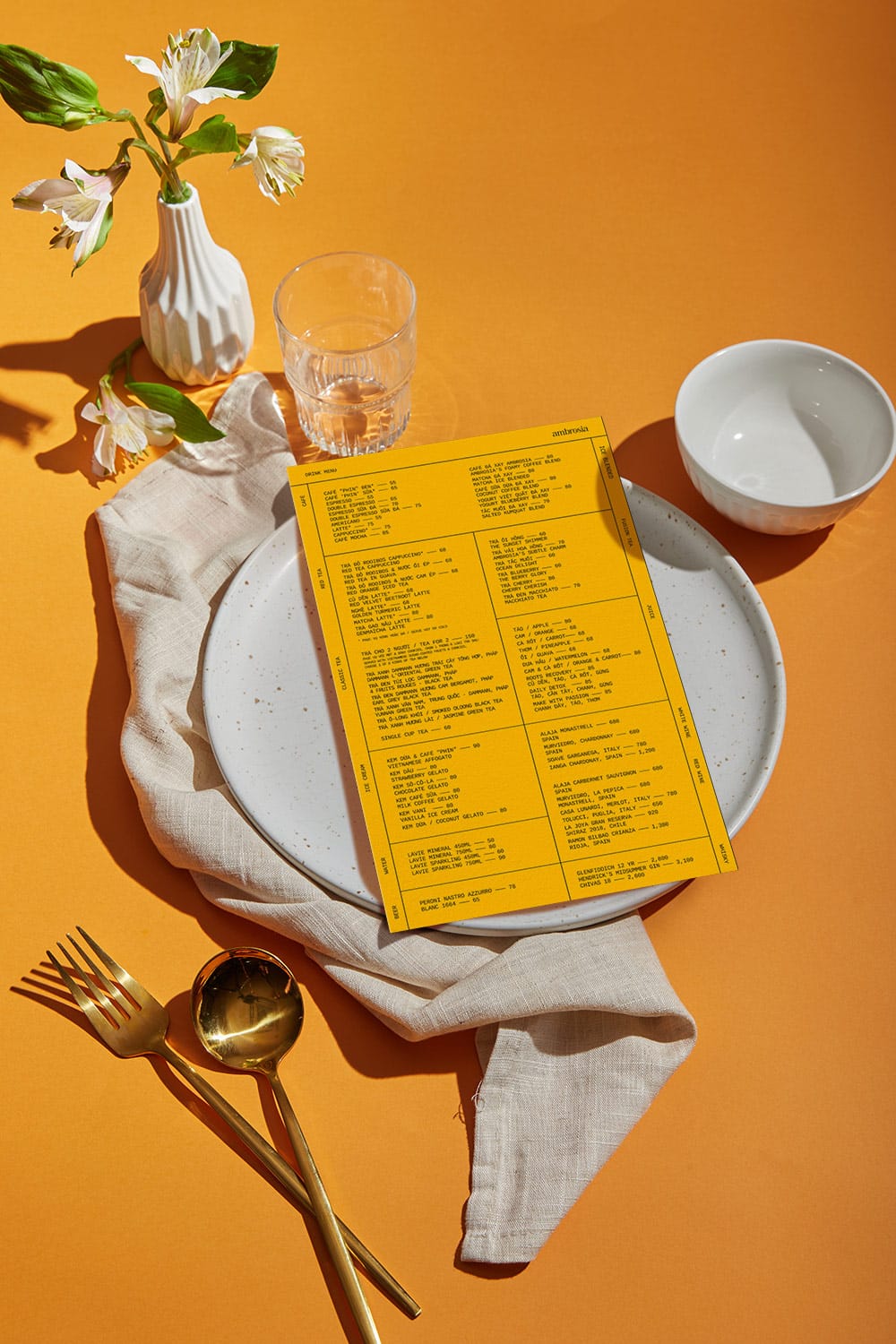
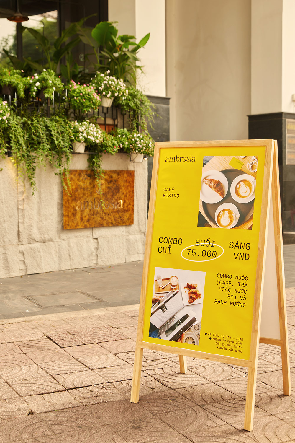
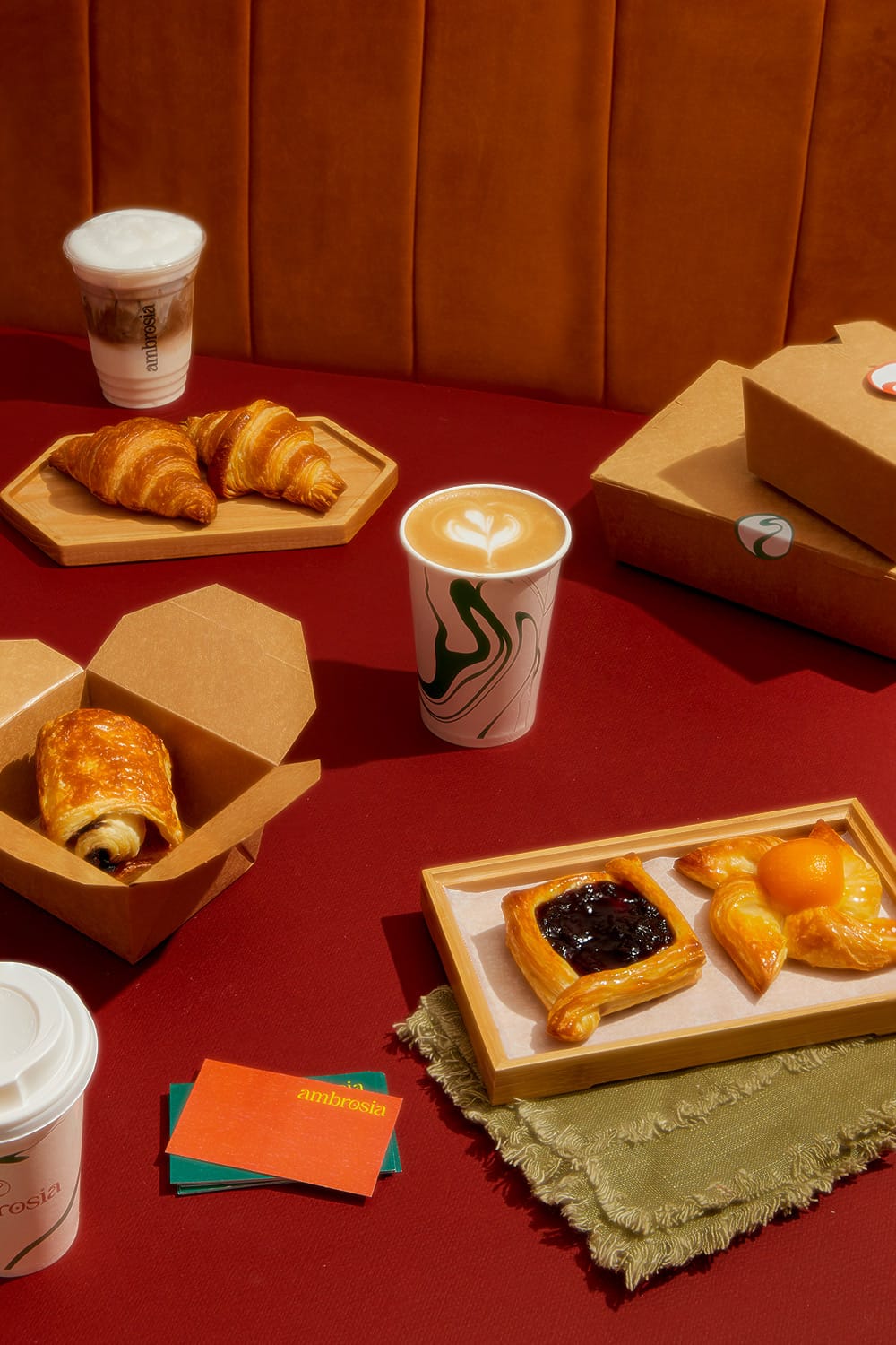
Canary yellow is paired with orange and deep-sea green for a captivating analogous color scheme. The bright yellow and orange tones convey warmth and vibrance, which starkly contrast against the green. The three colors together connote life, energy, and creativity, creating a positive and welcoming aura for the café.
We designed the key visual in two different color ways in order to accommodate more possibilities for brand application. This visual plays with abstract shapes and distorted perspective inspired by the fluidity of smells and tastes, and is applied on the menu, across all takeaway packaging, as well as within the interior design of the cafe.
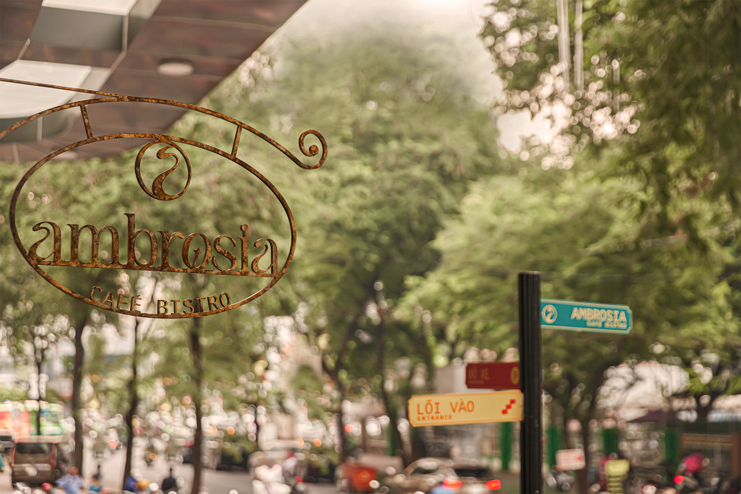
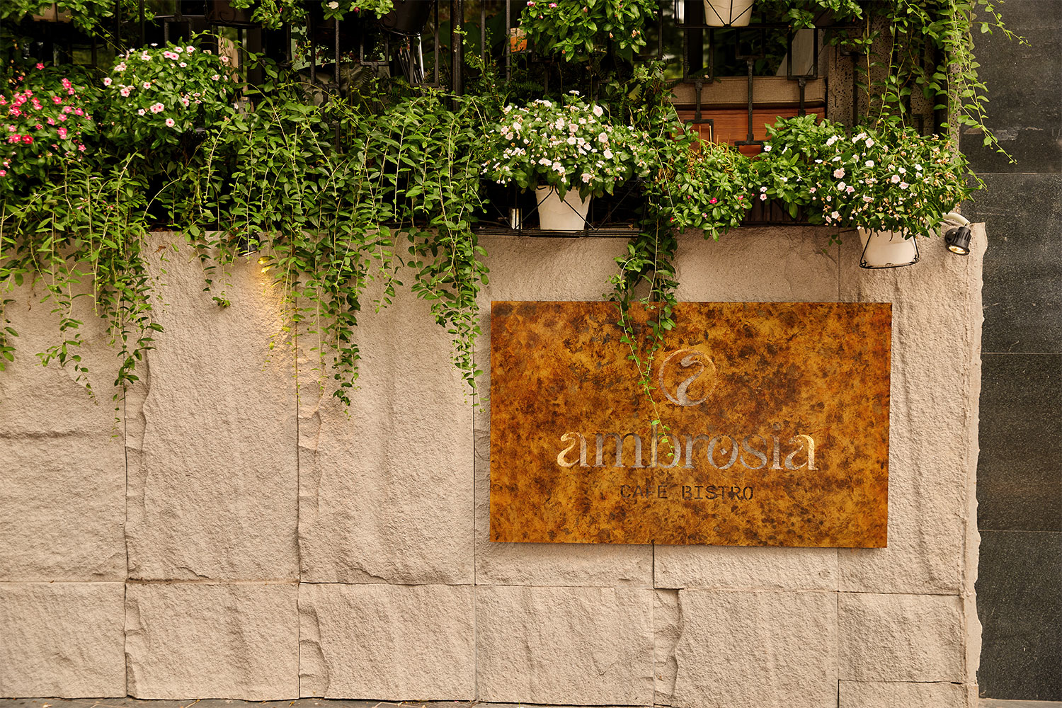
For the logo, we kept things simple so that it could be easily recognizable. However, we still wanted to incorporate the principal idea of flow and movement into the design.
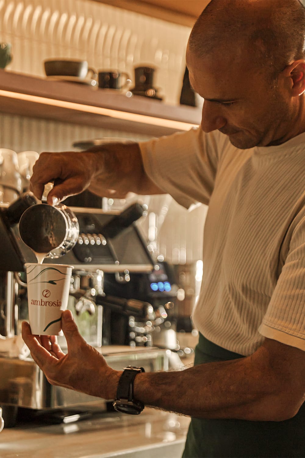
The letter ‘a’ is designed to mimic the fluid effect used in the key visual, and the slight tilt of the ‘o’ depicts a playfulness that ties into the brand’s goal to appeal to a young and trendy demographic. The pictorial mark was derived from the ‘a’ and illustrated to look like a smoky aroma, in order to be used across social media platforms and on smaller applications.
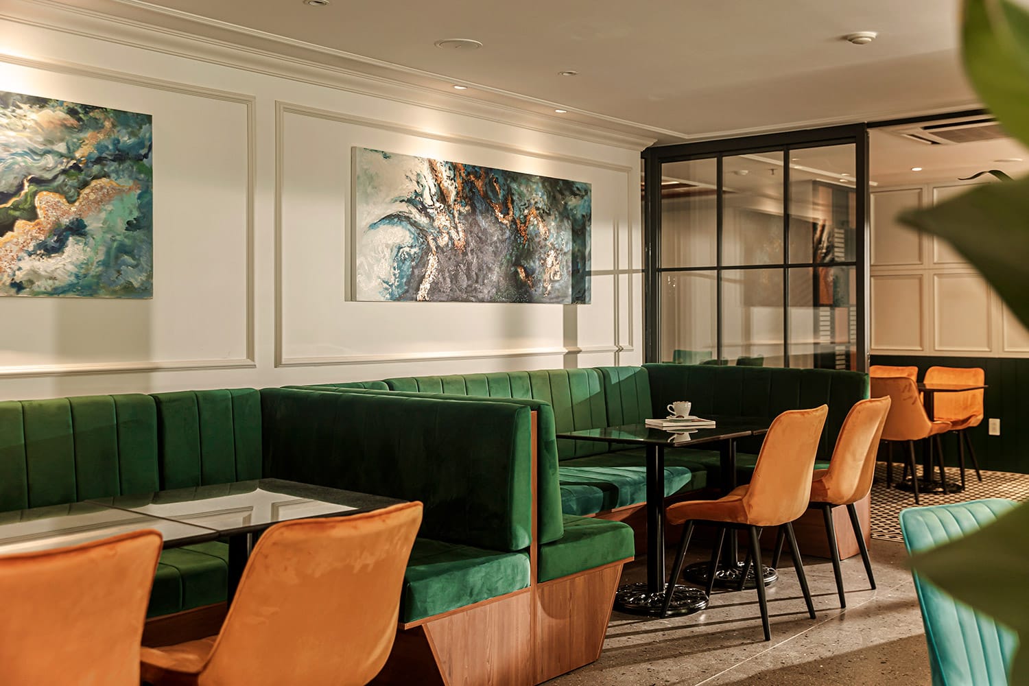
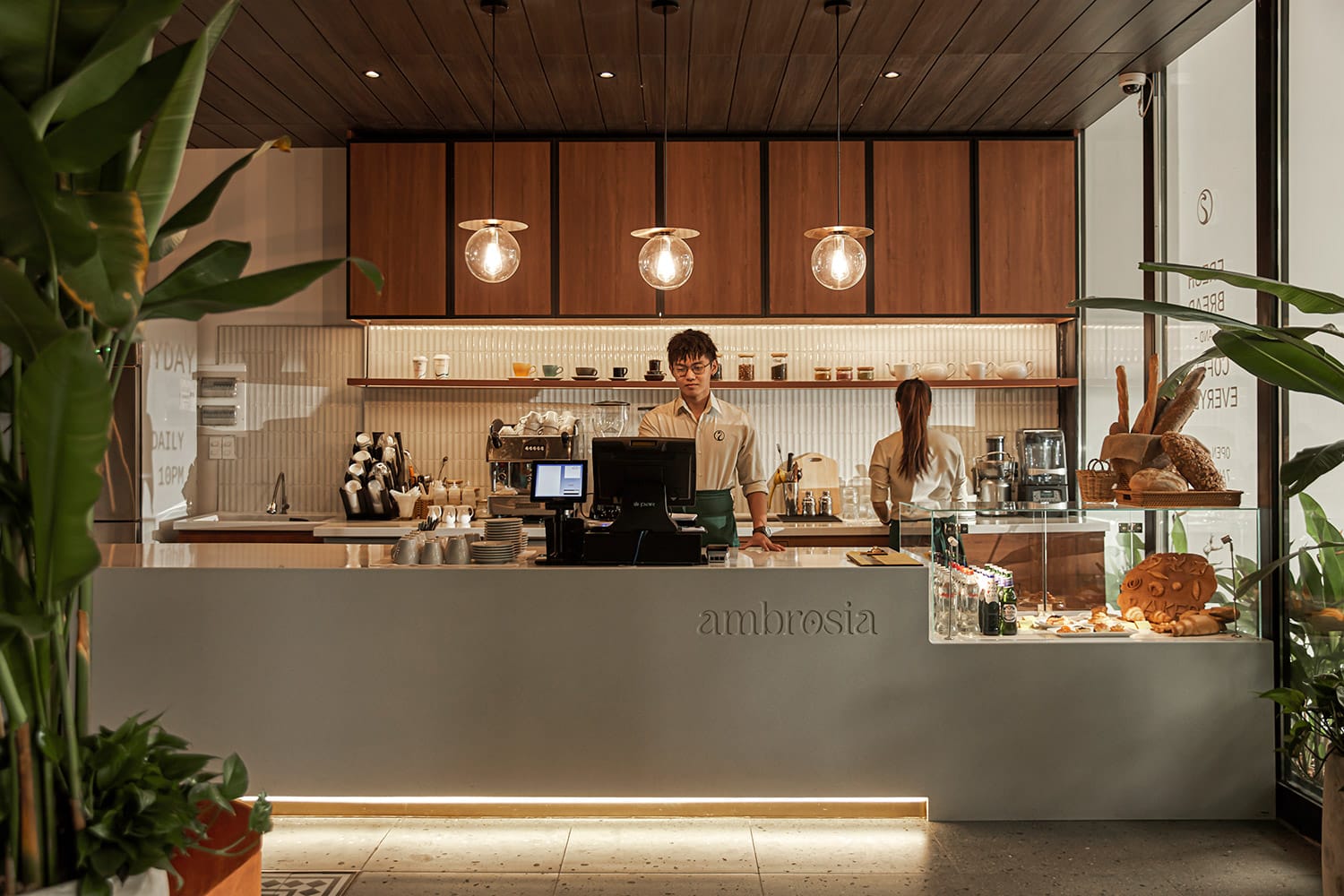
Regarding the interior design, a classic Indochine-esque style is juxtaposed with the bright color palette to create an inviting space that appeals to both younger and older customers. The design allows the café itself to exude an element of luxury, while its price point and menu offer familiarity and comfort.
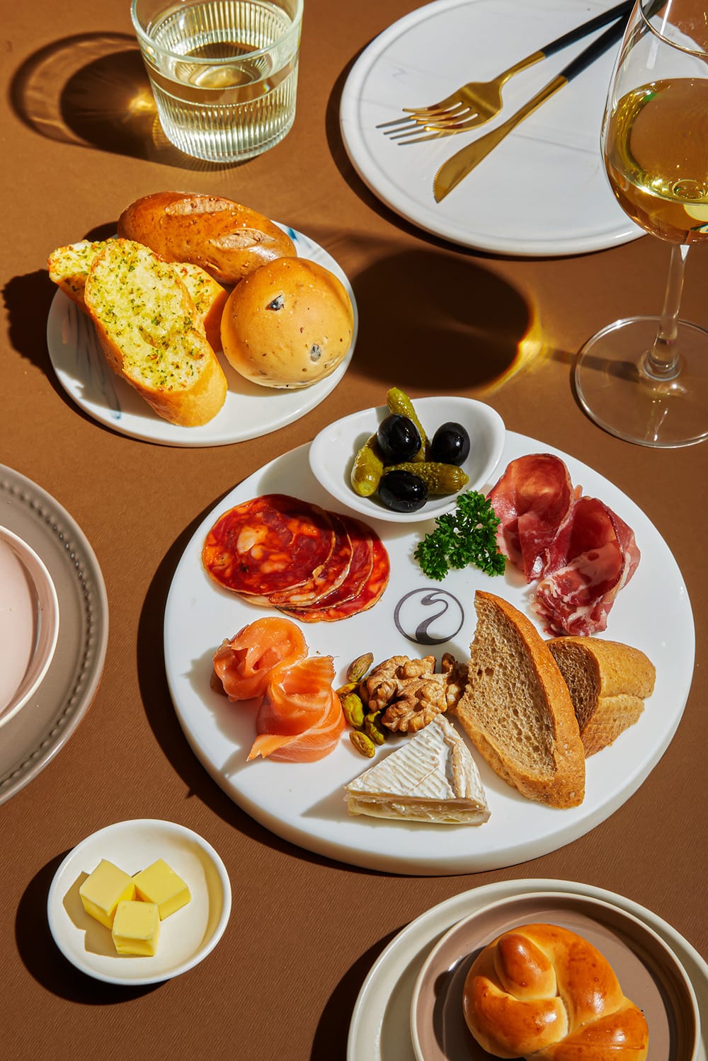
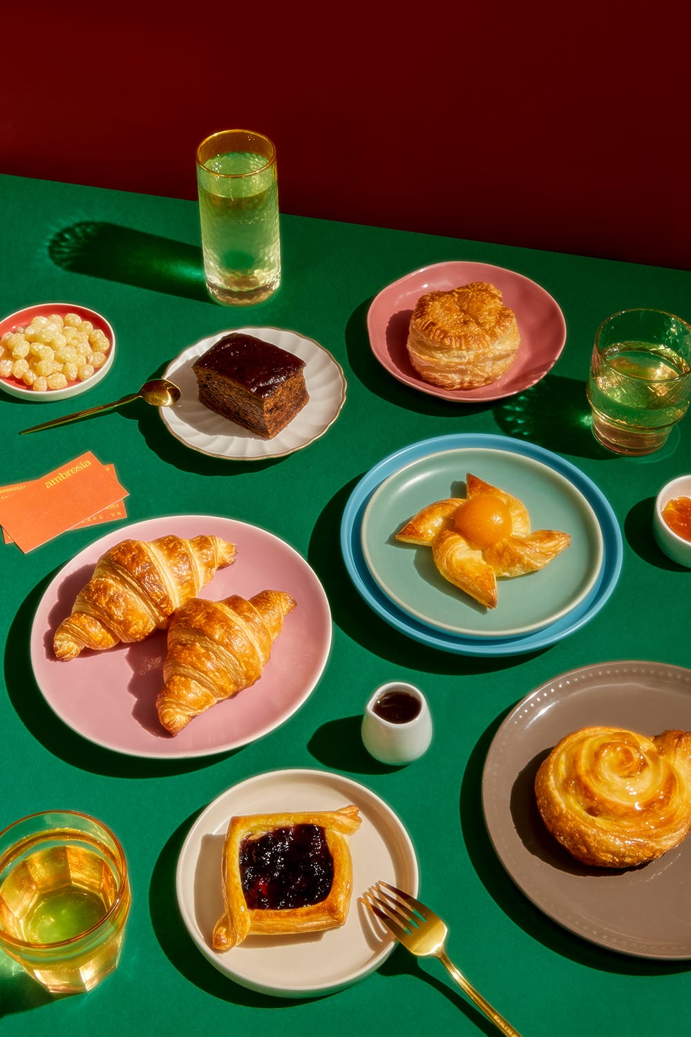
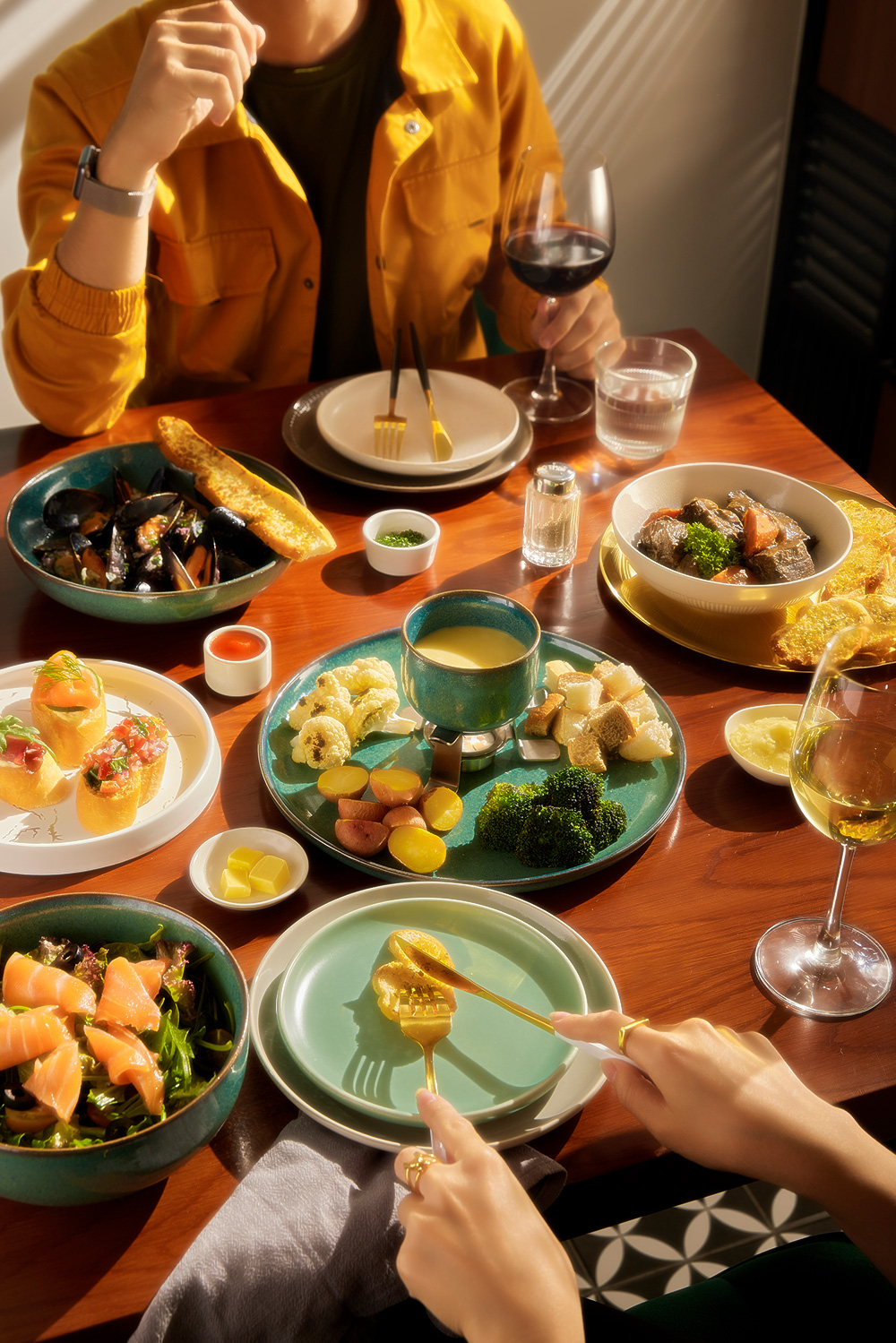
Ambrosia’s photography was visually directed by the xolve team. We conceptualized the photos to have high contrast, bright colors, and hard shadows, which are intended to emphasize the color and texture of the food and drinks. The goal of the lighting and color design is to express the sensation of bold flavors and smells permeating your senses.
We welcome you to drop by and experience the sheer Ambrosia for yourself.